


- Destroy this mad brute Poster
- Der gute Nachbar von Südamerika Poster
- Italien mit Vatikanstadt Poster
- Les Lalanne Poster
- Tanzendes Paar im Schnee Poster
- Jet Clipper nach Hawaii Poster
- Kohler Chocolat Poster
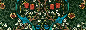
- Strawberry Thief Poster
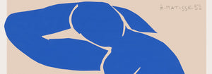
- Matisse Tanzende Figuren Poster
- Tom Krojer Ausstellungs-Poster
- Berliner Straßenszene Poster
- Ernst Kirchner Ausstellung Poster
- Sitzende Frau von hinten Poster
- Rotes Haar, blauer Hut Poster
- Park Near Lu Poster
- El Comienzo Poster
- Parler Seul 2 Poster
- Ring der Dämmerung Poster
- Parler Seul Poster
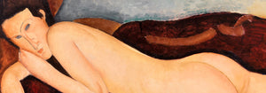
- The Dream Poster
- Le Concert Poster
- Weibliche Künstlerin Poster
- Revenge of the Pink Panther Poster
- Frau und Vogel in der Nacht Poster
- Puerto Rico entdecken Poster
- Bauhaus 20 Poster
- Bauhaus 21 Poster
- Mehr Obst essen Poster
- Blauer japanischer Kranich Poster
- Snoopy Come Home Poster
- Nach London mit Jet Clipper Poster
- Crans Poster
- Monte Carlo Poster
- Pacific Vibrations Poster
- Continental Hawaii Airline Poster
- Bier und Zigarette Poster
- West Coast of Mexico Poster
-
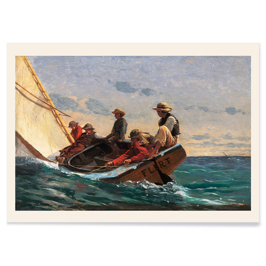
The Flirt Poster
Winslow Homer · 1874 · Lebhaftes Segelboot-Poster mit flirtender Szene und nostalgischer maritimer 19. Jahrhundert-Atmosphäre
Poster ab €9 · Gerahmt ab €16
Normaler Preis Von €6,00Normaler Preis -
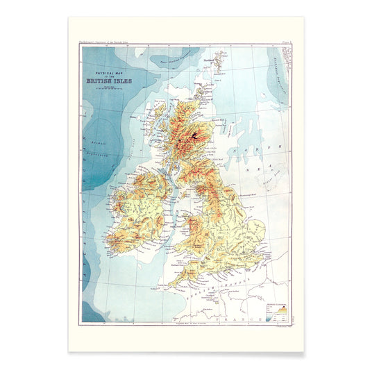
Gazetteer der Britischen Inseln Poster
John Bartholomew · 1887 · Detaillierter Gazetteer-Poster der Britischen Inseln mit klaren Beschriftungen und atlasartigem Aufbau
Poster ab €9 · Gerahmt ab €16
Normaler Preis Von €6,00Normaler Preis -
Purpur-Topas Poster
James Bolton · 1768 · Feiner detailreicher naturhistorischer Kunstdruck mit Purpur-Topas-Kolibri, Muscheln, Schmetterlingen und Zyklamen
Poster ab €9 · Gerahmt ab €16
Normaler Preis Von €6,00Normaler Preis -
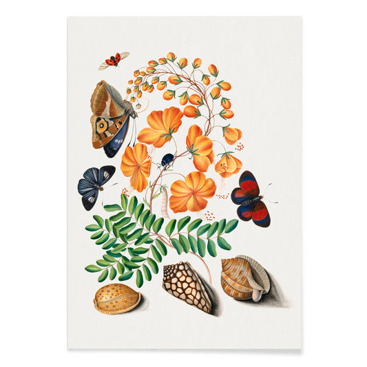
Caesalpinoide Poster
James Bolton · 1768 · Zarter naturkundlicher Kunstdruck mit Schmetterling, Käfern und Muscheln auf cremefarbenem Grund
Poster ab €9 · Gerahmt ab €16
Normaler Preis Von €6,00Normaler Preis -
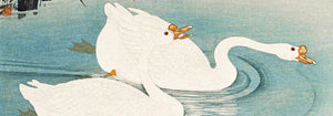
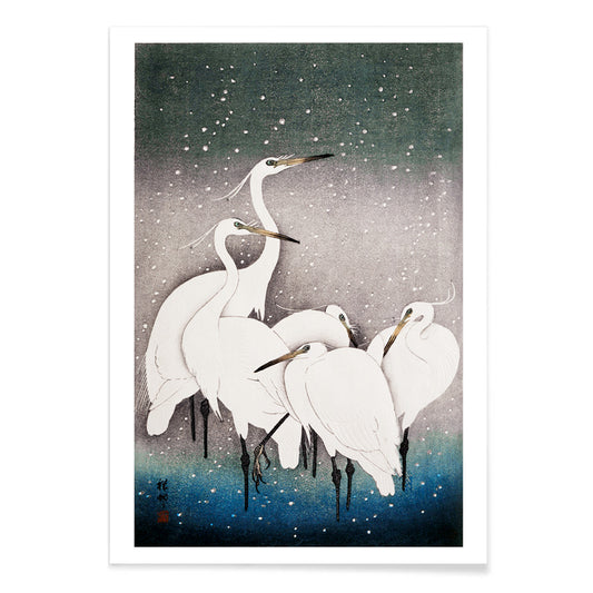
Gruppe von Reihern Poster
Ohara Koson · 1925 · Ruhiger, eleganter Reiherdruck in winterlicher Stille mit blaugrauen Schatten
Poster ab €9 · Gerahmt ab €16
Normaler Preis Von €6,00Normaler Preis -
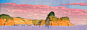
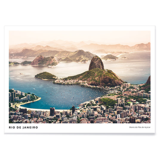
Rio de Janeiro Poster
Agnieszka Ciesielska · 2019 · Vintage-inspiriertes Rio de Janeiro Poster mit Zuckerhut-Silhouette, weiten Stränden und Booten
Poster ab €9 · Gerahmt ab €16
Normaler Preis Von €6,00Normaler Preis -
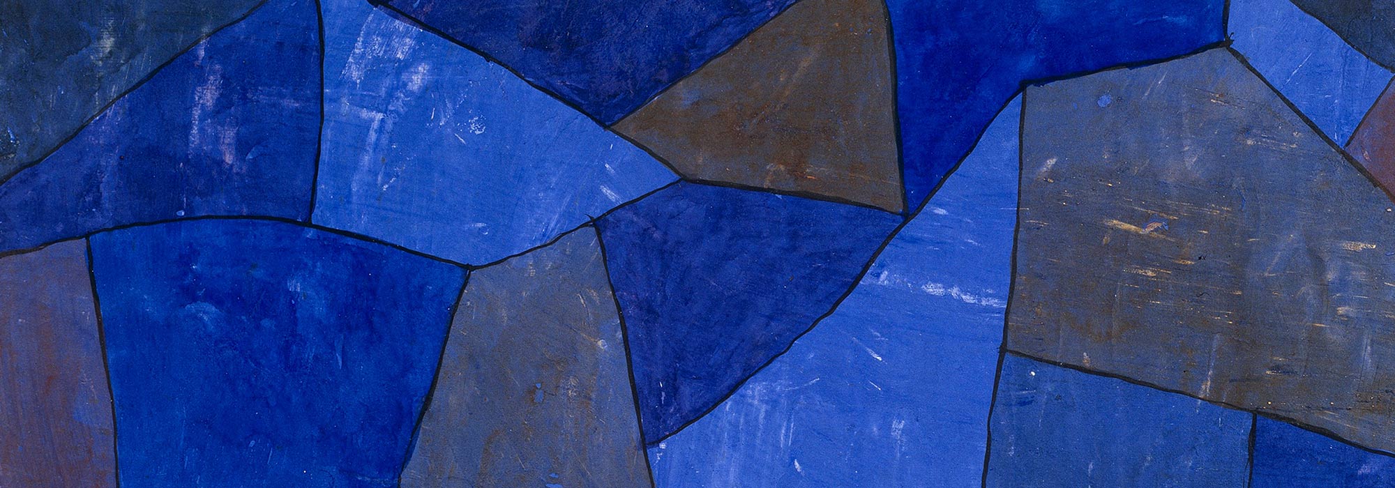
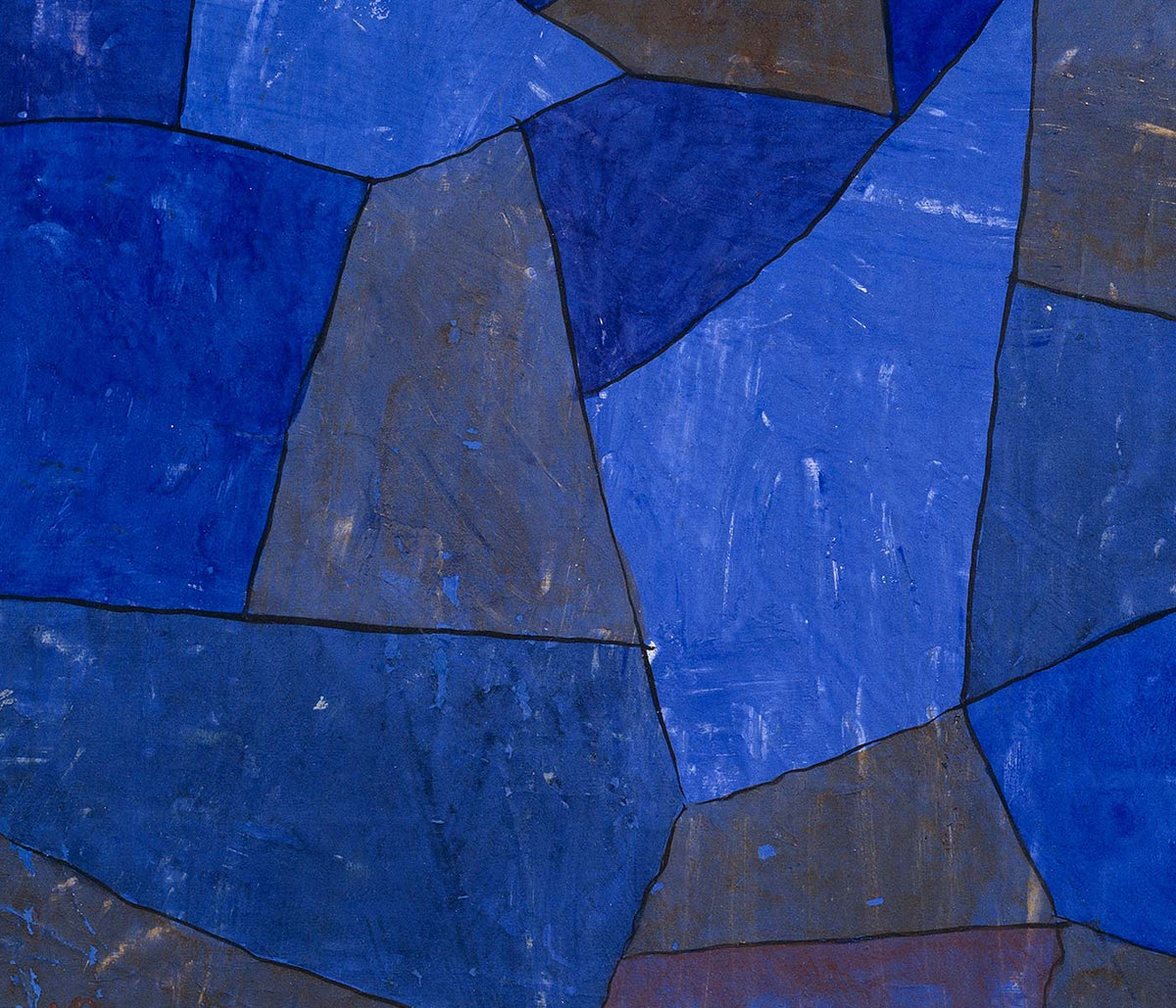
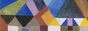
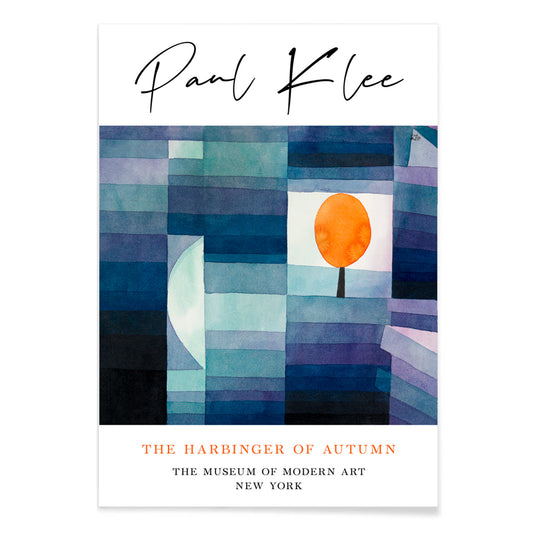
Der Vorbote des Herbstes Poster
Paul Klee · 1922 · Modernistischer Kunstdruck eines orangen Baums in verspielter Blau- und Orangengeometrie
Poster ab €9 · Gerahmt ab €16
Normaler Preis Von €6,00Normaler Preis -
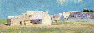
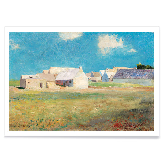
Bretonisches Dorf Poster
Odilon Redon · 1890 · Traumhafter Kunstdruck eines Dorfes mit blau-grünen Feldern und sanft verschwommenen Dächern
Poster ab €9 · Gerahmt ab €16
Normaler Preis Von €6,00Normaler Preis -
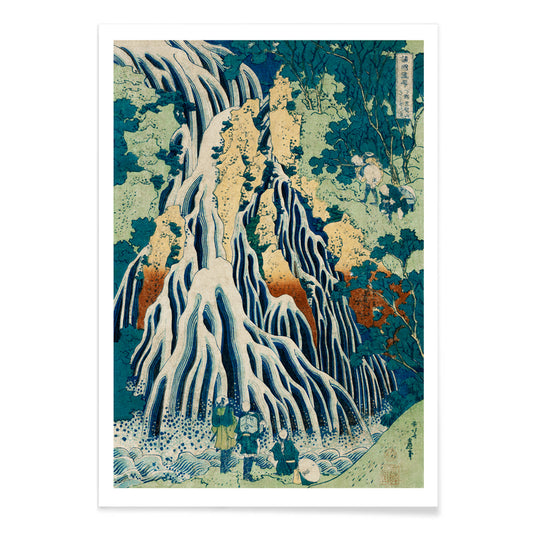
Shimotsuke Kurokami-Yama Kurifuri no Taki Poster
Katsushika Hokusai · 1832 · Dramatischer Vintage-Druck mit klein wirkenden Reisenden neben tosenden senkrechten Kaskaden
Poster ab €9 · Gerahmt ab €16
Normaler Preis Von €6,00Normaler Preis -
Yoro-Wasserfall Poster
Katsushika Hokusai · 1832 · Ikonischer japanischer Kunstdruck des Yoro-Wasserfalls mit wehendem Wasser und ruhiger Berglandschaft
Poster ab €9 · Gerahmt ab €16
Normaler Preis Von €6,00Normaler Preis -
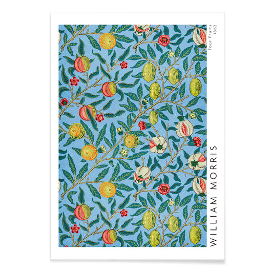
Vier-Früchte-Muster Poster
William Morris · 1862 · Üppiges Poster mit Früchten und Laub, verschlungene Blätter und intensives Blau
Poster ab €9 · Gerahmt ab €16
Normaler Preis Von €6,00Normaler Preis -
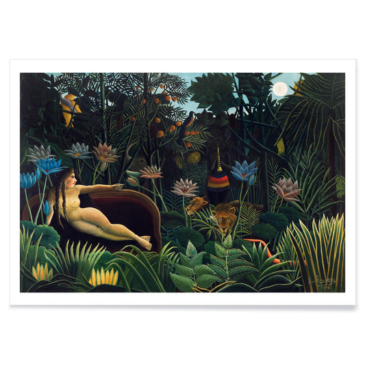
The Dream Poster
Henri Rousseau · 1910 · Traumhaftes Dschungel-Poster mit liegender Figur, mondhelles Blattwerk und wachsame Tiere
Poster ab €9 · Gerahmt ab €16
Normaler Preis Von €6,00Normaler Preis -
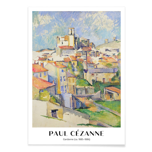
Gardanne Poster
Paul Cézanne · 1886 · Strukturiertes provenzalisches Dorf Kunstdruck mit terrakottafarbenen Dächern und kühlem blauem Himmel
Poster ab €9 · Gerahmt ab €16
Normaler Preis Von €6,00Normaler Preis -
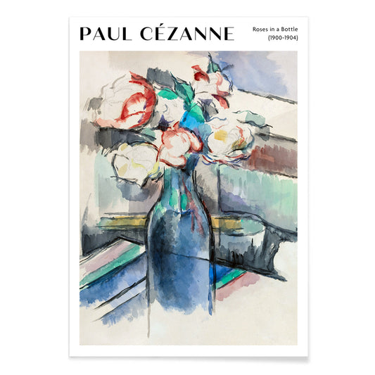
Rosen in einer Flasche Poster
Paul Cézanne · 1902 · Leuchtender Rosen-Kunstdruck in einer Flasche mit sanften Blau- und Grüntönen
Poster ab €9 · Gerahmt ab €16
Normaler Preis Von €6,00Normaler Preis -
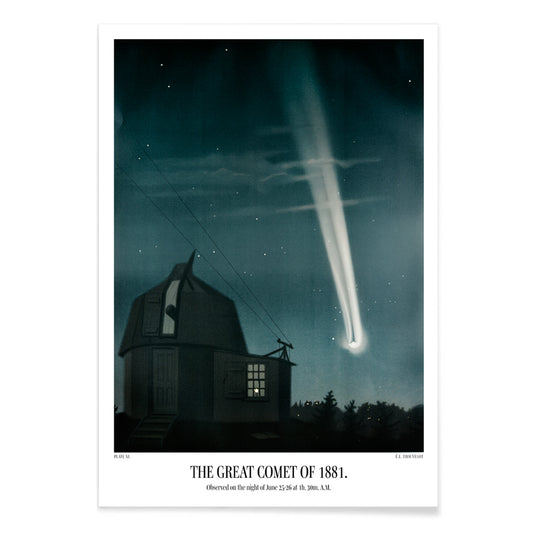
Großer Komet von 1881 Poster
Étienne Léopold Trouvelot · 1881 · wissenschaftlicher Druck des leuchtenden Kometen mit ausladendem Schweif im sternbesetzten Nachthimmel
Poster ab €9 · Gerahmt ab €16
Normaler Preis Von €6,00Normaler Preis -
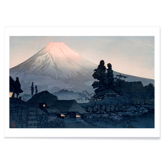
Mount Fuji von Mizukubo Poster
Hiroaki Takahashi · 1932 · Ruhiger Kunstdruck des Mount Fuji mit Dorfdächern unter sanftem Abendhimmel
Poster ab €9 · Gerahmt ab €16
Normaler Preis Von €6,00Normaler Preis -
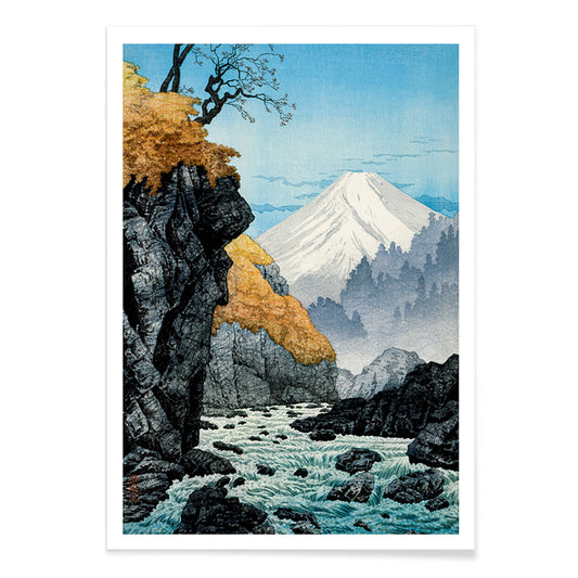
Fuß des Mount Ashitaka Poster
Hiroaki Takahashi · 1932 · Ruhiges Flusslandschafts-Poster mit goldenen Bäumen und fernem blauen Berg
Poster ab €9 · Gerahmt ab €16
Normaler Preis Von €6,00Normaler Preis -
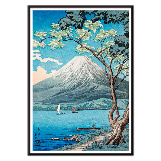
Mount Fuji vom Yamanakasee Poster
Hiroaki Takahashi · 1929 · Ruhiger japanischer Kunstdruck mit Segelbooten auf dem Yamanakasee unter dem schneebedeckten Fuji
Poster ab €9 · Gerahmt ab €16
Normaler Preis Von €6,00Normaler Preis -
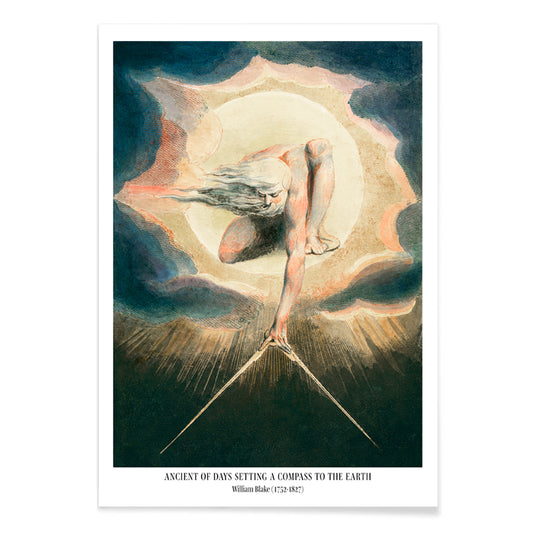
The Ancient of Days Poster
William Blake · 1794 · Visionärer Urizen Poster mit glühender Sonnenscheibe und Zirkel über Mitternachtsblau
Poster ab €9 · Gerahmt ab €16
Normaler Preis Von €6,00Normaler Preis -
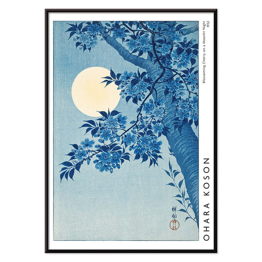
Blühende Kirschblüte in mondbeschienener Nacht Poster
Ohara Koson · 1932 · Mondbeschienene Kirschblüten Kunstdruck mit leuchtendem Vollmond und ruhiger blauer Nacht
Poster ab €9 · Gerahmt ab €16
Normaler Preis Von €6,00Normaler Preis -
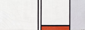
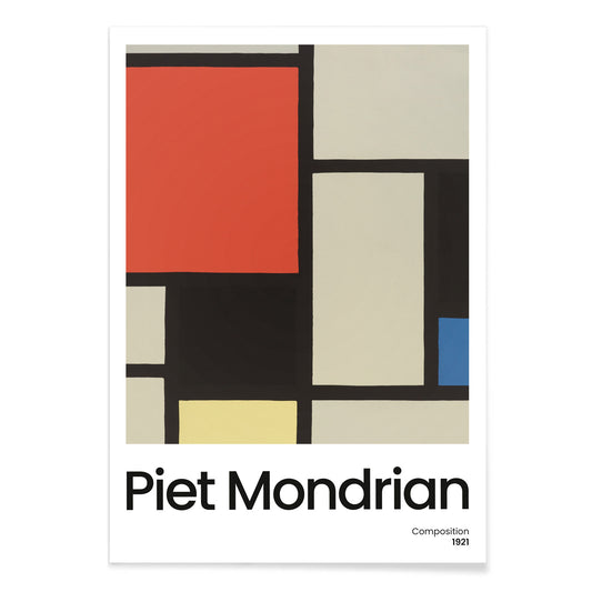
Komposition mit großer roter Fläche Poster
Piet Mondrian · 1921 · Geometrischer Kunstdruck mit großer roter Fläche und klarer schwarzer Rasterung
Poster ab €9 · Gerahmt ab €16
Normaler Preis Von €6,00Normaler Preis -
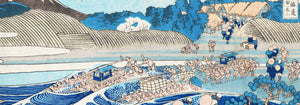
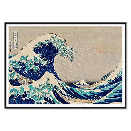
Die Große Welle Poster
Katsushika Hokusai · 1831 · Ikonisches japanisches Poster der Großen Welle mit Fuji und Booten
Poster ab €9 · Gerahmt ab €16
Normaler Preis Von €6,00Normaler Preis -
Komposition mit großer blauer Fläche Poster
Piet Mondrian · 1921 · Geometrischer De-Stijl-Kunstdruck mit großer blauer Fläche und klaren schwarzen Linien
Poster ab €9 · Gerahmt ab €16
Normaler Preis Von €6,00Normaler Preis -
Composition A Poster
Piet Mondrian · 1920 · Geometrischer Kunstdruck mit schwarzem Raster und Primärfarbflächen auf Weiß
Poster ab €9 · Gerahmt ab €16
Normaler Preis Von €6,00Normaler Preis -
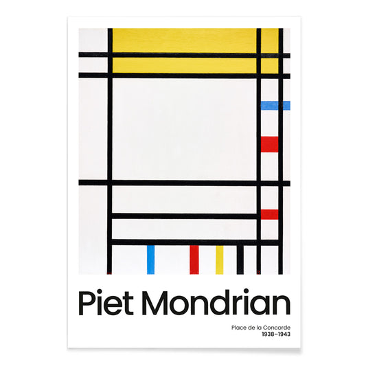
Place de la Concorde Poster
Piet Mondrian · 1941 · Geometrisches Poster mit schwarzem Gitter und roten, gelben und blauen Flächen
Poster ab €9 · Gerahmt ab €16
Normaler Preis Von €6,00Normaler Preis -
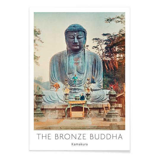
Bronzener Buddha von Kamakura Poster
Kazumasa Ogawa · 1897 · Sanft koloriertes Foto-Poster des Großen Buddha von Kamakura, umrahmt von Grün
Poster ab €9 · Gerahmt ab €16
Normaler Preis Von €6,00Normaler Preis -
Japanisches Muster Poster
Albert-Charles-Auguste Racinet · 1888 · Lebendiges japanisches Musterposter mit verschlungenen Blumen und geometrischen Formen in kräftigen Farben
Poster ab €9 · Gerahmt ab €16
Normaler Preis Von €6,00Normaler Preis -
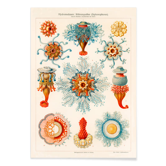
Vintage-Quallen-Illustration Poster
Ernst Haeckel · 1904 · Detaillierter wissenschaftlicher Quallen-Druck mit schwebenden Kuppeln, gekräuselten Rändern und nachziehenden Tentakeln
Poster ab €9 · Gerahmt ab €16
Normaler Preis Von €6,00Normaler Preis -
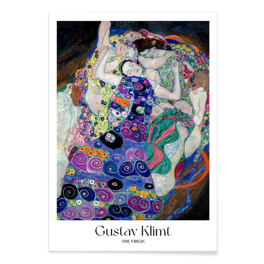
The Virgin Poster
Gustav Klimt · 1913 · Sinnlicher Symbolisten-Poster mit verschlungenen Frauen in einer hypnotischen violetten Muster-Spirale
Poster ab €9 · Gerahmt ab €16
Normaler Preis Von €6,00Normaler Preis -
Kirche in Cassone Poster
Gustav Klimt · 1913 · Leuchtender Kunstdruck der Seenkirche mit schimmernden Reflexionen und mosaikartigen Farbflächen
Poster ab €9 · Gerahmt ab €16
Normaler Preis Von €6,00Normaler Preis -
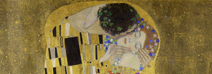
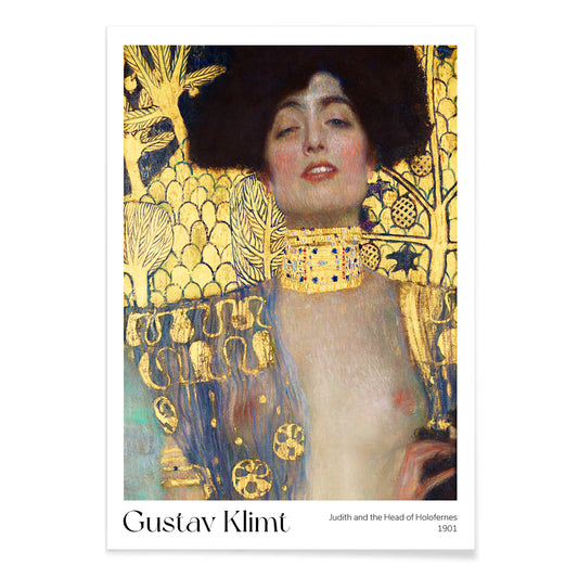
Judith und der Kopf des Holofernes Poster
Gustav Klimt · 1901 · Ikonischer goldener Kunstdruck mit Judith und Holoferneskopf im opulenten Jugendstil
Poster ab €9 · Gerahmt ab €16
Normaler Preis Von €6,00Normaler Preis -
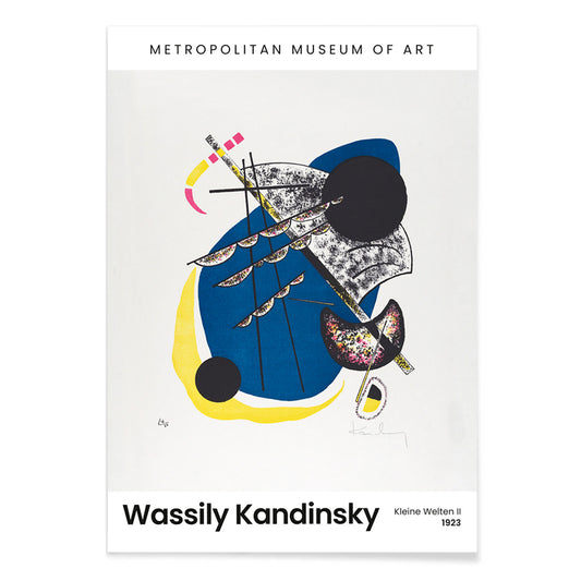
Kleine Welten II Poster
Wassily Kandinsky · 1922 · Rhythmischer geometrischer Kunstdruck mit schwebenden Kreisformen, scharfen Linien und kräftigem schwarzem Feld
Poster ab €9 · Gerahmt ab €16
Normaler Preis Von €6,00Normaler Preis -
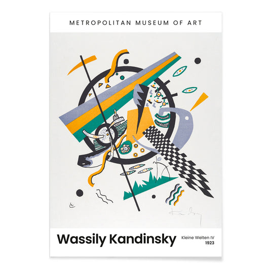
Kleine Welten IV Poster
Wassily Kandinsky · 1922 · Abstrakter Kunstdruck mit Kreisen und kantigen Linien sowie kräftigen Blau Gelb Grün Akzenten
Poster ab €9 · Gerahmt ab €16
Normaler Preis Von €6,00Normaler Preis -
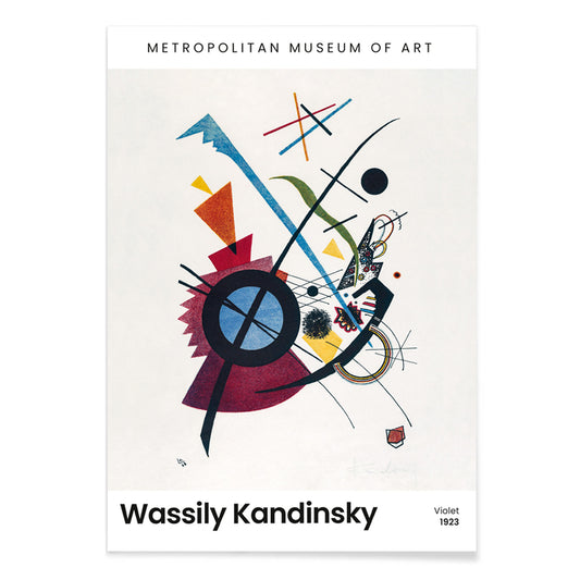
Violett Poster
Wassily Kandinsky · 1923 · Geometrischer Kunstdruck mit violetten, blauen und gelben Formen auf hellem Grund
Poster ab €9 · Gerahmt ab €16
Normaler Preis Von €6,00Normaler Preis -
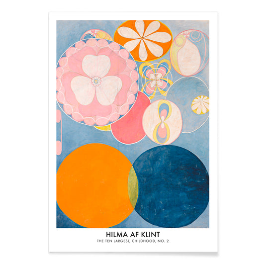
Die Zehn Größten, Kindheit Nr. 2 Poster
Hilma af Klint · 1907 · Leuchtender Kunstdruck mit wirbelnden Formen in Blau, Rosa, Orange und Gelb
Poster ab €9 · Gerahmt ab €16
Normaler Preis Von €6,00Normaler Preis -
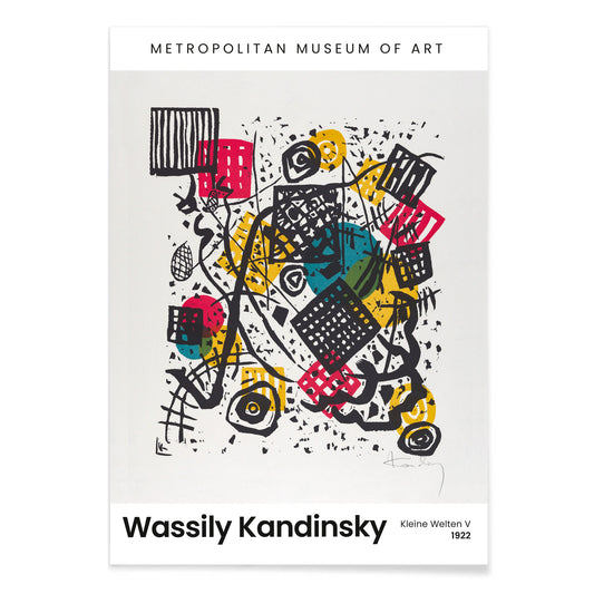
Kleine Welten V Poster
Wassily Kandinsky · 1922 · Rhythmisches geometrisches Poster mit Kreisen und scharfen Linien vor tiefschwarzem Hintergrund
Poster ab €9 · Gerahmt ab €16
Normaler Preis Von €6,00Normaler Preis


- Purpur-Topas Poster
- Rio de Janeiro Poster
- Der Vorbote des Herbstes Poster
- Shimotsuke Kurokami-Yama Kurifuri no Taki Poster
- Yoro-Wasserfall Poster
- Vier-Früchte-Muster Poster
- The Dream Poster
- Großer Komet von 1881 Poster
- Fuß des Mount Ashitaka Poster
- Mount Fuji vom Yamanakasee Poster
- Blühende Kirschblüte in mondbeschienener Nacht Poster
- Komposition mit großer roter Fläche Poster
- Die Große Welle Poster
- Place de la Concorde Poster
- The Virgin Poster
- Judith und der Kopf des Holofernes Poster
- Kleine Welten IV Poster
- Violett Poster
- Die Zehn Größten, Kindheit Nr. 2 Poster
Blau als Atmosphäre, nicht nur als Farbton
Blau verhält sich selten wie eine einzelne Farbe. Im Vintage-Posterdesign wird es zu Distanz, Wetter, Tiefe und sogar Zeit, es verschiebt sich von preußischer Tinte zu blassem Himmelswaschgang je nach Motiv. Diese Kollektion betrachtet Blau als strukturelles Element der Wandkunst: Es kann einen Raum kühlen, eine Linie klären und Papier archivisch erscheinen lassen. Man findet es in Küstenmotiven, in diagrammatischen Tafeln und in grafischen Kompositionen, wo das blaue Feld die Hauptrolle spielt statt nur Hintergrund zu sein. Für angrenzende Stimmungen bieten die reduzierte Zurückhaltung von Minimalistisch Postern und die tonale Konzentration von Schwarz-Weiß Drucken saubere Gegengewichte.
Indigo, Cyanotypie und der modernistische Himmel
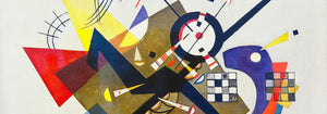
Historisch kommt Blau so sehr durch Technologien wie durch Geschmack. Indigo in Textilien pendelte zwischen Handwerk und Industrie, während die Cyanotypie fotografische Bilder mit Chemie und Sonnenlicht erzeugte und dieses unübersehbare Blau schuf. Strawberry Thief (1883) von William Morris legt sattes Indigo hinter Früchte und Vögel und verwandelt Wiederholung in eine Art häuslicher Architektur, die zugleich Muster und Bildszene ist. Fern (1850) Cyanotypie von Anna Atkins zeigt, wie dieselbe Farbe als Beleg wirken kann: die Pflanze erscheint als präzise Silhouette, halb Specimen halb Spitzenarbeit. In der modernen Abstraktion nutzt Bleu de Ciel (1925) von Wassily Kandinsky Blau als Bühne für schwebende Zeichen und verbindet Malerei mit der Epoche, die Musik, Wissenschaft und die Kartierung des Unsichtbaren fasziniert. Verwandte Formen und Farben finden sich in Abstrakt und Bauhaus.
Blau in der häuslichen Farbpalette platzieren
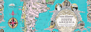
In der Raumgestaltung lässt sich Blau am leichtesten leben, wenn es über Materialien verankert ist. Warme Hölzer und sandige Neutraltöne verhindern, dass tiefe Blautöne kalt wirken, während gebürsteter Stahl und Glas blasse Blautöne bewusst statt dekorativ erscheinen lassen. Im Eingangsbereich kann ein blauer Kunstdruck wie ein visueller Kompass wirken; im Schlafzimmer wirkt er leiser, wenn er in Leinen oder einem Teppich aufgegriffen wird. In Küchen wirkt Blau neben weißen Fliesen besonders frisch, vor allem bei botanischen oder kartografischen Motiven. Für erkennbare Sujets mit Betonung auf Blau eignen sich Karten, Meer & Ozean und Botanik; wenn der Raum bereits starke Farbe hat, kann ein schlichteres Blatt aus Klassische Kunst das Gleichgewicht halten.
Kuratieren: Rhythmus, Maßstab und Rahmenwahl
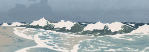
Blau erleichtert das Kuratieren, weil es gemischte Motive über eine Galeriewand hinweg vereinheitlichen kann. Beginnen Sie mit einem dominanten Stück und fügen Sie ein oder zwei ruhigere Begleiter hinzu, die dessen Temperatur wiederholen ohne das Sujet zu kopieren. The Great Wave off Kanagawa (1830) von Katsushika Hokusai ist ein offensichtlicher Fixpunkt: Das Blau der Welle ist nicht atmosphärisch sondern architektonisch, gebaut aus geschnitzten Konturen und Gischt, fast wie Typografie. Kombinieren Sie es mit Morning at Cape Inubō (1931) von Kawase Hasui, wo das Meer auf Bänder und Verläufe reduziert ist und eine ruhigere Kadenz schafft. Um die Zusammenstellung weniger nautisch wirken zu lassen, fügen Sie eine Kartenplatte oder eine abstrakte Komposition als visuellen Atemraum ein. Rahmenabschlussrichtungen steuern ebenfalls die Stimmung: helles Eichenholz lässt Blau atmen, eine weiße Passepartout gibt dunkler Tinte Luft und ein schlanker schwarzer Rahmen erhöht den Kontrast; Optionen finden Sie bei Rahmen.
Blau als Tinte, Farbstoff, Pigment und Datenträger
Was diese Poster zusammenhält, ist nicht eine Epoche oder ein Motiv, sondern die Art, wie Blau Information trägt. Es kann Handwerksfärbung, Drucktinte, Mineralpigment oder wissenschaftliche Notation lesen lassen, weshalb es Räume mit Keramik, Büchern und Reiseobjekten verbindet ohne inszeniert zu wirken. Als Vintage-Wandkunst schlägt Blau oft sowohl das Meer als auch die Bibliothek vor: eine Farbe, die mit Horizonten und mit Studium assoziiert wird. Diese Spannung zwischen Empfindung und Struktur ist der wirkliche Faden der Kollektion und macht Blau in der täglichen Dekoration beständig.