


- Zwiebeln Poster
- Radieschen Poster
- Tanzendes Paar im Schnee Poster
- Jet Clipper nach Hawaii Poster
- Campari Soda Poster
- Bec-Kina Poster
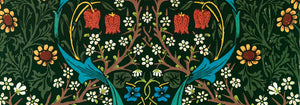
- Strawberry Thief Poster
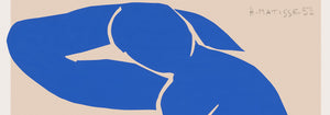
- Matisse Tanzende Figuren Poster
- Tom Krojer Ausstellungs-Poster
- Berliner Straßenszene Poster
- Ernst Kirchner Ausstellung Poster
- Park Near Lu Poster
- El Comienzo Poster
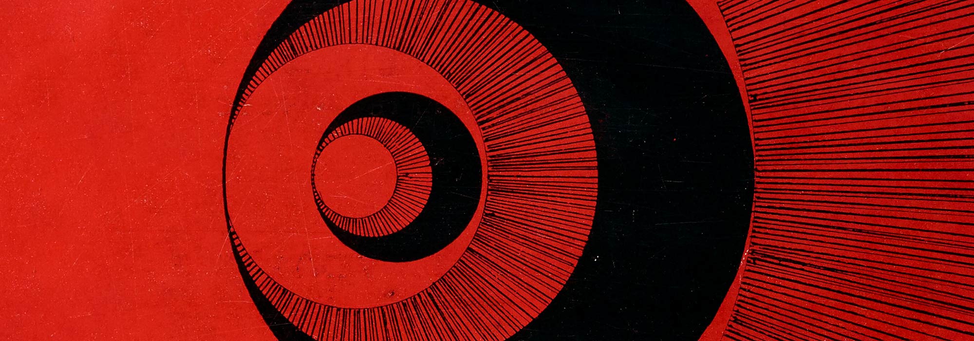
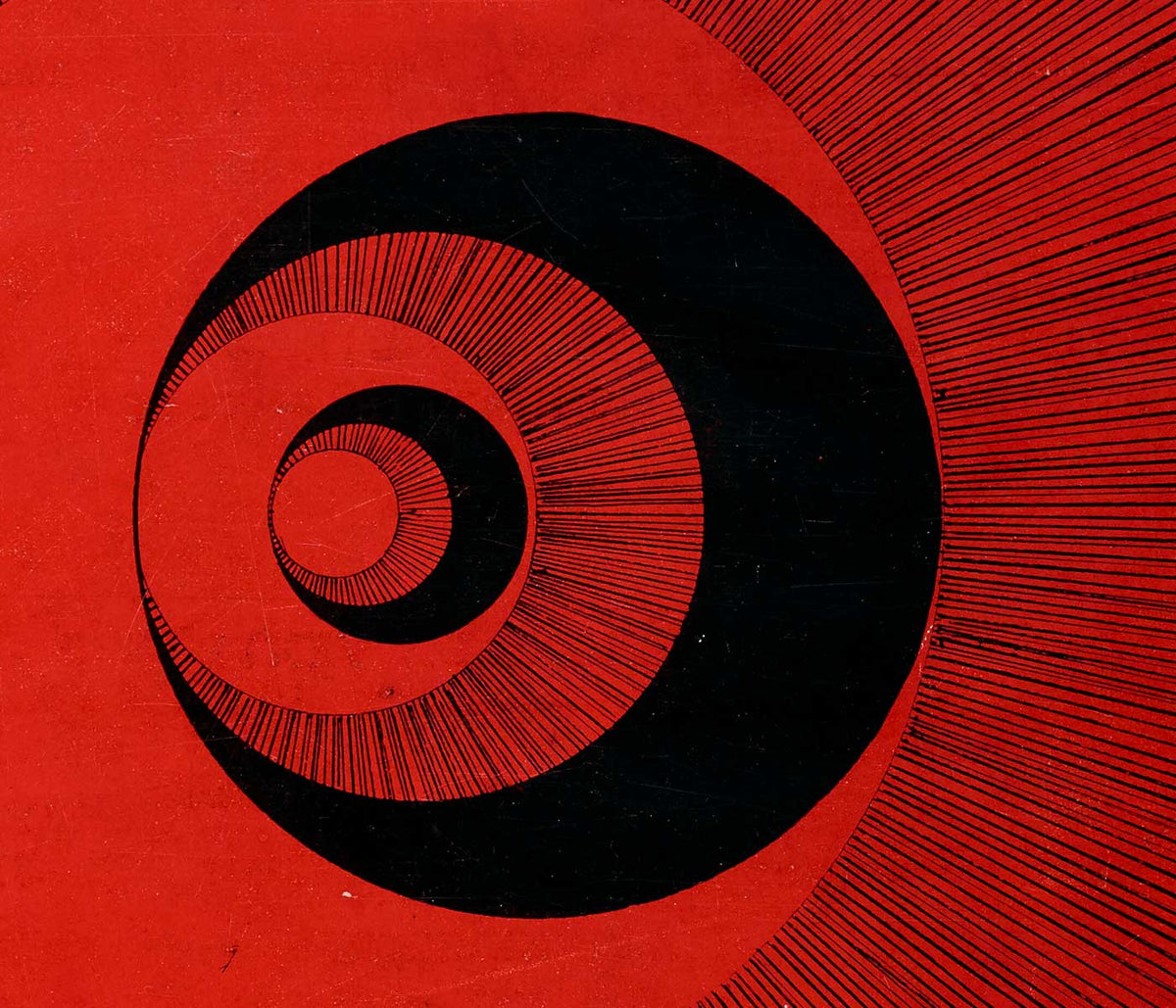
- Ring der Dämmerung Poster
- Parler Seul Poster
- Faun und Nymphe Poster
- The Dream Poster
- Le Concert Poster
- Frau und Vogel in der Nacht Poster
- Bauhaus 20 Poster
- Bauhaus 21 Poster
- Mehr Obst essen Poster
- Snoopy Come Home Poster
- Nach London mit Jet Clipper Poster
- Kyushu-Okinawa Poster
- Xerez Pedro Domecq Poster
- Balsam Aperitif Poster
- Butter Poster
- Crans Poster
- Monte Carlo Poster
- Pacific Vibrations Poster
- Continental Hawaii Airline Poster
- Schwarze Katze 4 Poster
- Schwarze Katze 3 Poster
- Bier und Zigarette Poster
-
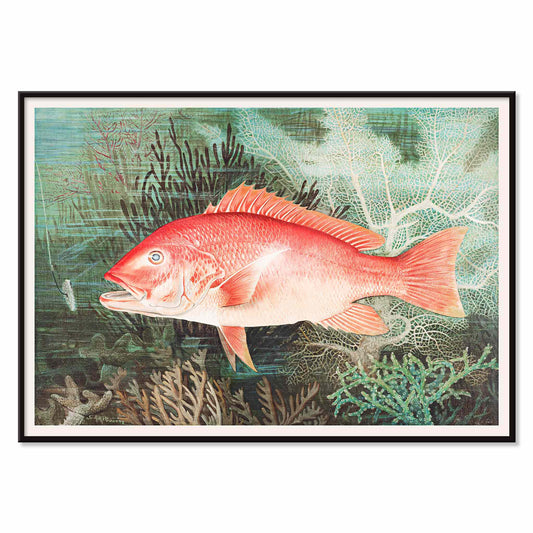
nördlicher roter Schnapper Poster
Samuel Kilbourne · 1861 · Detaillierter Druck des nördlichen roten Schnappers mit lebendigen Rottönen und präziser Anatomie
Poster ab €9 · Gerahmt ab €16
Normaler Preis Von €6,00Normaler Preis -
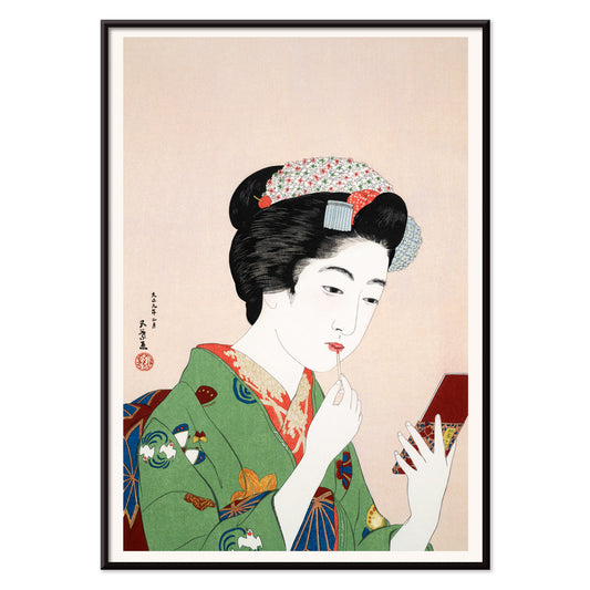
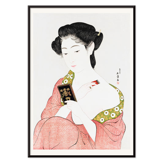
Frau beim Rougeauftragen Poster
Goyō Hashiguchi · 1920 · Intimer Kunstdruck im Bijin-ga-Stil zeigt Frau beim Auftragen von Rouge
Poster ab €9 · Gerahmt ab €16
Normaler Preis Von €6,00Normaler Preis -
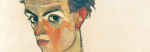
Stehender Akt Poster
Egon Schiele · 1917 · Expressiver stehender Akt Kunstdruck mit eckiger Linienführung auf warmem beige Papier
Poster ab €9 · Gerahmt ab €16
Normaler Preis Von €6,00Normaler Preis -
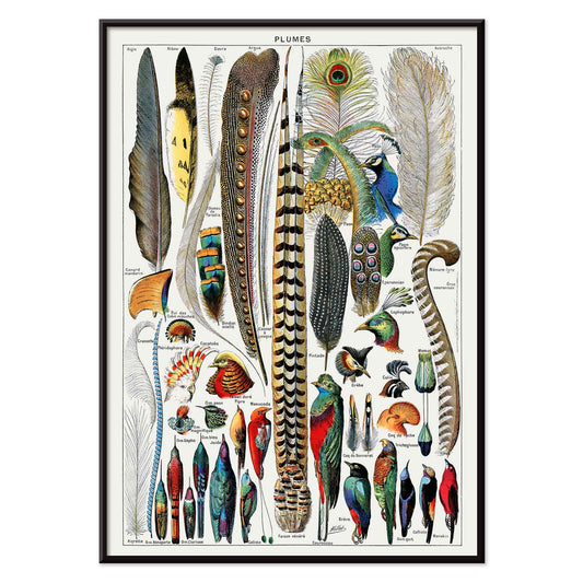
Federn Poster
Adolphe Millot · 1900 · Detaillierter Kunstdruck mit verschiedenen Federtypen in geordneter Präparattafel-Optik mit beschrifteten Formen
Poster ab €9 · Gerahmt ab €16
Normaler Preis Von €6,00Normaler Preis -
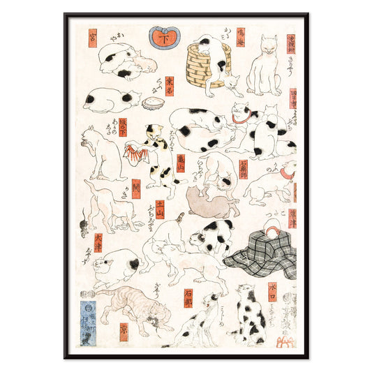
Katzen Poster
Utagawa Kuniyoshi · 1849 · Verspielter Ukiyo-e-Druck mit Katzen in verschiedenen Posen, klare Tuschelinien und rote Akzente
Poster ab €9 · Gerahmt ab €16
Normaler Preis Von €6,00Normaler Preis -
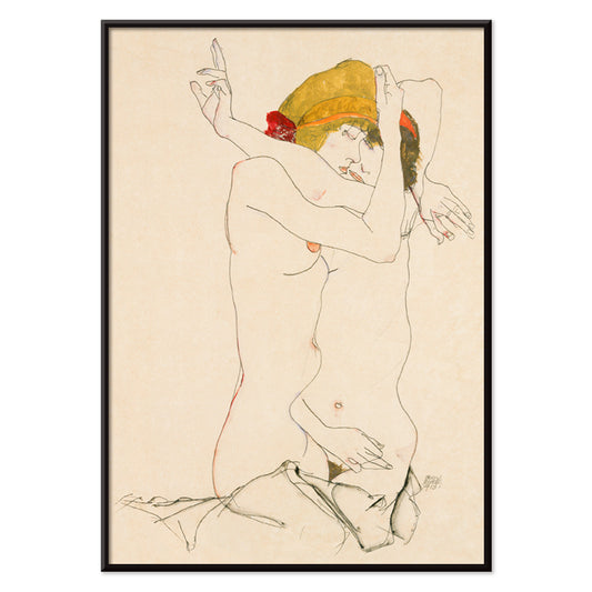
Zwei Frauen, die sich umarmen Poster
Egon Schiele · 1913 · Intimer figurativer Kunstdruck zweier ineinander verschlungener Frauen in warmen Beige- und Rottönen
Poster ab €9 · Gerahmt ab €16
Normaler Preis Von €6,00Normaler Preis -
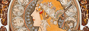
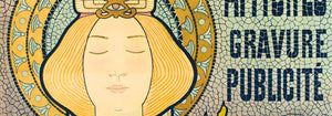
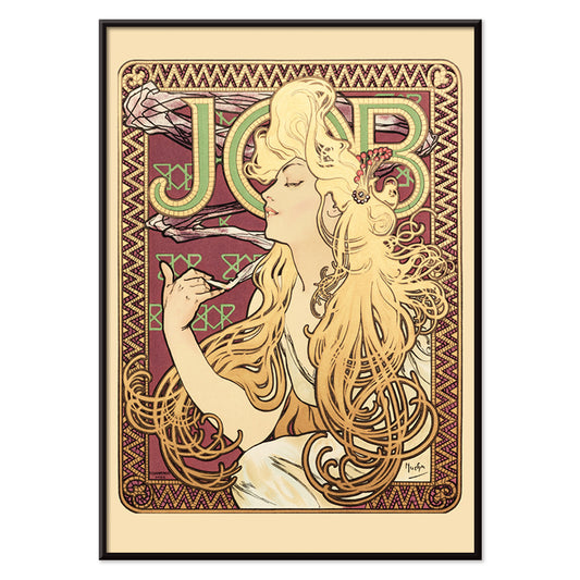
Job von Alphonse Mucha Poster
Alphonse Mucha · 1896 · Ikonisches Jugendstil-Poster mit sinnlicher Silhouette und eleganter, herabfließender ornamentaler Haarpracht
Poster ab €9 · Gerahmt ab €16
Normaler Preis Von €6,00Normaler Preis -
Frau beim Pudern Poster
Goyō Hashiguchi · 1918 · Eleganter Bijin-ga Kunstdruck einer Frau beim Pudern im stillen Morgenlicht
Poster ab €9 · Gerahmt ab €16
Normaler Preis Von €6,00Normaler Preis -
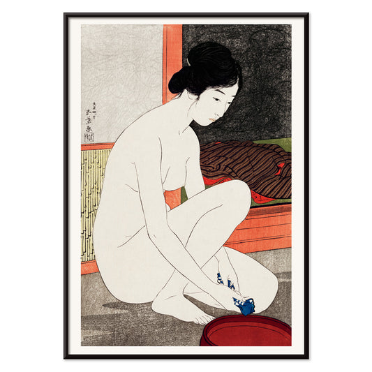
Yokugo no onna Poster
Goyō Hashiguchi · 1915 · Feiner Kunstdruck einer Badenden mit blasser Haut, dunklem Haar und zinnoberroten Akzenten
Poster ab €9 · Gerahmt ab €16
Normaler Preis Von €6,00Normaler Preis -
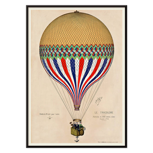
Trikolore-Ballon Poster
Unbekannter Künstler · 1874 · Heißluftballon mit Trikolore über Paris in kräftiger französischer Farbgebung
Poster ab €9 · Gerahmt ab €16
Normaler Preis Von €6,00Normaler Preis -
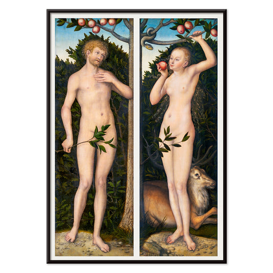
Adam und Eva Poster
Lucas Cranach · 1535 · Anmutiger Renaissance-Kunstdruck von Adam und Eva am verlockenden Baum voller symbolischer Details
Poster ab €9 · Gerahmt ab €16
Normaler Preis Von €6,00Normaler Preis -
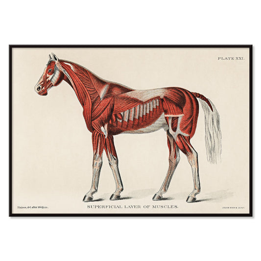
Equines Muskelsystem Poster
Unbekannter Künstler · 1904 · Detaillierter wissenschaftlicher Druck der pferdlichen Muskulatur in Rot mit nummerierten Beschriftungen
Poster ab €9 · Gerahmt ab €16
Normaler Preis Von €6,00Normaler Preis -
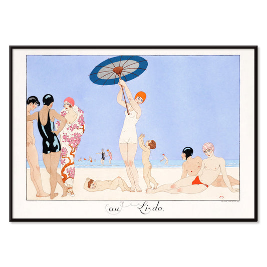
Au Lido Poster
George Barbier · 1920 · Elegantes Art‑Deco‑Poster mit schlanken Figuren, Sonnenschirmen und ruhiger blauer Strandstimmung
Poster ab €9 · Gerahmt ab €16
Normaler Preis Von €6,00Normaler Preis -
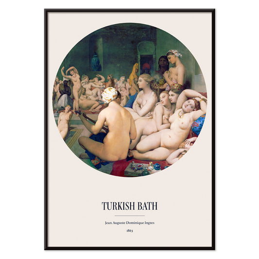
Türkisches Bad Poster
Jean Auguste Dominique Ingres · 1863 · Sinnlicher orientalischer Kunstdruck mit verschlungenen Badenden in leuchtendem Tondo
Poster ab €9 · Gerahmt ab €16
Normaler Preis Von €6,00Normaler Preis -
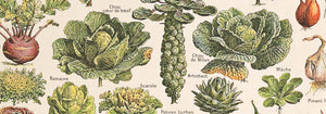
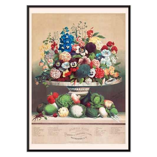
Blumen und Gemüse Poster
Anton Carl Rahn · 1800 · Feiner Stillleben-Kunstdruck, der Gartenblumen mit frisch geerntetem Gemüse auf warmem Beige vereint
Poster ab €9 · Gerahmt ab €16
Normaler Preis Von €6,00Normaler Preis -
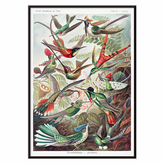
Trochilidae Poster
Ernst Haeckel · 1904 · Detaillierter wissenschaftlicher Druck von Kolibris, der naturhistorische Präzision mit ornamentaler Eleganz verbindet
Poster ab €9 · Gerahmt ab €16
Normaler Preis Von €6,00Normaler Preis -
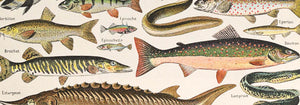
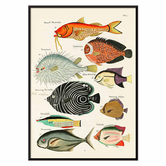
Surreale Fischillustrationen Poster
Louis Renard · 1754 · Lebendiger Druck exotischer Fische mit handkolorierten Details und naturalistischem, theatralischem Stil
Poster ab €9 · Gerahmt ab €16
Normaler Preis Von €6,00Normaler Preis -
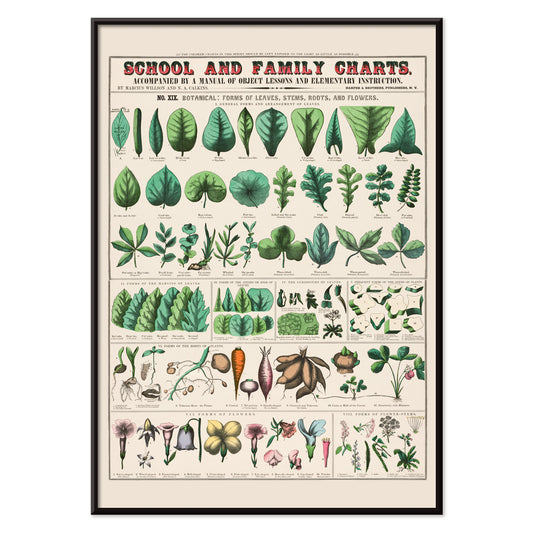
Formen von Blättern Poster
Marcius Willson · 1890 · Pädagogischer Blätter-Kunstdruck mit beschrifteten Formen und sanften grünen Tönen, ideal für Lernraum und Wohnraum
Poster ab €9 · Gerahmt ab €16
Normaler Preis Von €6,00Normaler Preis -
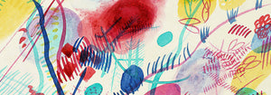
Rose Fried Gallery Poster
José Guerrero · 1963 · Energiegeladenes abstraktes Poster mit schwarzen, roten und blauen Pinselstrichen auf weißem Grund
Poster ab €9 · Gerahmt ab €16
Normaler Preis Von €6,00Normaler Preis -
Wach auf und lies Poster
Unbekannter Künstler · 1961 · Modernistisches Kampagnen-Poster mit markanter Typografie und energischem Rot-Blau-Kontrast als Blickfang
Poster ab €9 · Gerahmt ab €16
Normaler Preis Von €6,00Normaler Preis -
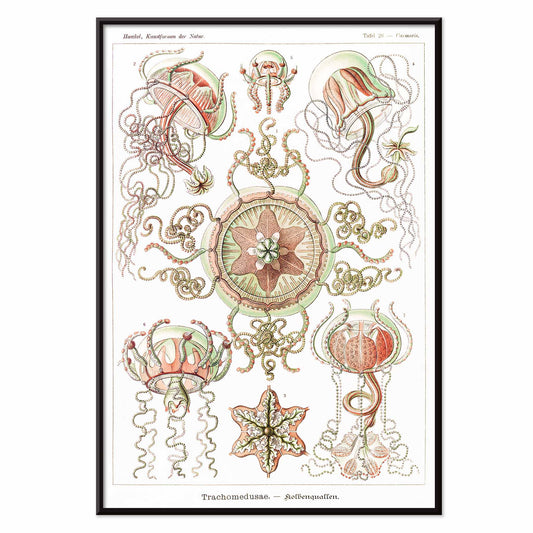
Trachomedusae Poster
Ernst Haeckel · 1904 · Detaillierter wissenschaftlicher Kunstdruck mit wallenden Tentakeln und feiner meeresfarbener Transparenz
Poster ab €9 · Gerahmt ab €16
Normaler Preis Von €6,00Normaler Preis -
Muscinae–Laubmoose Poster
Ernst Haeckel · 1904 · Detaillierter wissenschaftlicher Druck mit fein ausgearbeiteten Laubmoos-Formen in Schaukabinett-Anordnung
Poster ab €9 · Gerahmt ab €16
Normaler Preis Von €6,00Normaler Preis -
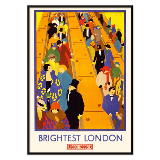
Strahlendes London 2 Poster
Horace Taylor · 1924 · Dynamischer Poster-Entwurf der London Underground mit Menschen auf Rolltreppen und kräftigen Art-déco-Farben
Poster ab €9 · Gerahmt ab €16
Normaler Preis Von €6,00Normaler Preis -
Jantzen 2 Poster
Joseph Binder · 1952 · Dynamisches Poster mit stilisierten Skifahrern und kräftigen Blau-, Weiß- und Rotflächen
Poster ab €9 · Gerahmt ab €16
Normaler Preis Von €6,00Normaler Preis -
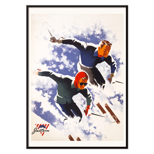
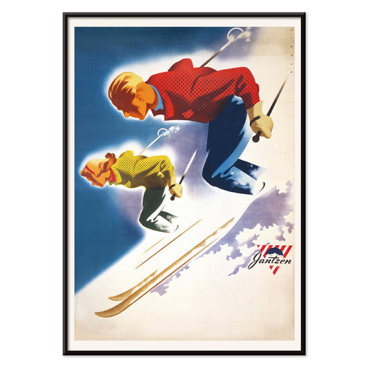
Jantzen Poster
Joseph Binder · 1952 · Energetisches Poster mit stilisiertem Paar, das dynamisch alpine Formen durchschneidet
Poster ab €9 · Gerahmt ab €16
Normaler Preis Von €6,00Normaler Preis -
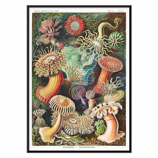
Actiniae Poster
Ernst Haeckel · 1904 · Detaillierter wissenschaftlicher Druck von Seeanemonen mit strahlenden Tentakeln und feiner Detailzeichnung wie geschmückte Meeresblumen
Poster ab €9 · Gerahmt ab €16
Normaler Preis Von €6,00Normaler Preis -
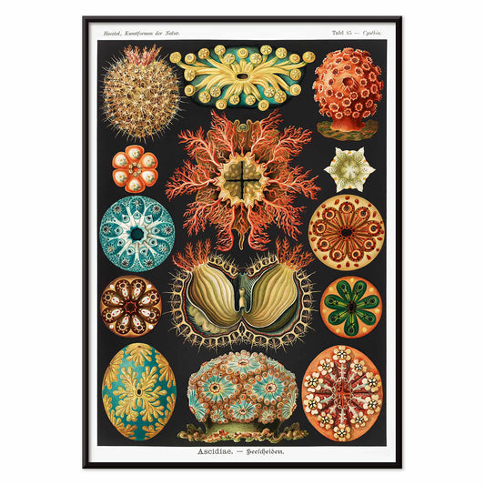
Ascidiae Poster
Ernst Haeckel · 1904 · Detaillierter wissenschaftlicher Kunstdruck mit komplexen Seescheiden in symmetrischer naturgeschichtlicher Darstellung
Poster ab €9 · Gerahmt ab €16
Normaler Preis Von €6,00Normaler Preis -
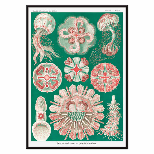
Discomedusae Scheibenquallen Poster
Ernst Haeckel · 1904 · Detaillierter wissenschaftlicher Druck mit schwebenden Glocken und feinen, spitzen Tentakeln
Poster ab €9 · Gerahmt ab €16
Normaler Preis Von €6,00Normaler Preis -
Wilder Storchschnabel Poster
Maurice Pillard Verneuil · 1896 · Stilisiertes Poster des Wilden Storchschnabels mit fließenden Jugendstilkurven und gemustertem Laub
Poster ab €9 · Gerahmt ab €16
Normaler Preis Von €6,00Normaler Preis -
Scharlachbanane Poster
Pierre-Joseph Redouté · 1805 · Eleganter Kunstdruck der Scharlachbanane mit klaren grünen Blättern und leuchtend roter Blüte
Poster ab €9 · Gerahmt ab €16
Normaler Preis Von €6,00Normaler Preis -
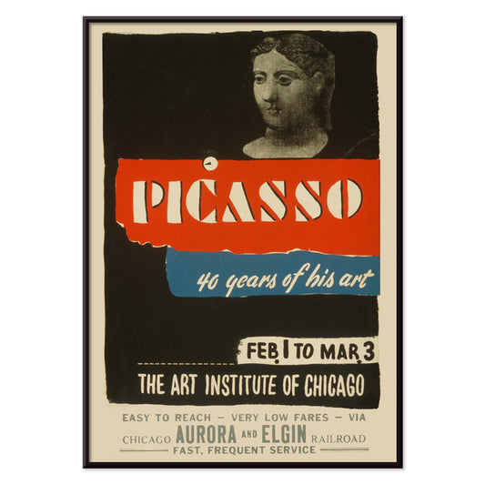
Picasso - 40 Jahre seines Schaffens Poster
Art Institute of Chicago · 1970 · Auffälliges Ausstellungsposter mit kräftiger Typografie und moderner abstrakter Figur in Rot und Blau
Poster ab €9 · Gerahmt ab €16
Normaler Preis Von €6,00Normaler Preis -
Meereswunder Poster
Percival Albert Trompf · 1933 · Art-déco Poster des Great Barrier Reef mit lebhaften Fischen und Korallen in tiefem Blau
Poster ab €9 · Gerahmt ab €16
Normaler Preis Von €6,00Normaler Preis -
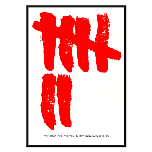
The Magnificent Seven Poster
Saul Bass · 1960 · Minimalistisches Poster mit sieben kraftvollen roten Pinselstrichen auf Weiß
Poster ab €9 · Gerahmt ab €16
Normaler Preis Von €6,00Normaler Preis -
Attack of the 50ft Woman Poster
Reynold Brown · 1958 · Kraftvolles Sci‑Fi‑Poster mit riesiger Frau, die Autos und Straßenzüge beherrscht
Poster ab €9 · Gerahmt ab €16
Normaler Preis Von €6,00Normaler Preis -
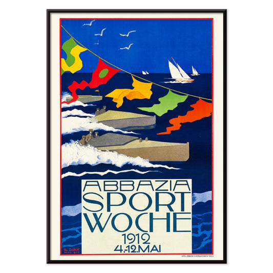
Abbazia Sportwoche Poster
Stefanie Glax · 1912 · Dynamisches Regatta-Poster mit markanten Segeln vor leuchtendem Blau und maritimen Lichtern
Poster ab €9 · Gerahmt ab €16
Normaler Preis Von €6,00Normaler Preis -
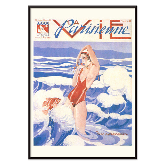
La Vie Parisienne Poster
Umberto Brunelleschi · 1932 · Art-déco-Poster mit selbstbewusster Frau im roten Badeanzug vor blau-weißem Hintergrund
Poster ab €9 · Gerahmt ab €16
Normaler Preis Von €6,00Normaler Preis


36/761 items
- Frau beim Rougeauftragen Poster
- Stehender Akt Poster
- Federn Poster
- Katzen Poster
- Zwei Frauen, die sich umarmen Poster
- Job von Alphonse Mucha Poster
- Frau beim Pudern Poster
- Yokugo no onna Poster
- Trikolore-Ballon Poster
- Au Lido Poster
- Trochilidae Poster
- Surreale Fischillustrationen Poster
- Formen von Blättern Poster
- Rose Fried Gallery Poster
- Wach auf und lies Poster
- Muscinae–Laubmoose Poster
- Actiniae Poster
- Wilder Storchschnabel Poster
- Meereswunder Poster
- The Magnificent Seven Poster
- Attack of the 50ft Woman Poster
- Abbazia Sportwoche Poster
- La Vie Parisienne Poster
Rot, der bewussteste Akzent
In der Rot-Kollektion fungiert Farbe weniger als Sujet denn als Signal: ein Mohnpunkt, eine lackierte Schlagzeile, ein warmer Schimmer auf Papier. Diese Poster bewegen sich zwischen Illustration, Modernismus, Reisegrafik und diagrammatischen Drucken, und doch verlassen sich alle auf Rot, um Aufmerksamkeit zu steuern. Zinnober vor Creme, Backstein vor Graphit oder eine einzelne karminrote Form in ruhigem Raum kann bestimmen, wie ein Zimmer gelesen wird. Als Wandkunst wirkt Rot wie Würze in der Wohnkultur: ein kleiner Akzent belebt die Galeriewand, ein größeres Feld etabliert einen Fokus und eine Richtung in der Dekoration.
Handwerk, Pigment und die Kunst der Überzeugung
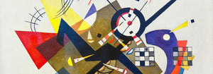
Rot hat in der Druckgeschichte technisches und kulturelles Gewicht getragen. Frühe Farbstoffe und Pigmente wie Cochenille und Krapp prägten Textilien und dekorative Künste, während die Lithografie kühne rote Schriftzüge und flächige Farben ins Zentrum der öffentlichen Bildkultur rückte. Strawberry Thief (1883) von William Morris verwendet Rot als strukturelles Element im Rapport und hält Vögel und Früchte in rhythmischer Spannung. In Hygieia (1907) von Gustav Klimt liest sich der Mantel zugleich als Emblem und Warnung, das Purpur wie eine Grenze um die Figur legt. Heavy Red (1924) von Wassily Kandinsky zeigt Rot als Masse, eine Fläche, die benachbarte Formen in Bewegung setzt und Geometrie körperlich erscheinen lässt.
Wo rote Poster am besten wirken
Rote Akzente harmonieren besonders mit ehrlichen Materialien: Nussbaum, Terrakotta, Messing, Leinen und gealterter Stein. In Küchen und Essecken spiegeln Fruchtstudien und Pflanzenbilder die Farben von Tischgut und Keramik, weshalb Botanik-Drucke leicht zu rotgeführten Arrangements passen. Im Flur zieht ein kräftiges rotes Element den Blick durch enge Räume; die grafische Logik der Werbung ergänzt sich gut mit Spiegeln, Garderobenhaken und dunklen Dielen. Im Schlafzimmer sollte Rot kleiner und wärmer bleiben, eher Backstein oder Rosenrot als reines Signalrot, und mit hellen Bettwaren sowie sanftem bernsteinfarbenem Licht balanciert werden. Öffnet sich der Raum ins Grüne, wird Rot zum klaren Gegenpol; ruhigere Motive aus Landschaften halten die Palette geerdet.
Kombinieren, Rahmung und Galeriewand
Damit Rot nicht dominiert, behandeln Sie es als eine Stimme innerhalb einer gemessenen Palette. Eine weiße Passepartout-Lage gibt Rot Luft, ein schlanker schwarzer Rahmen schärft gesättigte Bereiche und echoiert die Disziplin von Schwarz-Weiß-Motiven. Für strukturierte Paarungen stellen Sie ein rotgeführtes Poster neben geometrische Arbeiten aus Bauhaus, wo Rot oft als kontrollierter Block statt als Zier erscheint. Für stärkeren Theatercharakter wirkt Cachou Lajaunie (1920) von Leonetto Cappiello wie Straßenlicht vor dunklem Holz und gedämpften Wänden. Beim Aufbau einer Galeriewand wiederholen Sie Rot zweimal, einmal als größere Fläche und einmal als kleiner Akzent, damit das Auge einen klaren Weg zwischen den Drucken hat.
Ein letzter Gedanke zu Rot
Rot ist auch ein nützlicher Hinweis beim Lesen von Bildern: in Reisegrafik signalisiert es Hitze, Nachtleben und Appetit; in modernistischer Komposition markiert es den Punkt, an dem abschweifende Aufmerksamkeit in Fokus schnellt. Deshalb kann diese Auswahl von Muster zu symbolistischer Figur zu scharfkantiger Abstraktion springen, ohne ihre Kohärenz zu verlieren. Lassen Sie Atemraum um die lauteste rote Fläche und lassen Sie benachbarte Drucke ruhigere Töne wie Sand, Tinte und Meergrün tragen. So wird Rot Rhythmus statt Lärm und Dekoration wirkt absichtsvoll ohne Strenge.