


- Zwiebeln Poster
- Radieschen Poster
- Tanzendes Paar im Schnee Poster
- Jet Clipper nach Hawaii Poster
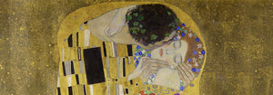
- Campari Soda Poster
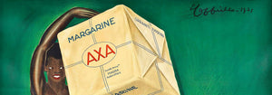
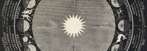
- Bec-Kina Poster
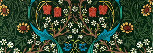
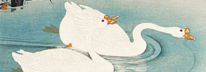
- Strawberry Thief Poster
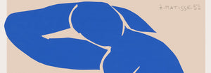
- Matisse Tanzende Figuren Poster
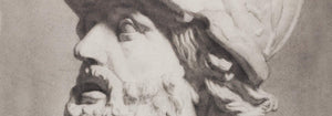
- Tom Krojer Ausstellungs-Poster
- Berliner Straßenszene Poster
- Ernst Kirchner Ausstellung Poster
- Park Near Lu Poster
- El Comienzo Poster
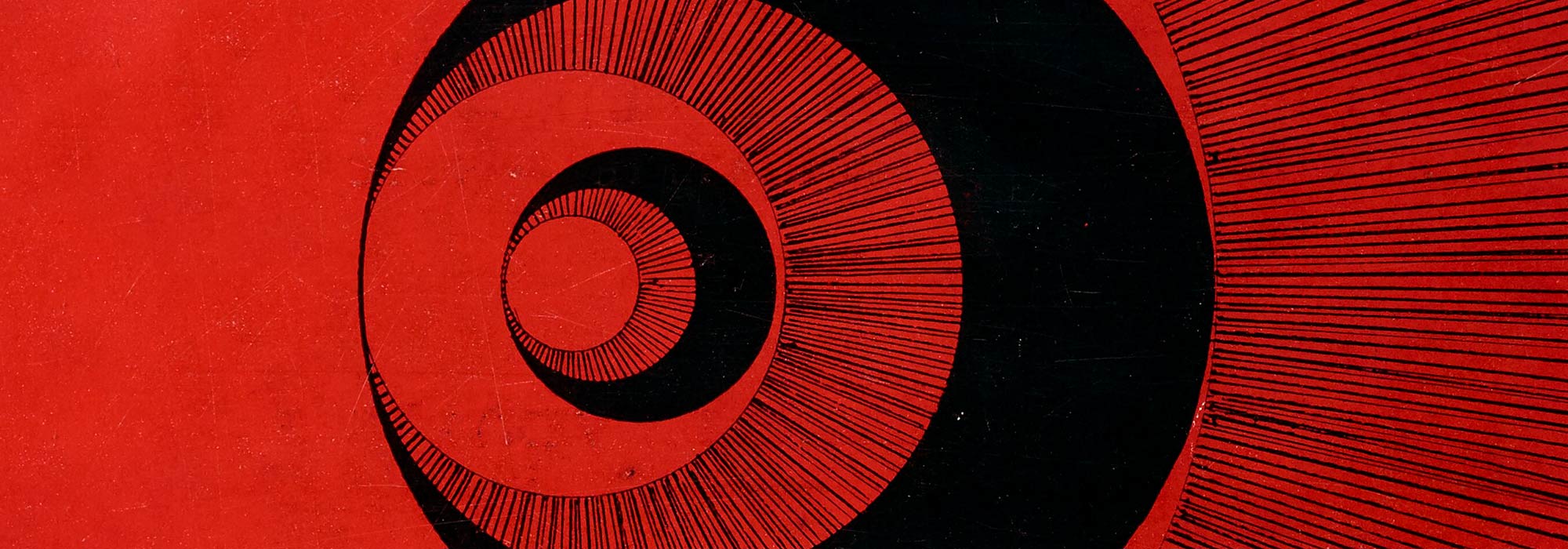
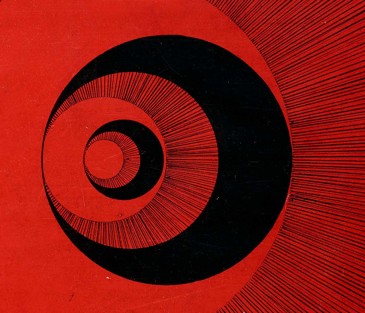
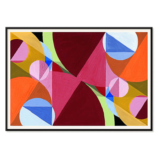
- Ring der Dämmerung Poster
- Parler Seul Poster
- Faun und Nymphe Poster
- The Dream Poster
- Le Concert Poster
- Frau und Vogel in der Nacht Poster
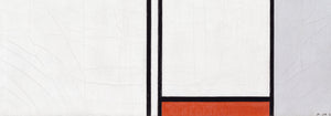
- Bauhaus 20 Poster
- Bauhaus 21 Poster
- Mehr Obst essen Poster
- Snoopy Come Home Poster
- Nach London mit Jet Clipper Poster
- Kyushu-Okinawa Poster
- Xerez Pedro Domecq Poster
- Balsam Aperitif Poster
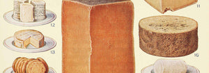
- Butter Poster
- Crans Poster
- Monte Carlo Poster
- Pacific Vibrations Poster
- Continental Hawaii Airline Poster
- Schwarze Katze 4 Poster
- Schwarze Katze 3 Poster
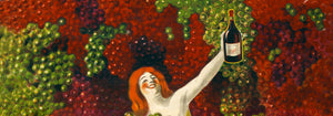
- Bier und Zigarette Poster
-
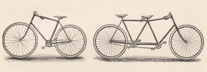
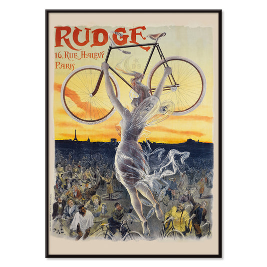
Rudge Poster
Jean de Paleologue · 1898 · Jugendstil-Poster mit geflügelter Muse, die ein glänzendes Fahrrad über dem Publikum hebt
Poster ab €9 · Gerahmt ab €16
Normaler Preis Von €6,00Normaler Preis -
Vivaudous Mavis Poster
Fred L. Parker · 1920 · Glamouröses Art-Deco-Poster mit eleganter Figur und juwelenfarbenen Parfümflaschen
Poster ab €9 · Gerahmt ab €16
Normaler Preis Von €6,00Normaler Preis -
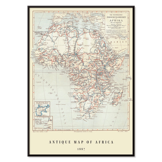
Antike Afrika-Karte Poster
Institute of Leipzig · 1851 · Detaillierter Vintage-Druck der Afrika-Karte mit Gitterkoordinaten und zahlreichen Ortsnamen
Poster ab €9 · Gerahmt ab €16
Normaler Preis Von €6,00Normaler Preis -
Mapamundi Poster
Josep Paluzie Lucena · 1900 · Detailliertes Vintage‑Weltkarten‑Poster mit blauen Ozeanen, warmem Beigeton und feinen roten Akzenten
Poster ab €9 · Gerahmt ab €16
Normaler Preis Von €6,00Normaler Preis -
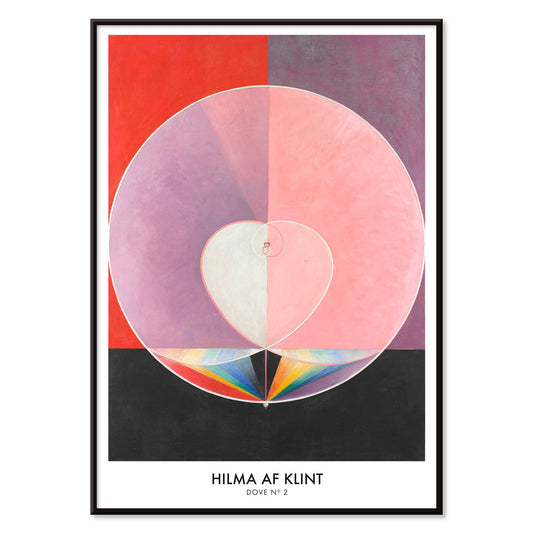
Doves No. 2 Poster
Hilma af Klint · 1915 · Lyrischer Kunstdruck mit Taubensymbolik und subtilen pastellfarbenen geometrischen Formen
Poster ab €9 · Gerahmt ab €16
Normaler Preis Von €6,00Normaler Preis -
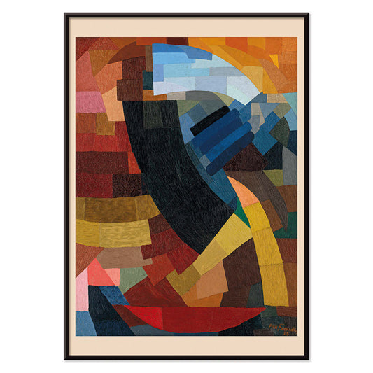
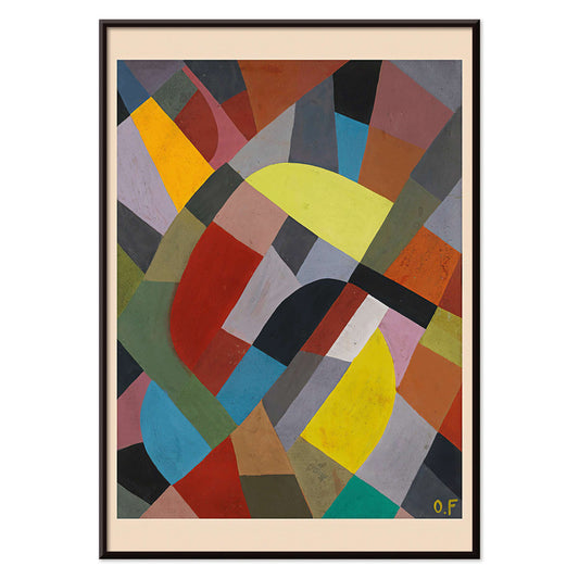
Fragmente einer Figur Poster
Otto Freundlich · 1928 · Lebhaftes geometrisches Poster einer fragmentierten Figur mit markanten schwarzen Konturen
Poster ab €9 · Gerahmt ab €16
Normaler Preis Von €6,00Normaler Preis -
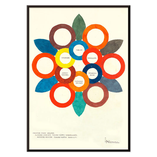
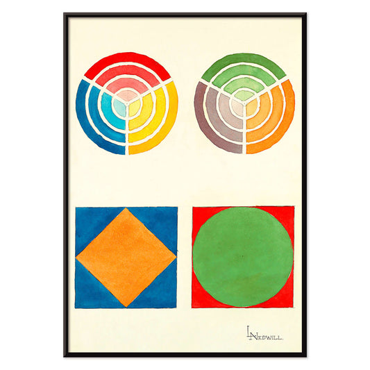
Centre Pure Colors Poster
Elizabeth A. Nedwill · 1900 · Abstraktes Farbkreis-Poster mit überlappenden Ringen in warmen und kühlen Farbtönen
Poster ab €9 · Gerahmt ab €16
Normaler Preis Von €6,00Normaler Preis -
Antibes Poster
David Dellepiane · 1910 · Elegantes Antibes Poster mit stilvoller Dame und Hund über der Mittelmeerküste
Poster ab €9 · Gerahmt ab €16
Normaler Preis Von €6,00Normaler Preis -
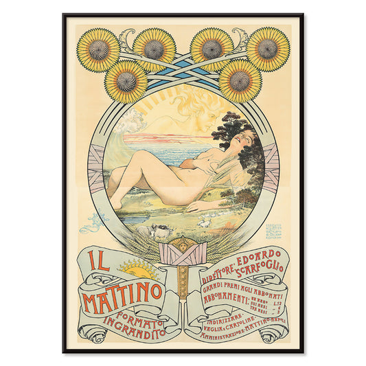
Il Mattino Poster
Giovanni Mataloni · 1896 · Lyrisches Jugendstil-Poster einer liegenden Frau, umgeben von leuchtenden Sonnenblumen im Sonnenlicht
Poster ab €9 · Gerahmt ab €16
Normaler Preis Von €6,00Normaler Preis -
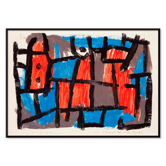
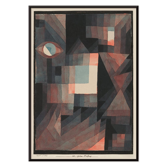
The Hour Before One Night Poster
Paul Klee · 1940 · Traumhaftes abstraktes Poster mit schwarzen Linien und roten sowie blauen Formen auf gedämpftem Grund
Poster ab €9 · Gerahmt ab €16
Normaler Preis Von €6,00Normaler Preis -
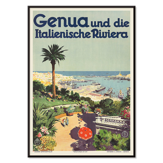
Genua Poster
Aurelio Craffonara · 1931 · Sonnenhelles Genua-Poster mit stilisierten Booten und klaren Küsten-Silhouetten
Poster ab €9 · Gerahmt ab €16
Normaler Preis Von €6,00Normaler Preis -
Altarpiece No. 1 Poster
Hilma af Klint · 1915 · Strahlender geometrischer Kunstdruck mit zentraler Sonnenform und kräftigen Formen auf Schwarz
Poster ab €9 · Gerahmt ab €16
Normaler Preis Von €6,00Normaler Preis -
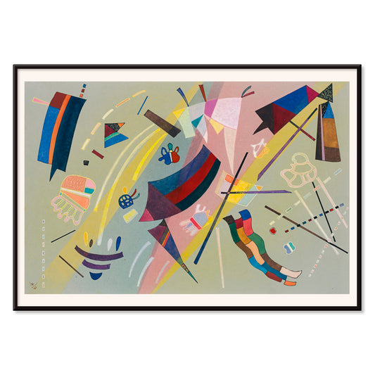
Sans Titre 1941 Poster
Wassily Kandinsky · 1941 · Lyrisches abstraktes Poster mit schwebenden geometrischen Akzenten in Blau, Gelb, Rosa und Rot
Poster ab €9 · Gerahmt ab €16
Normaler Preis Von €6,00Normaler Preis -
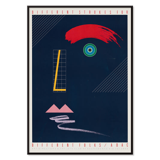
Jeder nach seiner Art Poster
McRay Magleby · 1942 · Verspieltes geometrisches Poster, das Individualität mit leuchtenden Mid-Century-Farbflächen und rhythmischer Komposition feiert
Poster ab €9 · Gerahmt ab €16
Normaler Preis Von €6,00Normaler Preis -
Rote und grüne Abstufung Poster
Paul Klee · 1921 · Modernistischer abstrakter Poster mit abgestuften roten und grünen Feldern und feinen schwarzen Linien
Poster ab €9 · Gerahmt ab €16
Normaler Preis Von €6,00Normaler Preis -
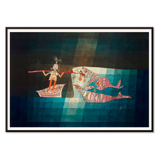
Der Seefahrer Poster
Paul Klee · 1923 · Verspieltes abstraktes Seefahrer-Poster mit rhythmischen Symbolen, die Musik und Meer hervorrufen
Poster ab €9 · Gerahmt ab €16
Normaler Preis Von €6,00Normaler Preis -
Area Broken by Perpendiculars Poster
Joseph Schillinger · 1934 · Geometrisches Poster mit senkrechtem Raster und lebhaften Farbflächen in rhythmischer Balance
Poster ab €9 · Gerahmt ab €16
Normaler Preis Von €6,00Normaler Preis -
Composition Abstraite Poster
Otto Freundlich · 1937 · Lebendiger geometrischer Kunstdruck mit ineinandergreifenden Farbflächen und kräftig schwarz konturierten Formen
Poster ab €9 · Gerahmt ab €16
Normaler Preis Von €6,00Normaler Preis -
Komposition Poster
Otto Freundlich · 1936 · Lebhafter geometrischer Kunstdruck mit ineinandergreifenden Farbflächen und kräftiger modernistischer Energie
Poster ab €9 · Gerahmt ab €16
Normaler Preis Von €6,00Normaler Preis -
Osnovnoye Design Poster
Gustavs Klucis · 1920 · Dynamisches konstruktivistisches Poster mit kyrillischer Typografie und kräftigen roten Formen
Poster ab €9 · Gerahmt ab €16
Normaler Preis Von €6,00Normaler Preis -
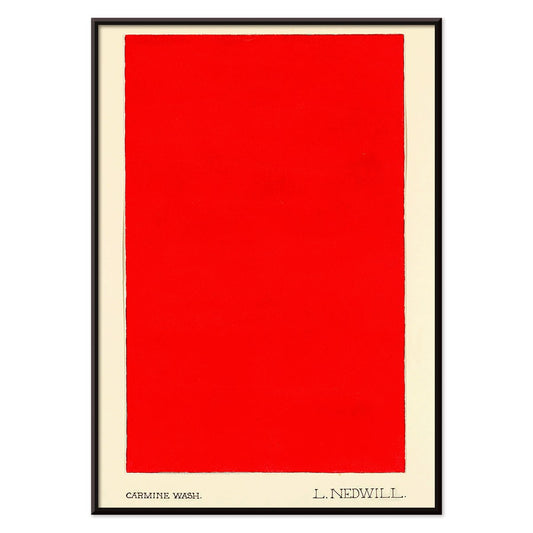
Carmine Wash Poster
Elizabeth A. Nedwill · 1900 · Minimalistischer abstrakter Kunstdruck mit einem einzelnen karminroten Block auf elfenbeinfarbenem Hintergrund
Poster ab €9 · Gerahmt ab €16
Normaler Preis Von €6,00Normaler Preis -
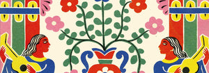
Historisches Ornament Poster
Elizabeth A. Nedwill · 1900 · Lebendiger geometrischer Ornament-Vintage-Druck, der historisches Muster mit modernem Rhythmus verbindet
Poster ab €9 · Gerahmt ab €16
Normaler Preis Von €6,00Normaler Preis -
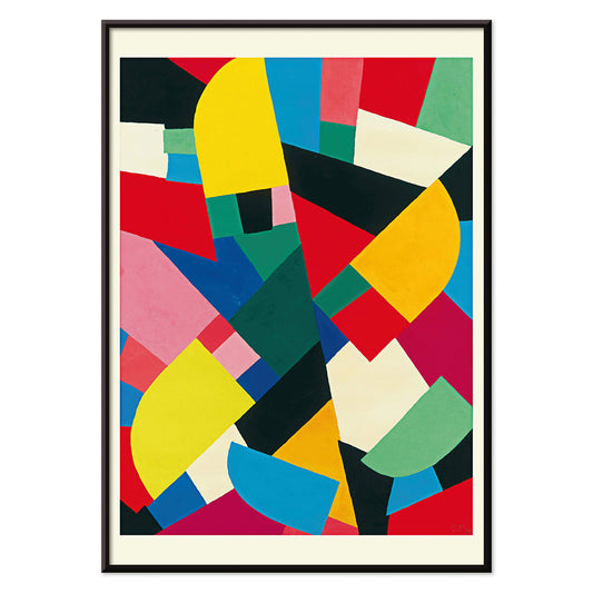
Color Patchwork Poster
Otto Freundlich · 1936 · Lebendiges abstraktes Poster mit ineinandergreifenden Farbflächen und kräftigen schwarzen Konturen
Poster ab €9 · Gerahmt ab €16
Normaler Preis Von €6,00Normaler Preis -
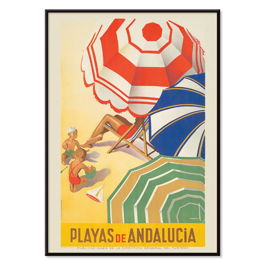
Strände von Andalusien Poster
José Morell · 1939 · Lebhaftes andalusisches Poster mit Sonnenbadenden, blauem Meer, Booten und markanter Typografie
Poster ab €9 · Gerahmt ab €16
Normaler Preis Von €6,00Normaler Preis -
Zu den Südseeinseln mit Pan American Poster
Paul George Lawler · 1938 · Lebhaftes Südsee-Reiseposter mit Pan Am-Wasserflugzeug und tropischer Küste in leuchtenden Farben
Poster ab €9 · Gerahmt ab €16
Normaler Preis Von €6,00Normaler Preis -
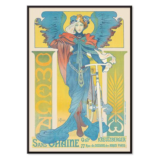
Omega Poster
Henri Thiriet · 1897 · Art-Nouveau-Poster mit Fahrrad und geflügelter Frau vor kräftigem Blau
Poster ab €9 · Gerahmt ab €16
Normaler Preis Von €6,00Normaler Preis -
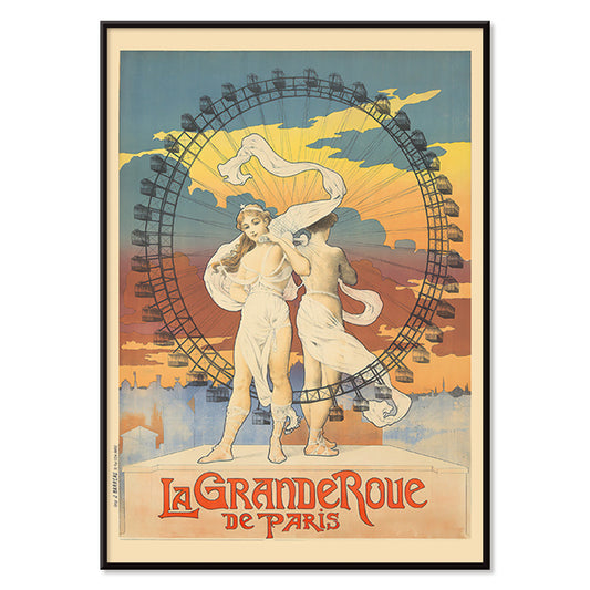
La Grande Roue Poster
Unbekannter Künstler · 1899 · Belle Époque Poster mit eleganten Damen vor dem Riesenrad in warmen Sonnenuntergangstönen
Poster ab €9 · Gerahmt ab €16
Normaler Preis Von €6,00Normaler Preis -
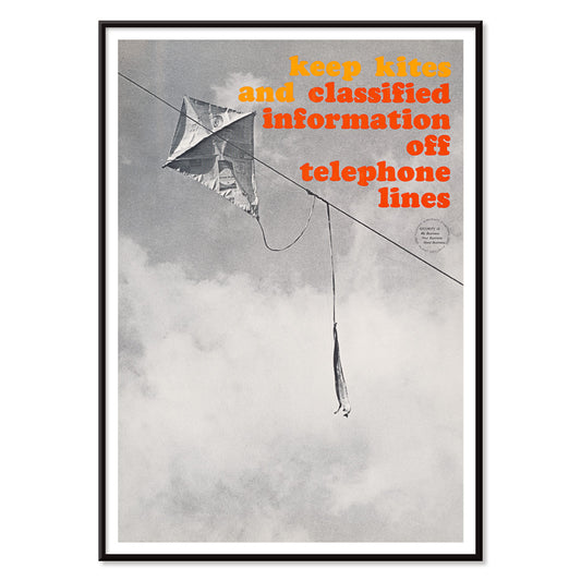
Nicht an Telefonleitungen Poster
Unbekannter Künstler · 1964 · Prägnantes Poster mit Drachen in Telefonleitungen, schwarz-weiße Bildwirkung mit roten und gelben Akzenten
Poster ab €9 · Gerahmt ab €16
Normaler Preis Von €6,00Normaler Preis -
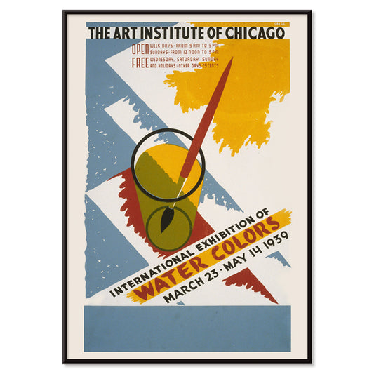
Internationale Ausstellung der Aquarelle Poster
Arlington Gregg · 1939 · Markantes Grafikposter mit Primärfarbfeldern und einem aufrecht stehenden Pinsel im Glas
Poster ab €9 · Gerahmt ab €16
Normaler Preis Von €6,00Normaler Preis -
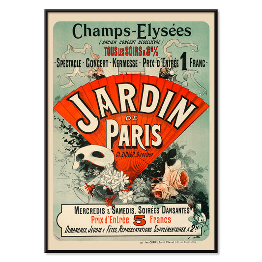
Jardin De Paris Poster
Jules Chéret · 1884 · Fröhliches Belle-Époque-Poster mit wirbelnder Tänzerin, dynamischen Masken und konfettiartigen Blumen
Poster ab €9 · Gerahmt ab €16
Normaler Preis Von €6,00Normaler Preis -
Algérie Poster
Léon Cauvy · 1930 · Lebhaftes Poster eines algerischen Hafens mit markanter Typografie und sonniger Mittelmeerstimmung
Poster ab €9 · Gerahmt ab €16
Normaler Preis Von €6,00Normaler Preis -
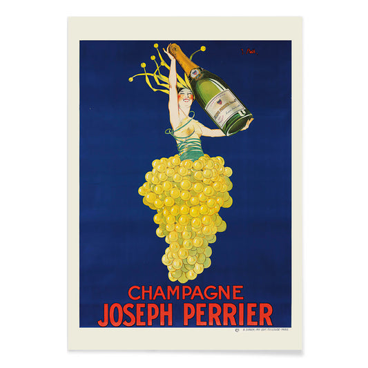
Champagne Joseph Perrier Poster
Joseph Stall · 1902 · Festliches Poster Champagne mit eleganter Figur und wirbelnden Traubenmotiven in lebendigen Farben
Poster ab €9 · Gerahmt ab €16
Normaler Preis Von €6,00Normaler Preis -
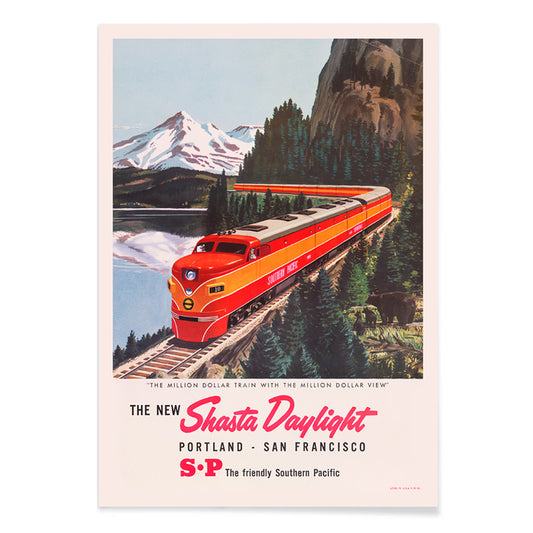
Shasta Daylight Poster
Unbekannter Künstler · 1950 · Stromlinienzug in rot windet sich durch eine bergige Landschaft im klaren Mid-Century-Stil
Poster ab €9 · Gerahmt ab €16
Normaler Preis Von €6,00Normaler Preis -
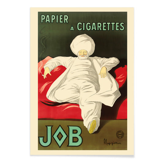
Rolling Paper Job Poster
Leonetto Cappiello · 1933 · Elegantes Werbeposter mit weißgewandeter Figur vor lebhaftem Grün und markanten roten Akzenten
Poster ab €9 · Gerahmt ab €16
Normaler Preis Von €6,00Normaler Preis -
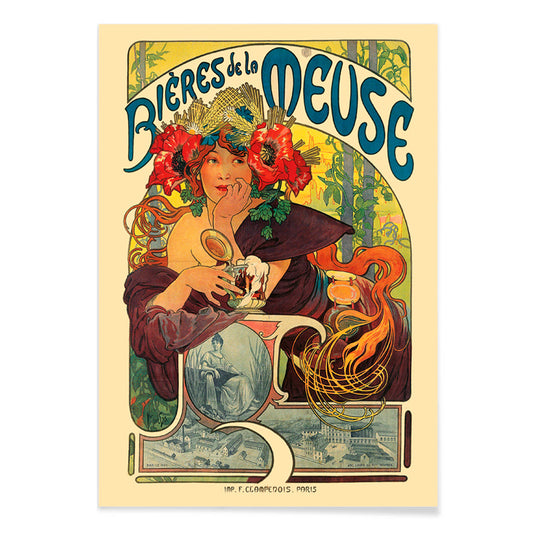
Bières De La Meuse Poster
Alphonse Mucha · 1897 · Strahlendes Art‑Nouveau-Poster mit blumenbekränzter Muse und wehenden Haaren
Poster ab €9 · Gerahmt ab €16
Normaler Preis Von €6,00Normaler Preis -
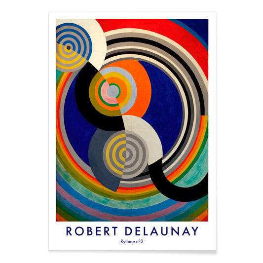
Rythme n°2 Poster
Robert Delaunay · 1938 · Abstrakter Rhythmus-Kunstdruck mit ineinandergreifenden Kreisen und Bögen in lebhaften Primärfarben
Poster ab €9 · Gerahmt ab €16
Normaler Preis Von €6,00Normaler Preis


36/761 items
- Rudge Poster
- Vivaudous Mavis Poster
- Mapamundi Poster
- Doves No. 2 Poster
- Fragmente einer Figur Poster
- Centre Pure Colors Poster
- Antibes Poster
- Genua Poster
- Altarpiece No. 1 Poster
- Sans Titre 1941 Poster
- Jeder nach seiner Art Poster
- Area Broken by Perpendiculars Poster
- Komposition Poster
- Carmine Wash Poster
- Historisches Ornament Poster
- Color Patchwork Poster
- Strände von Andalusien Poster
- Zu den Südseeinseln mit Pan American Poster
- La Grande Roue Poster
- Nicht an Telefonleitungen Poster
- Jardin De Paris Poster
- Champagne Joseph Perrier Poster
- Shasta Daylight Poster
- Rolling Paper Job Poster
- Rythme n°2 Poster
Rot, der bewussteste Akzent
In der Rot-Kollektion fungiert Farbe weniger als Sujet denn als Signal: ein Mohnpunkt, eine lackierte Schlagzeile, ein warmer Schimmer auf Papier. Diese Poster bewegen sich zwischen Illustration, Modernismus, Reisegrafik und diagrammatischen Drucken, und doch verlassen sich alle auf Rot, um Aufmerksamkeit zu steuern. Zinnober vor Creme, Backstein vor Graphit oder eine einzelne karminrote Form in ruhigem Raum kann bestimmen, wie ein Zimmer gelesen wird. Als Wandkunst wirkt Rot wie Würze in der Wohnkultur: ein kleiner Akzent belebt die Galeriewand, ein größeres Feld etabliert einen Fokus und eine Richtung in der Dekoration.
Handwerk, Pigment und die Kunst der Überzeugung
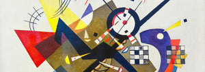
Rot hat in der Druckgeschichte technisches und kulturelles Gewicht getragen. Frühe Farbstoffe und Pigmente wie Cochenille und Krapp prägten Textilien und dekorative Künste, während die Lithografie kühne rote Schriftzüge und flächige Farben ins Zentrum der öffentlichen Bildkultur rückte. Strawberry Thief (1883) von William Morris verwendet Rot als strukturelles Element im Rapport und hält Vögel und Früchte in rhythmischer Spannung. In Hygieia (1907) von Gustav Klimt liest sich der Mantel zugleich als Emblem und Warnung, das Purpur wie eine Grenze um die Figur legt. Heavy Red (1924) von Wassily Kandinsky zeigt Rot als Masse, eine Fläche, die benachbarte Formen in Bewegung setzt und Geometrie körperlich erscheinen lässt.
Wo rote Poster am besten wirken
Rote Akzente harmonieren besonders mit ehrlichen Materialien: Nussbaum, Terrakotta, Messing, Leinen und gealterter Stein. In Küchen und Essecken spiegeln Fruchtstudien und Pflanzenbilder die Farben von Tischgut und Keramik, weshalb Botanik-Drucke leicht zu rotgeführten Arrangements passen. Im Flur zieht ein kräftiges rotes Element den Blick durch enge Räume; die grafische Logik der Werbung ergänzt sich gut mit Spiegeln, Garderobenhaken und dunklen Dielen. Im Schlafzimmer sollte Rot kleiner und wärmer bleiben, eher Backstein oder Rosenrot als reines Signalrot, und mit hellen Bettwaren sowie sanftem bernsteinfarbenem Licht balanciert werden. Öffnet sich der Raum ins Grüne, wird Rot zum klaren Gegenpol; ruhigere Motive aus Landschaften halten die Palette geerdet.
Kombinieren, Rahmung und Galeriewand
Damit Rot nicht dominiert, behandeln Sie es als eine Stimme innerhalb einer gemessenen Palette. Eine weiße Passepartout-Lage gibt Rot Luft, ein schlanker schwarzer Rahmen schärft gesättigte Bereiche und echoiert die Disziplin von Schwarz-Weiß-Motiven. Für strukturierte Paarungen stellen Sie ein rotgeführtes Poster neben geometrische Arbeiten aus Bauhaus, wo Rot oft als kontrollierter Block statt als Zier erscheint. Für stärkeren Theatercharakter wirkt Cachou Lajaunie (1920) von Leonetto Cappiello wie Straßenlicht vor dunklem Holz und gedämpften Wänden. Beim Aufbau einer Galeriewand wiederholen Sie Rot zweimal, einmal als größere Fläche und einmal als kleiner Akzent, damit das Auge einen klaren Weg zwischen den Drucken hat.
Ein letzter Gedanke zu Rot
Rot ist auch ein nützlicher Hinweis beim Lesen von Bildern: in Reisegrafik signalisiert es Hitze, Nachtleben und Appetit; in modernistischer Komposition markiert es den Punkt, an dem abschweifende Aufmerksamkeit in Fokus schnellt. Deshalb kann diese Auswahl von Muster zu symbolistischer Figur zu scharfkantiger Abstraktion springen, ohne ihre Kohärenz zu verlieren. Lassen Sie Atemraum um die lauteste rote Fläche und lassen Sie benachbarte Drucke ruhigere Töne wie Sand, Tinte und Meergrün tragen. So wird Rot Rhythmus statt Lärm und Dekoration wirkt absichtsvoll ohne Strenge.