


- Destroy this mad brute Poster
- Shaw oder Ironie Poster
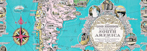
- Der gute Nachbar von Südamerika Poster
- Italien mit Vatikanstadt Poster
- Zwiebeln Poster
- Radieschen Poster
- Karotten Poster
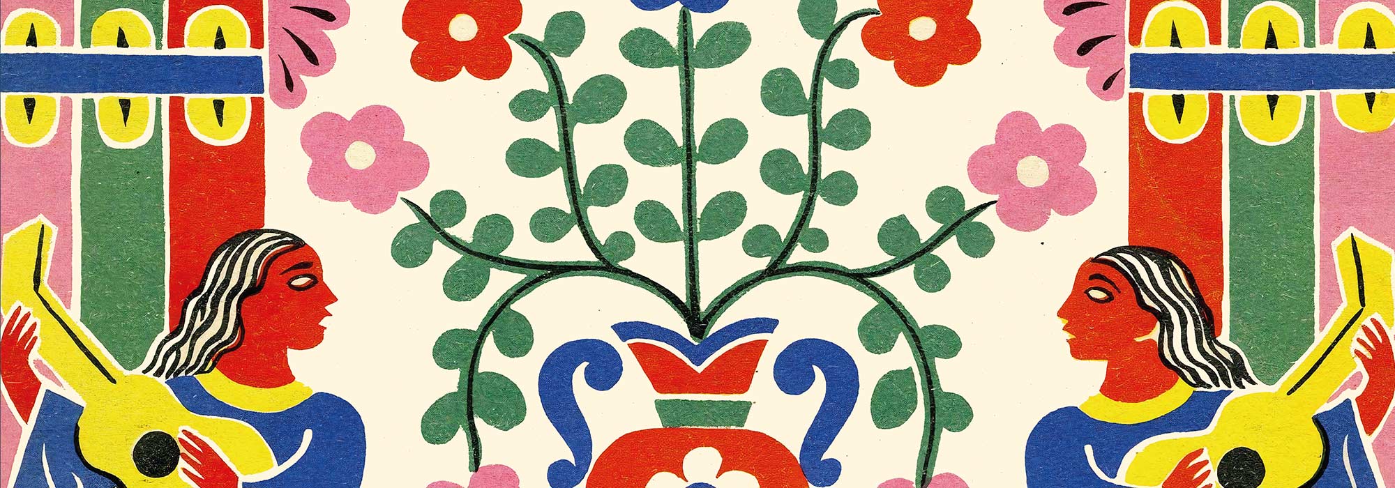
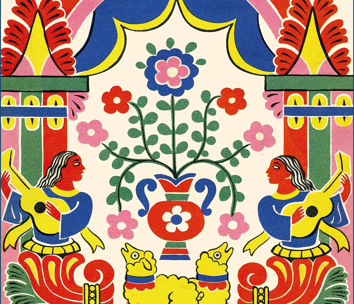
- Les Lalanne Poster
- Punch Boutique Poster
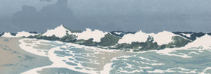
- Tanzendes Paar im Schnee Poster
- Standpunkt Judentum und Heidentum Poster
- Jet Clipper nach Hawaii Poster
- Campari Soda Poster
- Bec-Kina Poster
- Kohler Chocolat Poster
- Strawberry Thief Poster
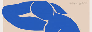
- Matisse Tanzende Figuren Poster
- Tom Krojer Ausstellungs-Poster
- Berliner Straßenszene Poster
- Ernst Kirchner Ausstellung Poster
- Eiffelturm Poster
- Sitzende Frau von hinten Poster
- Rotes Haar, blauer Hut Poster
- Park Near Lu Poster
- El Comienzo Poster
- Parler Seul 2 Poster
- The Current Standpoint of the Mahatmas Poster
- Ring der Dämmerung Poster
- Parler Seul Poster
- Faun und Nymphe Poster
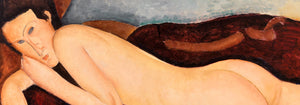
- The Dream Poster
- Le Concert Poster
- Weibliche Künstlerin Poster
-
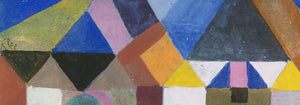
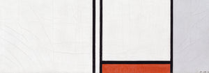
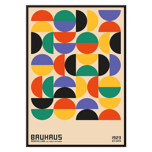
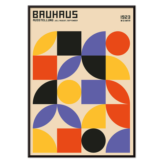
Bauhaus 12 Poster
MORYARTY · 1923 · Geometrisches Bauhaus Poster mit ausgewogenem Spiel aus Kreisen und Rechtecken in Rot, Blau, Gelb und Schwarz
Poster ab €9 · Gerahmt ab €16
Normaler Preis Von €6,00Normaler Preis -
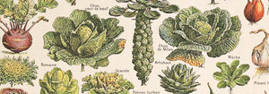
Grünes Gemüse und Kräuter Poster
MORYARTY · 2012 · Frischer Kunstdruck zu Gemüse und Kräutern als klare zeitgenössische botanische Studie
Poster ab €9 · Gerahmt ab €16
Normaler Preis Von €6,00Normaler Preis -
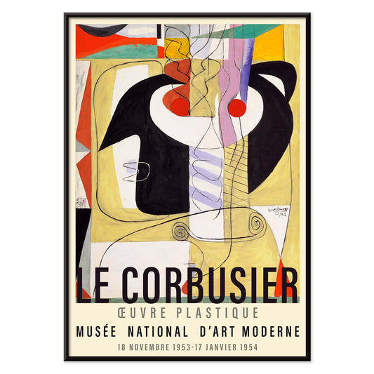
Arbalète I Poster
Le Corbusier · 1953 · Geometrischer modernistischer Kunstdruck mit armbrustartigen Formen in Rot, Blau und Schwarz
Poster ab €9 · Gerahmt ab €16
Normaler Preis Von €6,00Normaler Preis -
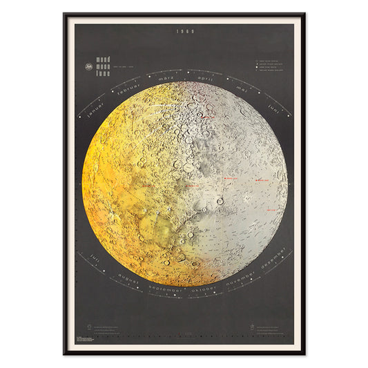
Mondkarte Poster
Falk-Verlag · 1969 · Detailliertes Poster der Mondkarte mit präzisen Beschriftungen und klarer Mid-Century-Ästhetik
Poster ab €9 · Gerahmt ab €16
Normaler Preis Von €6,00Normaler Preis -
Mondfotografie Poster
Gerard Kuiper · 1950 · Präziser Mondfoto-Poster mit klaren Kraterdetails vor tiefschwarzem Weltraum
Poster ab €9 · Gerahmt ab €16
Normaler Preis Von €6,00Normaler Preis -
Le Modulor Poster
Le Corbusier · 1950 · Ikonisches Modulor Poster mit proportionellem Menschendiagramm in Schwarz, Rot und Blau
Poster ab €9 · Gerahmt ab €16
Normaler Preis Von €6,00Normaler Preis -
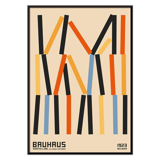
Métamorphose du violon Poster
Le Corbusier · 1920 · Modernistisches Poster, das Instrumentkurven in klare geometrische Rhythmen und kräftige Primärfarben übersetzt
Poster ab €9 · Gerahmt ab €16
Normaler Preis Von €6,00Normaler Preis -
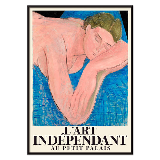
Le rêve Poster
Henri Matisse · 1935 · Traumhafter liegender Akt-Kunstdruck mit fließenden schwarzen Linien und zarten Rosa- und Blautönen
Poster ab €9 · Gerahmt ab €16
Normaler Preis Von €6,00Normaler Preis -
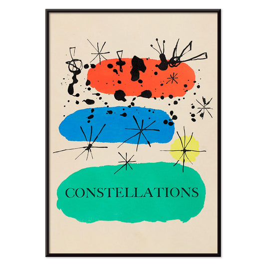
Konstellationen Poster
Joan Miró · 1941 · Traumhaftes Konstellationen-Poster mit verspielten Sternen und biomorphen Symbolen in leuchtenden Primärfarben
Poster ab €9 · Gerahmt ab €16
Normaler Preis Von €6,00Normaler Preis -
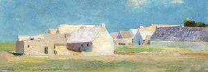
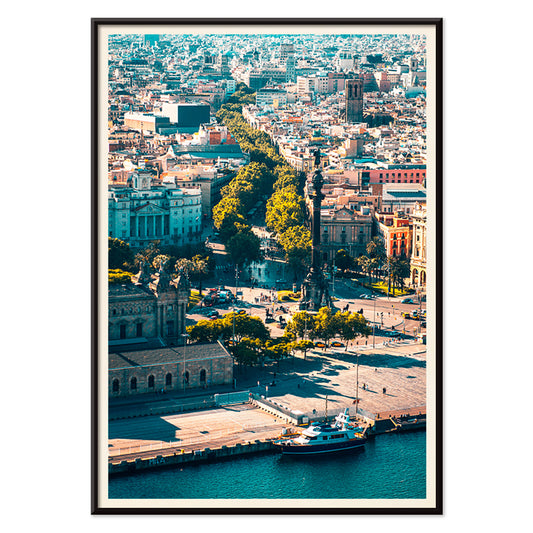
La Rambla Poster
MORYARTY · 1977 · Stilisiertes Poster der Barceloner Flaniermeile mit klarer Geometrie und kühlen Blau- und Grüntönen
Poster ab €9 · Gerahmt ab €16
Normaler Preis Von €6,00Normaler Preis -
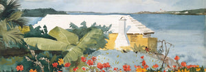
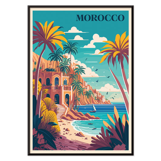
Marokko Poster
MORYARTY · 1930 · Sonniges Marokko Poster mit Palmen, weißer Villa und ruhigem blauem Meer
Poster ab €9 · Gerahmt ab €16
Normaler Preis Von €6,00Normaler Preis -
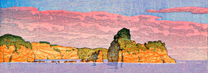
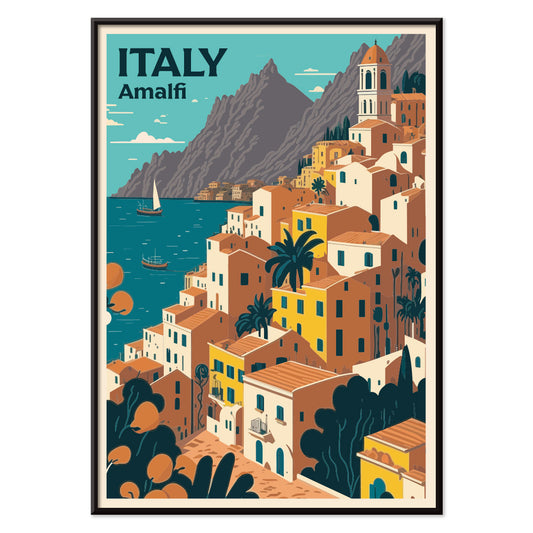
Reise nach Italien Poster
MORYARTY · 1920 · Sonnendurchflutetes Poster der Amalfiküste mit Felsendörfern und funkelndem Meer
Poster ab €9 · Gerahmt ab €16
Normaler Preis Von €6,00Normaler Preis -
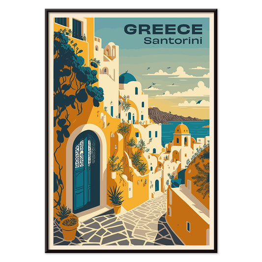
Reise nach Santorini Poster
MORYARTY · 2023 · Vintage-inspiriertes Santorini-Poster mit weißem Dorf an der Klippe und tiefen Ägäisblau-Tönen
Poster ab €9 · Gerahmt ab €16
Normaler Preis Von €6,00Normaler Preis -
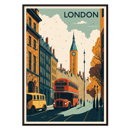
Reise nach London Poster
MORYARTY · 1930 · Klassisches London-Poster mit rotem Doppeldeckerbus und markantem Uhrturm in kräftigen Farben
Poster ab €9 · Gerahmt ab €16
Normaler Preis Von €6,00Normaler Preis -
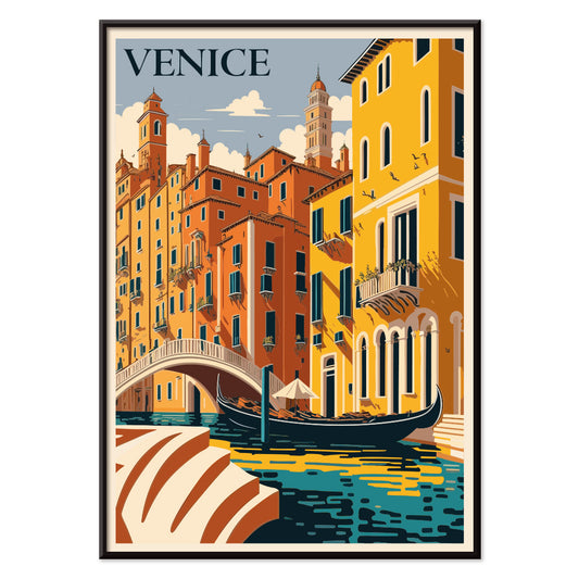
Reise nach Venedig Poster
MORYARTY · 1930 · Romantisches Venedig-Reiseposter mit einer Gondel auf einem sonnigen, ruhigen blauen Kanal
Poster ab €9 · Gerahmt ab €16
Normaler Preis Von €6,00Normaler Preis -
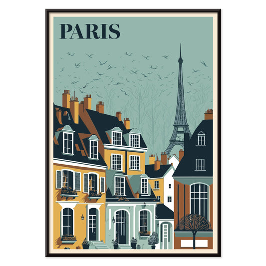
Reise nach Paris Poster
MORYARTY · 1929 · Elegantes Eiffelturm-Poster über Pariser Dächer in glühenden Blau- und Gelbtönen
Poster ab €9 · Gerahmt ab €16
Normaler Preis Von €6,00Normaler Preis -
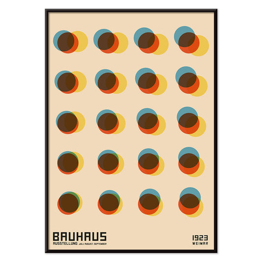
Yayoi Schwarzweiß Poster
Yayoi Kusama · 1965 · Kontrastreiches Polka-Dot Poster mit hypnotischer Wirkung und Gefühl von Unendlichkeit
Poster ab €9 · Gerahmt ab €16
Normaler Preis Von €6,00Normaler Preis -
Bauhaus 11 Poster
MORYARTY · 2023 · Geometrischer Poster mit kräftigen Kreisen und Diagonalen in Primärfarben auf weißem Hintergrund
Poster ab €9 · Gerahmt ab €16
Normaler Preis Von €6,00Normaler Preis -
Bauhaus Poster 10
MORYARTY · 1923 · Geometrisches abstraktes Bauhaus Poster mit Kreisen und Balken in kräftigen Primärfarben
Poster ab €9 · Gerahmt ab €16
Normaler Preis Von €6,00Normaler Preis -
Bauhaus Poster 9
MORYARTY · 2023 · Geometrisches Poster mit ausgewogenen Primärfarben, klaren schwarzen Linien und warmem Grund
Poster ab €9 · Gerahmt ab €16
Normaler Preis Von €6,00Normaler Preis -
Bauhaus 8 Poster
MORYARTY · 1923 · Geometrisches Bauhaus-Poster mit markantem Kreuz aus Kreisen und Quadraten auf warmem Beige
Poster ab €9 · Gerahmt ab €16
Normaler Preis Von €6,00Normaler Preis -
Bauhaus 7 Poster
MORYARTY · 1923 · Geometrisches Poster mit Kreisen in Primärfarben, klare Bauhaus-Balance und rhythmische Überlagerung
Poster ab €9 · Gerahmt ab €16
Normaler Preis Von €6,00Normaler Preis -
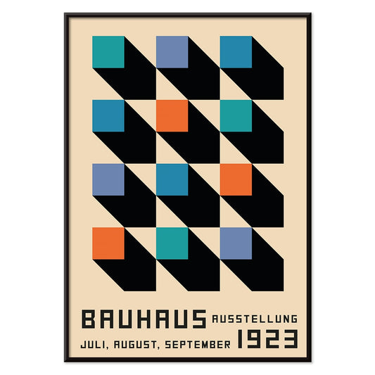
Bauhaus 6 Poster
MORYARTY · 1923 · Bauhaus-inspiriertes abstraktes Poster mit schwarzen Linien, orangefarbenen Akzenten und blauen geometrischen Formen
Poster ab €9 · Gerahmt ab €16
Normaler Preis Von €6,00Normaler Preis -
Bauhaus 4 Poster
MORYARTY · 1923 · Geometrisches Bauhaus-Poster mit orangenen und schwarzen Formen auf warmem Beigeton
Poster ab €9 · Gerahmt ab €16
Normaler Preis Von €6,00Normaler Preis -
Bauhaus Poster 5 Poster
MORYARTY · 1923 · Geometrisches Bauhaus Poster mit markanten Kreisen und Balken auf warmem Beigeton
Poster ab €9 · Gerahmt ab €16
Normaler Preis Von €6,00Normaler Preis -
Bauhaus 2 Poster
MORYARTY · 1923 · Geometrisches Bauhaus-Poster mit kräftigen schwarzen, orangefarbenen und blauen Formen und klaren Linien
Poster ab €9 · Gerahmt ab €16
Normaler Preis Von €6,00Normaler Preis -
Bauhaus Poster 1
MORYARTY · 1923 · Geometrisches Poster mit geschichteten Formen, klaren Linien und kräftigen modernistischen Farbkontrasten
Poster ab €9 · Gerahmt ab €16
Normaler Preis Von €6,00Normaler Preis -
Bauhaus 3 Poster
MORYARTY · 1923 · Geometrisches Bauhaus-Poster mit kräftigen Primärfarben, klarer modernistischer Balance und reduzierter Komposition
Poster ab €9 · Gerahmt ab €16
Normaler Preis Von €6,00Normaler Preis -
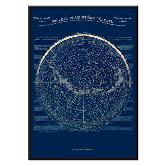
Observatoire populaire du Trocadéro Poster
Léon Jaubert · 1889 · Detailliertes Himmelskarten-Poster mit präzisen Sternbildlinien auf tiefblauem Grund
Poster ab €9 · Gerahmt ab €16
Normaler Preis Von €6,00Normaler Preis -
Ringer Poster
Kinbei Kusakabe · 1890 · Handkolorierter Sumoringer-Kunstdruck, der einen spannungsreichen Griff in warmen Sepiatönen zeigt
Poster ab €9 · Gerahmt ab €16
Normaler Preis Von €6,00Normaler Preis -
Japanisches Tattoo 2 Poster
Raimund von Stillfried · 1877 · Japanisches Tattoo-Porträt Poster mit handkolorierten Details und ruhiger Studio-Komposition
Poster ab €9 · Gerahmt ab €16
Normaler Preis Von €6,00Normaler Preis -
Le Gaulois artistique Poster
Unbekannter Künstler · 1929 · Auffälliges Vintage-Poster mit flammenhaariger Figur und markanter schwarzer Typografie auf Gelb
Poster ab €9 · Gerahmt ab €16
Normaler Preis Von €6,00Normaler Preis -
Lutte Poster
Claude Augé · 1908 · Lehrreicher Vintage-Druck mit klarer Linienführung, der Ringergriffe auf warmem Papier zeigt
Poster ab €9 · Gerahmt ab €16
Normaler Preis Von €6,00Normaler Preis -
Großer Buddha Poster
Kinbei Kusakabe · 1890 · Handkolorierter Buddha-Fotodruck mit monumentaler Statue in ruhigen Mineraltönen
Poster ab €9 · Gerahmt ab €16
Normaler Preis Von €6,00Normaler Preis -
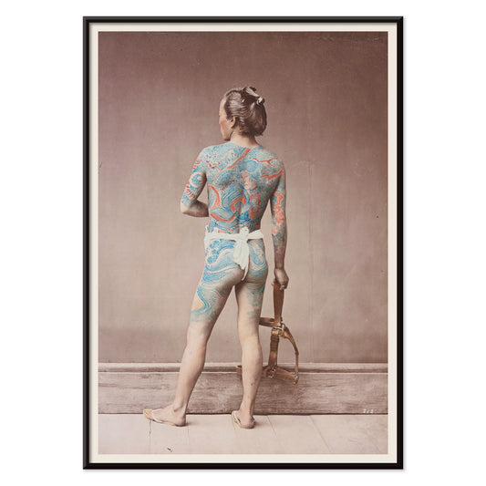
Japanisches Tattoo 1877 Poster
Raimund von Stillfried · 1877 · Handkoloriertes Studio-Poster mit detailliertem japanischem irezumi auf bloßem Rücken
Poster ab €9 · Gerahmt ab €16
Normaler Preis Von €6,00Normaler Preis -
Peinture et Teinture Poster
Claude Augé · 1908 · Lehrreiche Farbtafel als Poster mit französischen Bezeichnungen und geordneten Farbfeldern
Poster ab €9 · Gerahmt ab €16
Normaler Preis Von €6,00Normaler Preis


36/1512 items
- Bauhaus 12 Poster
- Grünes Gemüse und Kräuter Poster
- Arbalète I Poster
- Le Modulor Poster
- Métamorphose du violon Poster
- Le rêve Poster
- Konstellationen Poster
- La Rambla Poster
- Marokko Poster
- Reise nach Italien Poster
- Reise nach Santorini Poster
- Reise nach London Poster
- Reise nach Venedig Poster
- Reise nach Paris Poster
- Yayoi Schwarzweiß Poster
- Bauhaus 11 Poster
- Bauhaus Poster 10
- Bauhaus Poster 9
- Bauhaus 7 Poster
- Bauhaus 6 Poster
- Bauhaus 4 Poster
- Bauhaus Poster 5 Poster
- Bauhaus 2 Poster
- Bauhaus Poster 1
- Bauhaus 3 Poster
- Observatoire populaire du Trocadéro Poster
- Japanisches Tattoo 2 Poster
- Lutte Poster
- Japanisches Tattoo 1877 Poster
Warum vertikale Poster einen Raum verändern
Ein vertikales Poster wirkt wie ein architektonisches Element: Es lenkt den Blick nach oben, reduziert visuelles Rauschen und verleiht kleinen Räumen ein klareres Maß. Hochformatige Formate wurden lange für Theaterzettel, Buchumschläge und Straßenschilder genutzt, wo das hohe Rechteck ein getaktetes Lesen von oben nach unten unterstützt. Als Wandkunst kann diese Struktur unruhige Interieurs stabilisieren und Durchgangszonen komponierter erscheinen lassen. Besonders nützlich ist das Format im Eingangsbereich, im Flur und an der schmalen Wand zwischen Fenster und Regal, wo ein Querformat zerschnitten wirken würde.
Grafische Tradition und was sie dem Auge lehrt
Das Hochformat ist im öffentlichen Raum gewachsen. Reiseankündigungen, Kinoprogramme und die kommerzielle Lithographie lehrten Gestalter, Hierarchie präzise zu führen: Headline, Bild, Kleingedrucktes, ausbalanciert durch Ränder. Die besten Vintage-Poster übertragen diese Disziplin in die Gegenwart, ob typografisch oder rein bildlich. Flächige Farbblöcke und klare Konturen sorgen dafür, dass eine Komposition aus der Ferne lesbar bleibt, während Papierstruktur und Druckbild bei genauerem Hinsehen belohnen. Dieselbe Logik verbindet sich auf natürliche Weise mit der Klarheit des Bauhaus, den reduzierten Formen der Minimalistischen Gestaltung und dem starken Tongerüst in Schwarz-Weiß Bildern.
Porträt-Wandkunst Raum für Raum platzieren
Im Wohnzimmer passt ein hoher Druck gut neben ein Regal, einen Schrank oder eine Stehleuchte, wo er die schon vorhandenen Vertikalen aufgreift. Im Schlafzimmer fügen sich Porträt-Poster angenehm auf dem schmalen Streifen zwischen Kleiderschrank und Tür ein oder als einzelner Akzent, versetzt vom Bett statt darüber zentriert. Küche und Essnische vertragen oft grafische Vintage-Stücke, etwa etiketteninspirierte Layouts aus Werbung, während ruhigere botanische Studien aus Botanik harte Oberflächen wie Fliesen oder Stahl mildern. Betrachten Sie das Poster als Ihren Farbakzent: Ziehen Sie eine Tintenfarbe in Textilien oder Keramik auf und halten Sie Wand- und Rahmenoberflächen zurückhaltend, damit das Rechteck klar lesbar bleibt.
Paarungen, Rahmung und Galeriewandrhythmus kuratieren
Vertikale Drucke funktionieren besonders gut in Paaren: Ein bildreiches Blatt neben einer ruhigeren Fläche lässt die Wand zwischen Detail und Pause wechseln. Ein drittes Element kann die Komposition erweitern, etwa ein horizontales Gegenstück aus Landschaften, doch achten Sie auf gleichmäßige Abstände, damit das Arrangement gezielt wirkt. Dünne schwarze Rahmen schärfen grafische Designs; Eiche oder Nussbaum wärmen Archivmotive, und abgestimmte Optionen finden Sie bei Rahmen. Nutzen Sie einen schmalen Passepartout, damit dunklere Drucke atmen, besonders in kleineren Formaten, und hängen Sie an einer gemeinsamen Mittelachse in Augenhöhe, während die oberen Kanten dezent versetzt bleiben, um den vertikalen Rhythmus zu bewahren.
Die ruhige Logik des hohen Rechtecks
Formatgeleitete Sammlungen bleiben flexibel: Hochformatige Orientierungen können Architekturaufnahmen, symbolische Studien, Abstraktion oder Vintage-Typografie aufnehmen, ohne eine einzige Stimmung zu erzwingen. Was diese Poster eint, ist die Art, wie der hohe Beschnitt eine Szene schneidet und Gestus und Negativraum ins Gleichgewicht bringt. Wenn Wohnkultur zu gedrängt wirkt, kann ein wohlüberlegter vertikaler Kunstdruck eher Ordnung schaffen als eine Ansammlung. Als einzelnes, ruhiges Fenster an der Wand lässt er den Raum atmen und bietet zugleich einen klaren Blickpunkt.