


- Destroy this mad brute Poster
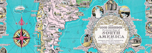
- The good neighbor of South America Poster
- Italy with Vatican City Poster
- Les Lalanne Poster
- Dancing couple in the snow Poster
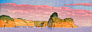
- Jet Clipper to Hawaii Poster
- Kohler Chocolat Poster
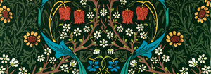
- Strawberry Thief Poster
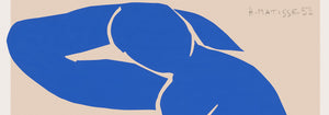
- Matisse Dancing Figures Poster
- Tom Krojer Exhibition Poster Poster
- Berlin Street Scene Poster
- Ernst Kirchner Exhibition Poster
- Woman Seated Back Poster
- Red Hair Blue Hat Poster
- Park Near Lu Poster
- El Comienzo Poster
- Parler Seul 2 Poster
- Twilight’s Ring Poster
- Parler Seul Poster
- The Dream Poster
- Le Concert Poster
- Female Artist Poster
- Revenge of the Pink Panther Poster
- Woman and Bird at Night Poster
- Visit Puerto Rico Poster
- Bauhaus 20 Poster
- Bauhaus 21 Poster
- Eat more fruits Poster
- Blue Japanese Crane Poster
- Snoopy come home Poster
- To London by Jet Clipper Poster
- Crans Poster
- Monte Carlo Poster
- Pacific Vibrations Poster
- Continental Hawaii Airline Poster
- Beer and Cigarette Poster
- West Coast of Mexico Poster
-
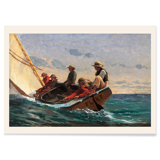
The Flirt Poster
Winslow Homer · 1874 · Breezy sailboat scene poster capturing seaside flirtation and 19th-century leisure
Poster from €9 · Framed from €16
Regular price From €6,00Regular price -
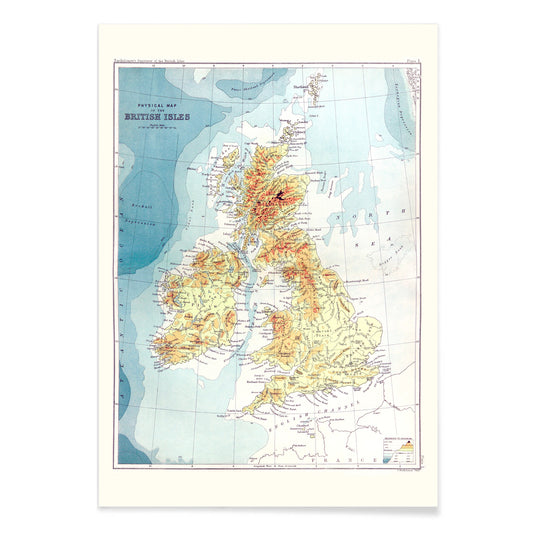
Gazetteer of the British Isles Poster
John Bartholomew · 1887 · Detailed British Isles vintage print balancing crisp labels with an atlas-like cartographic layout
Poster from €9 · Framed from €16
Regular price From €6,00Regular price -
Crimson topaz Poster
James Bolton · 1768 · Delicate natural history print pairing a crimson hummingbird with shells, butterflies, and cyclamen
Poster from €9 · Framed from €16
Regular price From €6,00Regular price -
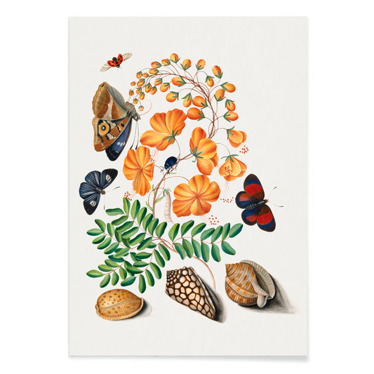
Caesalpinoid Poster
James Bolton · 1768 · Delicate natural history print with butterfly, beetles, and shells on cream
Poster from €9 · Framed from €16
Regular price From €6,00Regular price -
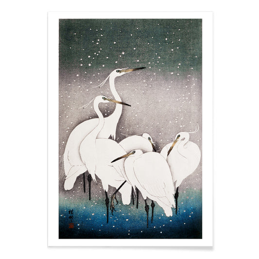
Group of Egrets Poster
Ohara Koson · 1925 · Tranquil egret print in winter stillness with soft blue shadows and crisp black accents
Poster from €9 · Framed from €16
Regular price From €6,00Regular price -
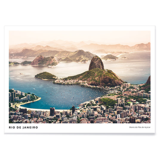
Rio de Janeiro Poster
Agnieszka Ciesielska · 2019 · Vintage inspired Rio de Janeiro poster with Sugarloaf silhouette, sweeping beaches, and boats
Poster from €9 · Framed from €16
Regular price From €6,00Regular price -
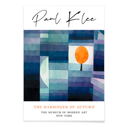
The Harbinger of Autumn Poster
Paul Klee · 1922 · Modernist art print of an orange tree in playful blue and orange geometry
Poster from €9 · Framed from €16
Regular price From €6,00Regular price -
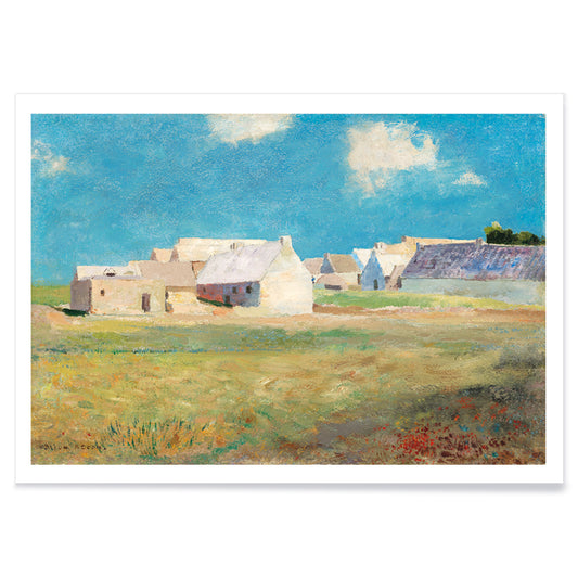
Breton Village Poster
Odilon Redon · 1890 · Dreamlike village art print with blue green fields and softly blurred rooftops
Poster from €9 · Framed from €16
Regular price From €6,00Regular price -
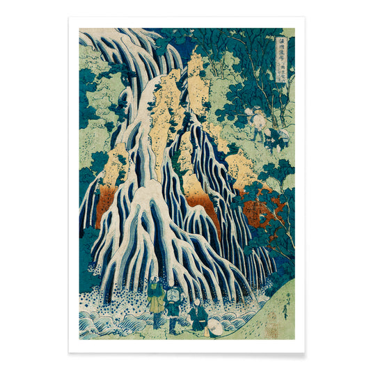
Shimotsuke Kurokami-Yama Kurifuri no Taki Poster
Katsushika Hokusai · 1832 · Dramatic waterfall vintage print with travelers dwarfed by rushing vertical cascades
Poster from €9 · Framed from €16
Regular price From €6,00Regular price -
Yoro Waterfall Poster
Katsushika Hokusai · 1832 · Iconic Japanese vintage print of Yoro Waterfall with sweeping cascade and quiet mountain setting
Poster from €9 · Framed from €16
Regular price From €6,00Regular price -
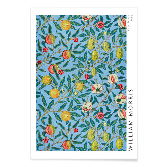
Four fruits pattern Poster
William Morris · 1862 · Lush fruit and foliage poster featuring interlacing leaves and rich blue backgrounds
Poster from €9 · Framed from €16
Regular price From €6,00Regular price -
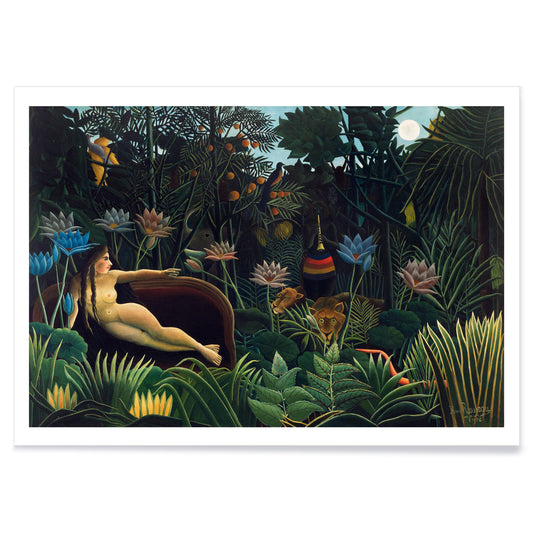
The Dream Poster
Henri Rousseau · 1910 · Dreamlike jungle poster with reclining figure, moonlit foliage, and quietly watchful animals
Poster from €9 · Framed from €16
Regular price From €6,00Regular price -
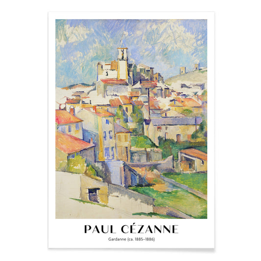
Gardanne Poster
Paul Cézanne · 1886 · Structured Provençal village art print with terracotta roofs and cool blue sky
Poster from €9 · Framed from €16
Regular price From €6,00Regular price -
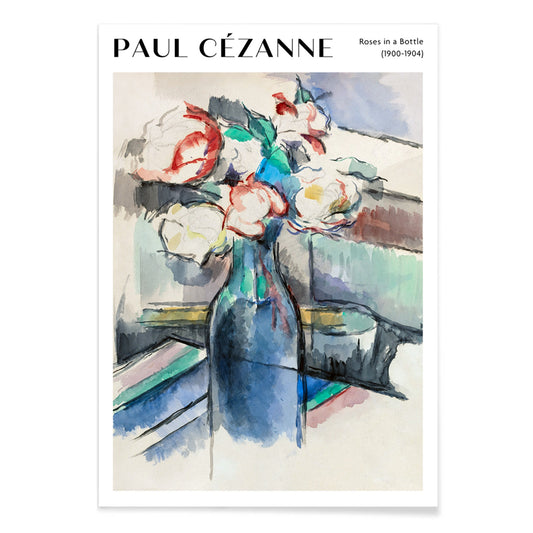
Roses in a Bottle Poster
Paul Cézanne · 1902 · Luminous roses art print arranged in a bottle with soft blue and green tones
Poster from €9 · Framed from €16
Regular price From €6,00Regular price -
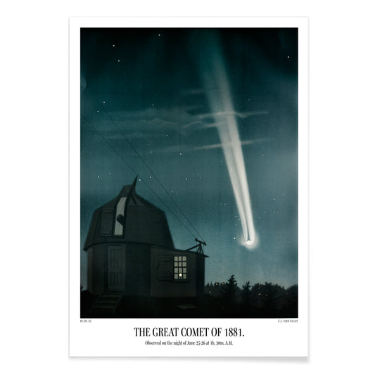
The great comet of 1881 Poster
Étienne Léopold Trouvelot · 1881 · Luminous comet scientific print sweeping through a star filled night sky in deep indigo
Poster from €9 · Framed from €16
Regular price From €6,00Regular price -
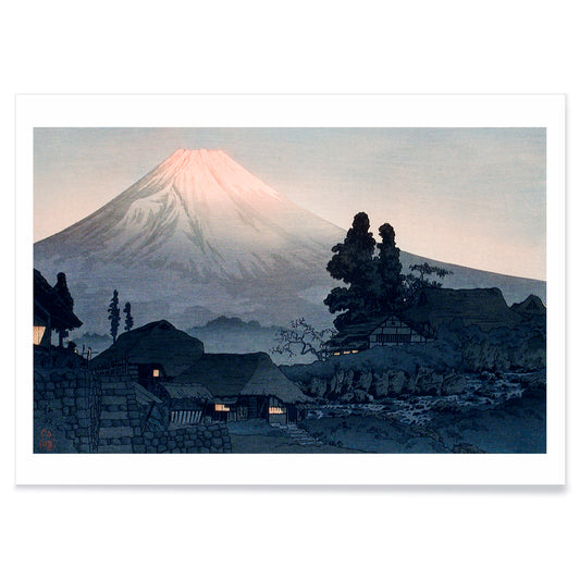
Mount Fuji From Mizukubo Poster
Hiroaki Takahashi · 1932 · Serene Mount Fuji art print with village rooftops under a soft dusk sky
Poster from €9 · Framed from €16
Regular price From €6,00Regular price -
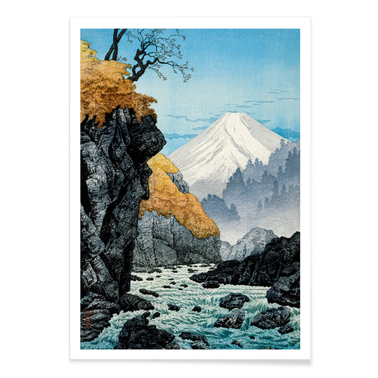
Foot of Mount Ashitaka Poster
Hiroaki Takahashi · 1932 · Serene river landscape poster with golden trees and distant blue mountain
Poster from €9 · Framed from €16
Regular price From €6,00Regular price -
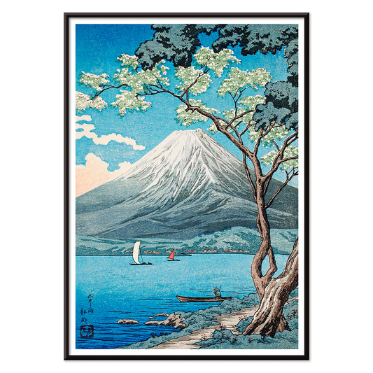
Mount Fuji from Lake Yamanaka Poster
Hiroaki Takahashi · 1929 · Serene Japanese landscape art print with sailboats on Lake Yamanaka beneath snow-capped Fuji
Poster from €9 · Framed from €16
Regular price From €6,00Regular price -
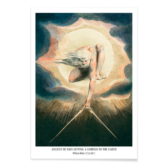
Compass to the Earth Poster
William Blake · 1794 · Visionary Urizen poster with blazing sun disc and compass over midnight blue
Poster from €9 · Framed from €16
Regular price From €6,00Regular price -
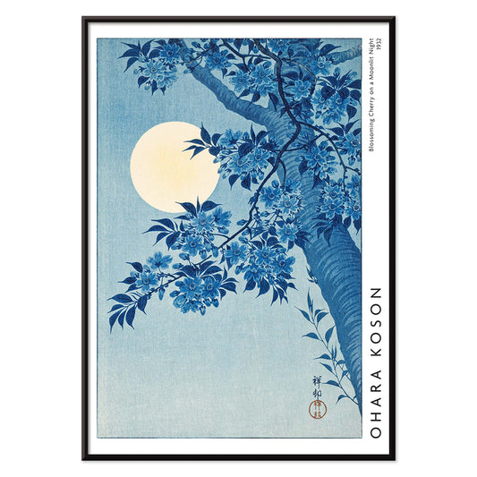
Blossoming Cherry on a Moonlit Night Poster
Ohara Matao · 1932 · Moonlit cherry blossoms art print with luminous full moon and quiet blue night
Poster from €9 · Framed from €16
Regular price From €6,00Regular price -
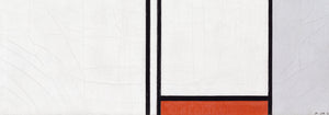
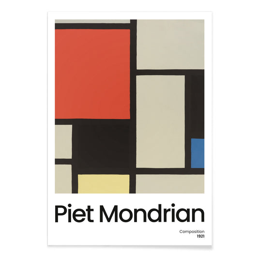
Composition with Large Red Plane Poster
Pieter Cornelis Mondriaan · 1921 · Geometric abstract art print with a large red plane and crisp black grid
Poster from €9 · Framed from €16
Regular price From €6,00Regular price -
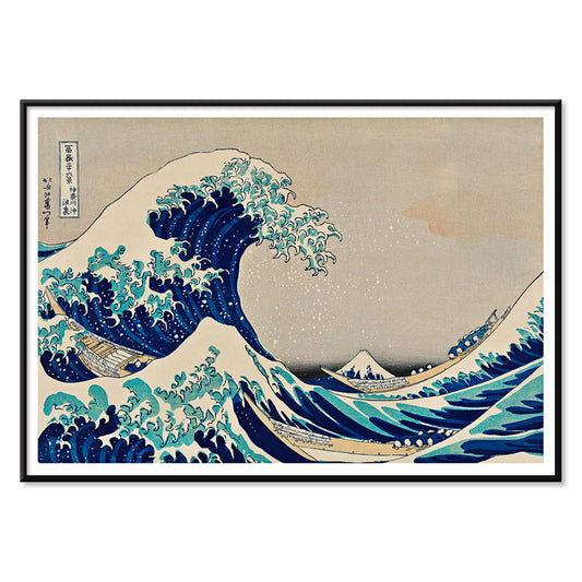
The Great Wave Poster
Katsushika Hokusai · 1831 · Iconic Japanese wave poster with Mount Fuji and boats under towering surf
Poster from €9 · Framed from €16
Regular price From €6,00Regular price -
Composition with Large Blue Plane Poster
Pieter Cornelis Mondriaan · 1921 · Geometric De Stijl art print with a large blue plane and crisp black lines
Poster from €9 · Framed from €16
Regular price From €6,00Regular price -
Composition A Poster
Pieter Cornelis Mondriaan · 1920 · Geometric abstract art print with black grid and primary color blocks on white
Poster from €9 · Framed from €16
Regular price From €6,00Regular price -
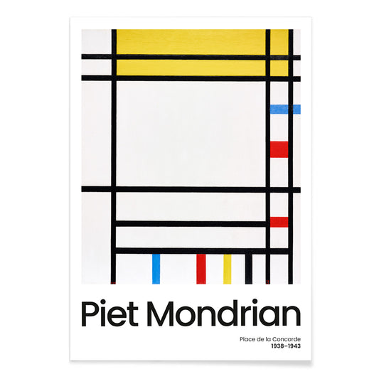
Place de la Concorde Poster
Piet Mondrian · 1941 · Geometric abstract poster balancing a black grid with red, yellow, and blue planes
Poster from €9 · Framed from €16
Regular price From €6,00Regular price -
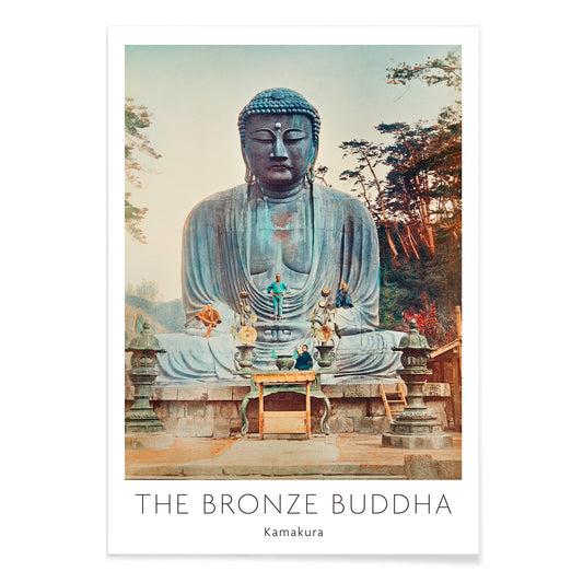
The Bronze Buddha at Kamakura Poster
Kazumasa Ogawa · 1897 · Serene hand-colored photo poster of the Kamakura Great Buddha framed by greenery
Poster from €9 · Framed from €16
Regular price From €6,00Regular price -
Japanese pattern Poster
Albert-Charles-Auguste Racinet · 1888 · Vibrant Japanese pattern poster of interlaced florals and geometry in rich color
Poster from €9 · Framed from €16
Regular price From €6,00Regular price -
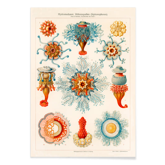
Vintage jellyfish illustration Poster
Ernst Haeckel · 1904 · Detailed jellyfish scientific print with floating bells, frilled edges, and trailing tentacles
Poster from €9 · Framed from €16
Regular price From €6,00Regular price -
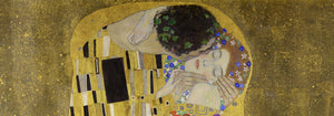
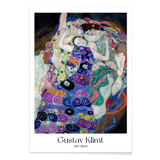
The Virgin Poster
Gustav Klimt · 1913 · Sensual Symbolist poster of intertwined women drifting in a violet spiral of patterns
Poster from €9 · Framed from €16
Regular price From €6,00Regular price -
Kirche in Cassone Poster
Gustav Klimt · 1913 · Luminous lakeside church art print with shimmering reflections and mosaic-like color blocks
Poster from €9 · Framed from €16
Regular price From €6,00Regular price -
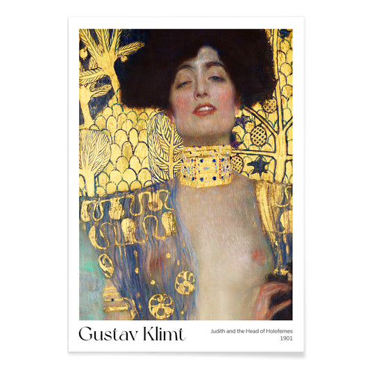
Judith and the Head of Holofernes Poster
Gustav Klimt · 1901 · Iconic gilded art print of Judith holding Holofernes head in opulent Art Nouveau style
Poster from €9 · Framed from €16
Regular price From €6,00Regular price -
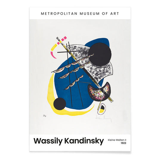
Kleine Welten II Poster
Wassily Kandinsky · 1922 · Rhythmic geometric art print with floating circles, sharp lines, and a bold black field
Poster from €9 · Framed from €16
Regular price From €6,00Regular price -
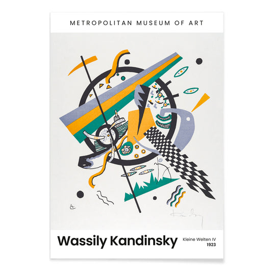
Kleine Welten IV Poster
Wassily Kandinsky · 1922 · Abstract art print of circles and angular lines with bright blue yellow green accents
Poster from €9 · Framed from €16
Regular price From €6,00Regular price -
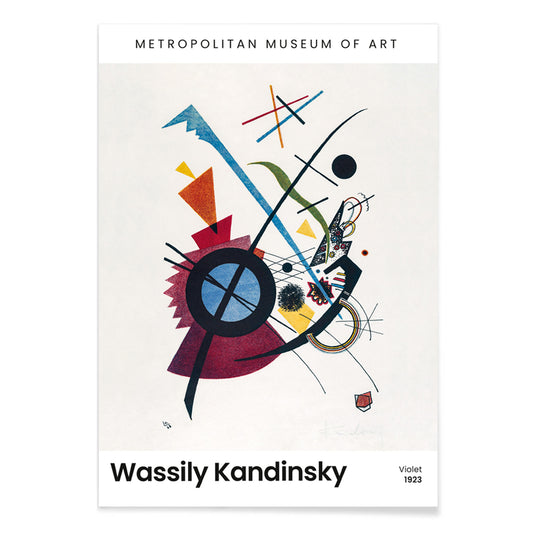
Violet Poster
Wassily Kandinsky · 1923 · Geometric abstract art print with violet, blue, and yellow shapes on pale ground
Poster from €9 · Framed from €16
Regular price From €6,00Regular price -
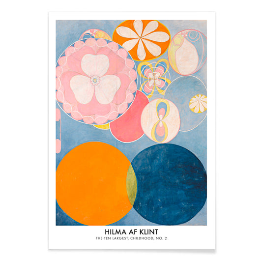
The Ten Largest, Childhood, No 2 Poster
Hilma af Klint · 1907 · Luminous abstract art print with swirling forms in blue, pink, orange, and yellow
Poster from €9 · Framed from €16
Regular price From €6,00Regular price -
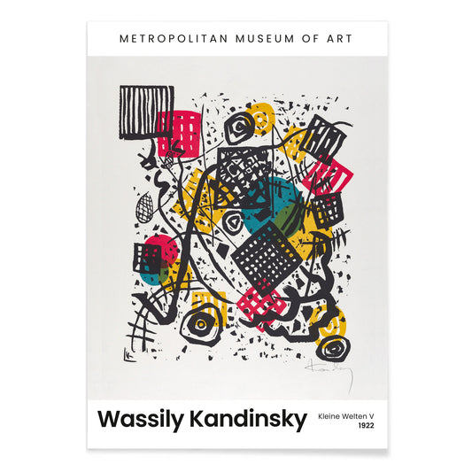
Kleine Welten V Poster
Wassily Kandinsky · 1922 · Rhythmic geometric poster of circles and sharp lines against a deep black field
Poster from €9 · Framed from €16
Regular price From €6,00Regular price


- Crimson topaz Poster
- Rio de Janeiro Poster
- The Harbinger of Autumn Poster
- Shimotsuke Kurokami-Yama Kurifuri no Taki Poster
- Yoro Waterfall Poster
- Four fruits pattern Poster
- The Dream Poster
- The great comet of 1881 Poster
- Foot of Mount Ashitaka Poster
- Mount Fuji from Lake Yamanaka Poster
- Blossoming Cherry on a Moonlit Night Poster
- Composition with Large Red Plane Poster
- The Great Wave Poster
- Place de la Concorde Poster
- The Virgin Poster
- Judith and the Head of Holofernes Poster
- Kleine Welten IV Poster
- Violet Poster
- The Ten Largest, Childhood, No 2 Poster
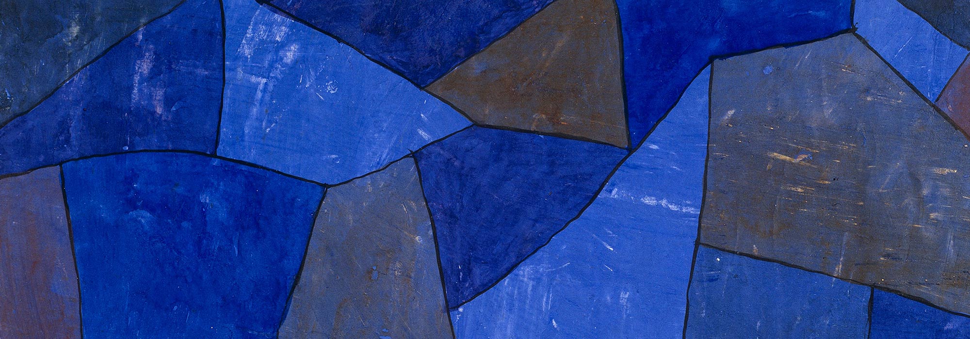
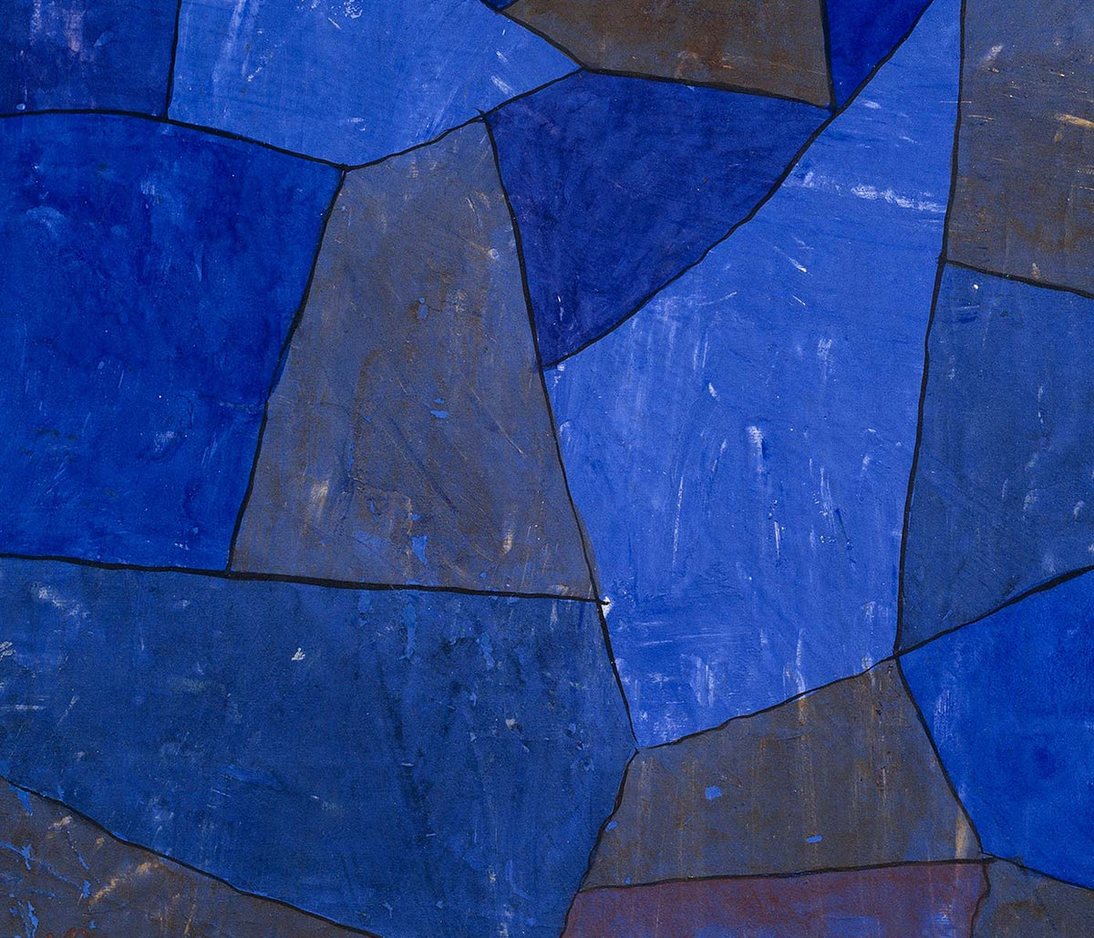
Blue as atmosphere, not just a hue
Blue rarely behaves like a single color. In vintage poster design it becomes distance, weather, depth, and even time, shifting from Prussian ink to pale sky wash as the subject changes. This collection treats blue as a structural element in wall art decoration: it can cool a room, clarify a line, and make paper feel archival. You see it in coastal imagery, in diagrammatic plates, and in graphic compositions where the blue field is the main event rather than a background. For adjacent moods, the pared-back restraint of Minimalist posters and the tonal focus of Black & White prints offer clean counterpoints.
Indigo, cyanotype, and the modernist sky
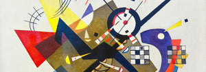
Historically, blue arrives through different technologies as much as through taste. Textile indigo moved between craft and industry, while cyanotype made photographic images from chemistry and sunlight, producing that unmistakable blueprint blue. William Morris’s Strawberry Thief (1883) sets rich indigo behind fruit and birds, turning repetition into a kind of domestic architecture that reads as both pattern and pictorial scene. Anna Atkins’s Fern (1850) cyanotype shows how the same color can act as evidence: the plant appears as a precise silhouette, halfway between specimen and lacework. In modern abstraction, Wassily Kandinsky’s Bleu de Ciel (1925) uses blue as a stage for floating signs, linking painting to the era’s fascination with music, science, and mapping the unseen. Related worlds of form and color sit in Abstract and Bauhaus.
Placing blue wall art in a home palette
In home decor, blue is easiest to live with when it is anchored by materials. Warm woods and sandy neutrals keep deep blues from feeling cold, while brushed steel and glass make pale blues feel deliberate rather than decorative. In an entryway, a blue print can act like a visual compass; in a bedroom, it reads as quieter when echoed in linen or a rug. For kitchens, blue beside white tile tends to feel crisp, especially when the imagery is botanical or cartographic. If you want recognizable subjects with blue emphasis, look toward Maps, Sea & Ocean, and Botanical; if the room already has strong color, a simpler sheet from Classic Art can keep the balance.
Curating: rhythm, scale, and framing choices
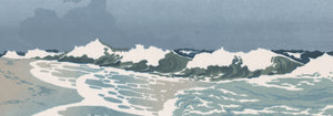
Blue makes curating easier because it can unify mixed imagery across a gallery wall. Start with one dominant piece, then add one or two quieter companions that repeat its temperature without copying its subject. Hokusai’s The Great Wave off Kanagawa (1830) is an obvious anchor: the wave’s blue is not atmospheric but architectural, built from carved contour and foam, almost like typography. Pair it with Kawase Hasui’s Morning at Cape Inubō (1931), where the sea is reduced to bands and gradients, creating a calmer cadence. To keep the set from becoming too nautical, insert a map plate or an abstract composition as a visual pause. Framing finishes also steer the mood: light oak keeps blues breathable, a white mat gives dark inks air, and a slim black frame heightens contrast; options live in Frames.
Blue as ink, dye, pigment, and data
What holds these posters together is not a single era or subject but the way blue carries information. It can read as craft dye, printing ink, mineral pigment, or scientific notation, which is why it fits rooms that mix ceramics, books, and travel objects without looking staged. As vintage wall art, blue often suggests both the sea and the library: a color associated with horizons and with study. That tension between sensation and structure is the collection’s real thread, and it is what makes blue feel steady in everyday decoration.