


- Destroy this mad brute Poster
- Shaw or Irony Poster
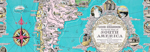
- The good neighbor of South America Poster
- Italy with Vatican City Poster
- Onions Poster
- Radishes Poster
- Carrots Poster
- Les Lalanne Poster
- Punch Boutique Poster
- Dancing couple in the snow Poster
- Judaism and Paganism Standpoint Poster
- Jet Clipper to Hawaii Poster
- Campari Soda Poster
- Bec-Kina Poster
- Kohler Chocolat Poster
- Strawberry Thief Poster
- Matisse Dancing Figures Poster
- Tom Krojer Exhibition Poster Poster
- Berlin Street Scene Poster
- Ernst Kirchner Exhibition Poster
- Tour Eiffel 2 Poster
- Woman Seated Back Poster
- Red Hair Blue Hat Poster
- Park Near Lu Poster
- El Comienzo Poster
- Parler Seul 2 Poster
- The Current Standpoint of the Mahatmas Poster
- Twilight’s Ring Poster
- Parler Seul Poster
- Faun and Nymphe Poster
- The Dream Poster
- Le Concert Poster
- Female Artist Poster
-
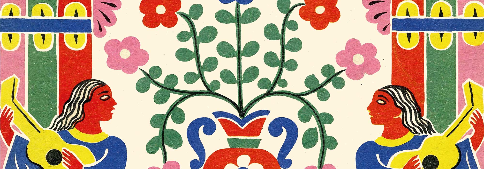
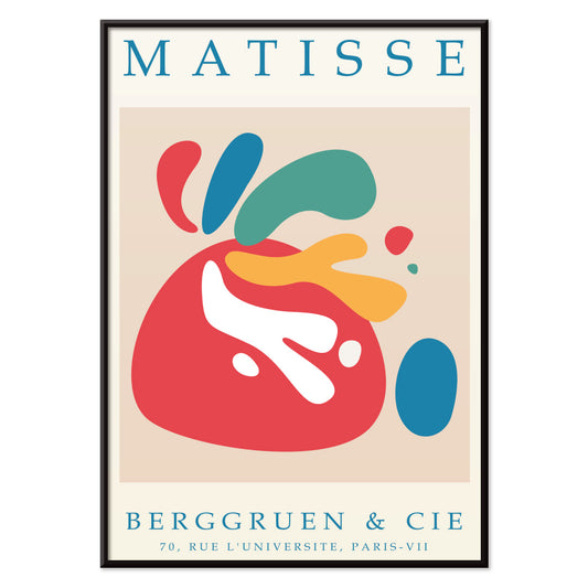
Papiers découpés 4 Poster
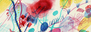
MORYARTY · 1952 · Joyful cut-paper style abstract poster with bold red and blue shapes on beige
Poster from €9 · Framed from €16
Regular price From €6,00Regular price -
Papiers découpés 3 Poster
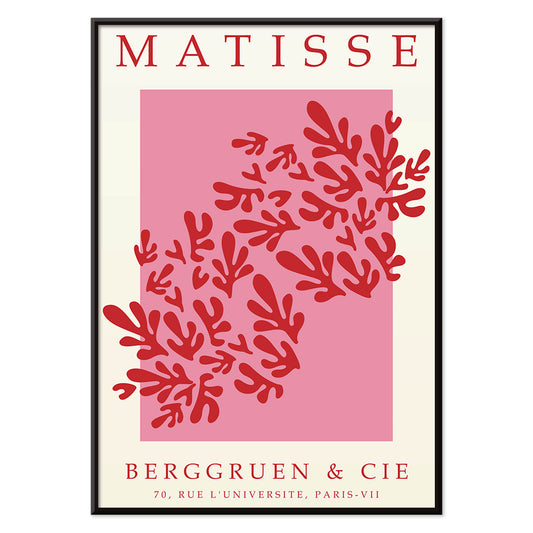
MORYARTY · 1949 · Matisse-inspired poster with bold red leaf shapes on airy white and pink
Poster from €9 · Framed from €16
Regular price From €6,00Regular price -
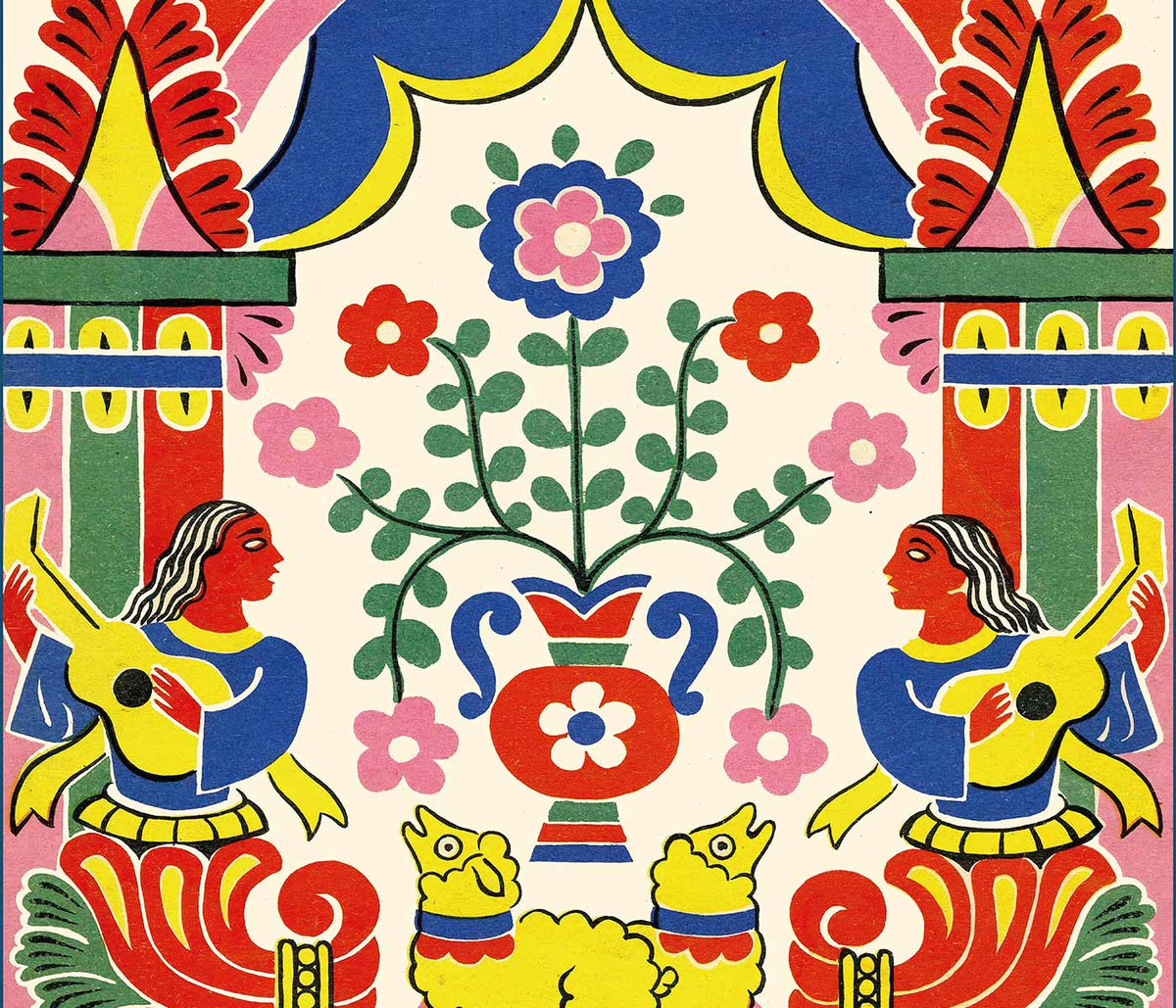
Papiers découpés 2 Poster
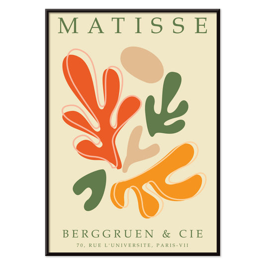
MORYARTY · 2023 · Matisse-inspired abstract poster featuring bold cut-paper shapes in vibrant primary colors
Poster from €9 · Framed from €16
Regular price From €6,00Regular price -
Papiers découpés 1 Poster
MORYARTY · 2021 · Vibrant cut-paper abstract poster with orange and green shapes on warm beige ground
Poster from €9 · Framed from €16
Regular price From €6,00Regular price -
Eat Greens for Health Poster
Hans Schleger · 1943 · Modernist nutrition poster with bold greens and crisp wartime typography
Poster from €9 · Framed from €16
Regular price From €6,00Regular price -
West Point Poster
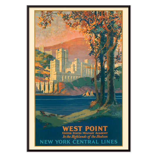
Frank Hazell · 1920 · Scenic Hudson Highlands poster featuring West Point architecture framed by autumn foliage
Poster from €9 · Framed from €16
Regular price From €6,00Regular price -
Noah’s Ark Poster
H. C. Tunison · 1899 · Storybook animals poster with pairs advancing toward a wooden ark under palms
Poster from €9 · Framed from €16
Regular price From €6,00Regular price -
Flower Market - Mumbai Poster
MORYARTY · 2022 · Vibrant water lily poster evoking Mumbai flower market blooms in purple, green, and blue
Poster from €9 · Framed from €16
Regular price From €6,00Regular price -
Flower Market - Kyoto Poster
MORYARTY · 2021 · Vibrant Kyoto flower market poster with stylized blossoms and clean graphic lines
Poster from €9 · Framed from €16
Regular price From €6,00Regular price -
Flower Market - Dehli Poster
MORYARTY · 2023 · Vibrant Delhi flower market poster with layered blooms and a lively graphic mood
Poster from €9 · Framed from €16
Regular price From €6,00Regular price -
Flower Market - Cape Town Poster
MORYARTY · 2013 · Vibrant bird of paradise poster in abstract shapes bringing tropical energy and bold color
Poster from €9 · Framed from €16
Regular price From €6,00Regular price -
Flower Market - Cardiff Poster
MORYARTY · 2010 · Graphic daffodils poster set against deep purple for a bright seasonal statement
Poster from €9 · Framed from €16
Regular price From €6,00Regular price -
Flower Market - Amsterdam 2 Poster
MORYARTY · 2023 · Vintage tulip poster featuring white blooms and green stems on a serene teal background
Poster from €9 · Framed from €16
Regular price From €6,00Regular price -
Flower Market - Seoul 2 Poster
MORYARTY · 2021 · Energetic floral market poster with bold orange field and graphic blooms in pink and purple
Poster from €9 · Framed from €16
Regular price From €6,00Regular price -
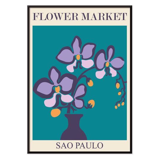
Flower Market - Sao Paulo Poster
MORYARTY · 2017 · Vibrant orchid poster with a clean vase form on deep teal
Poster from €9 · Framed from €16
Regular price From €6,00Regular price -
Flower Market - Rome Poster
MORYARTY · 2019 · Vibrant lily bouquet poster inspired by Roman flower markets in warm pink and orange tones
Poster from €9 · Framed from €16
Regular price From €6,00Regular price -
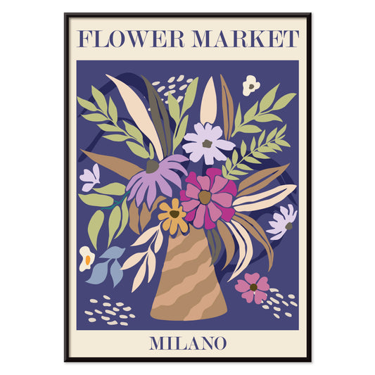
Flower Market - Milano Poster
MORYARTY · 2022 · Colorful floral bouquet poster capturing the lively spirit of a Milan flower market
Poster from €9 · Framed from €16
Regular price From €6,00Regular price -
First international tournée of animation Poster
Paul Showalter · 1970 · Surreal face and geometric poster in cool blue and grey with vivid pink accents
Poster from €9 · Framed from €16
Regular price From €6,00Regular price -
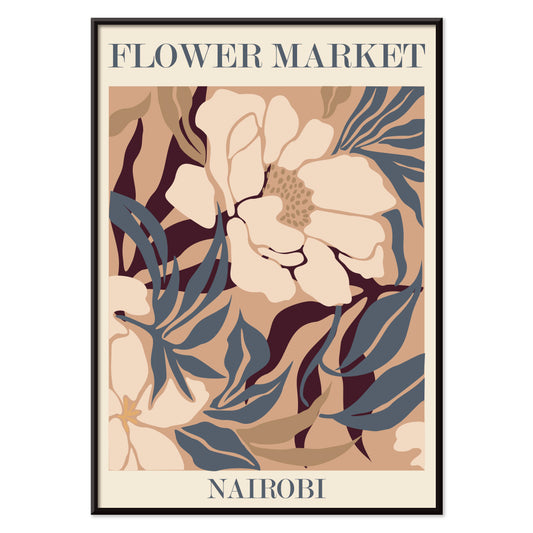
Flower Market - Nairobi Poster
MORYARTY · 2019 · Abstract floral art print in beige, brown, and blue with market energy
Poster from €9 · Framed from €16
Regular price From €6,00Regular price -
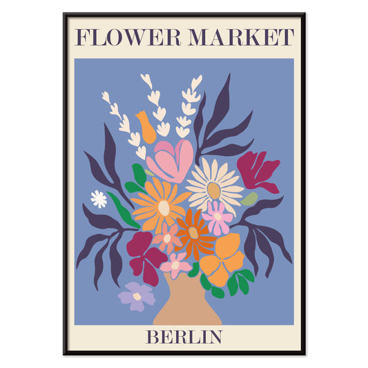
Flower Market - Berlin Poster
MORYARTY · 2019 · Colorful flower bouquet poster with bold Berlin lettering and lively market energy
Poster from €9 · Framed from €16
Regular price From €6,00Regular price -
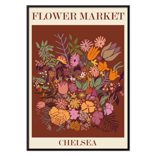
Flower Market - Chelsea Poster
MORYARTY · 2023 · Lively floral market poster with bold lettering and fresh botanical silhouettes
Poster from €9 · Framed from €16
Regular price From €6,00Regular price -
Flower Market - Jamaica Poster
MORYARTY · 2016 · Tropical flower market poster with layered botanicals and warm Caribbean color
Poster from €9 · Framed from €16
Regular price From €6,00Regular price -
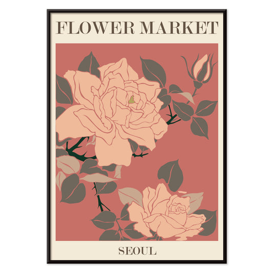
Flower Market - Seoul Poster
MORYARTY · 2021 · Graphic floral poster featuring pink market bouquets and lush green leaves on beige
Poster from €9 · Framed from €16
Regular price From €6,00Regular price -
Flower Market - Tokyo Poster
MORYARTY · 2021 · Vibrant floral poster with bold market blooms, crisp shapes, and fresh green accents
Poster from €9 · Framed from €16
Regular price From €6,00Regular price -
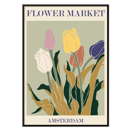
Flower Market - Amsterdam Poster
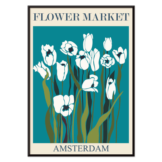
MORYARTY · 2019 · Retro tulip market poster capturing Amsterdam energy with earthy tones and graphic simplicity
Poster from €9 · Framed from €16
Regular price From €6,00Regular price -
Flower Market Columbia Road Poster
MORYARTY · 2017 · Vibrant floral poster featuring a stylized vase and bouquet in bold modern colors
Poster from €9 · Framed from €16
Regular price From €6,00Regular price -
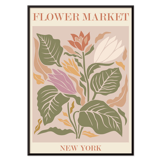
Flower Market New York Poster
MORYARTY · 2019 · Vibrant botanical poster with stylized market blooms and crisp New York lettering on beige
Poster from €9 · Framed from €16
Regular price From €6,00Regular price -
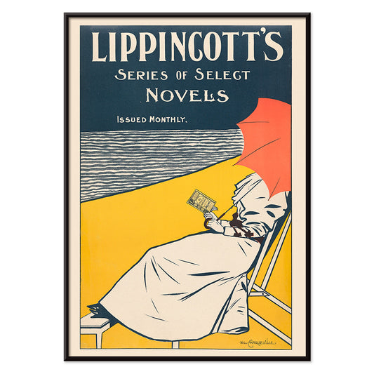
Lippincott Poster
William Carqueville · 1895 · Serene Belle Epoque poster of a woman reading by the water in bold blues
Poster from €9 · Framed from €16
Regular price From €6,00Regular price -
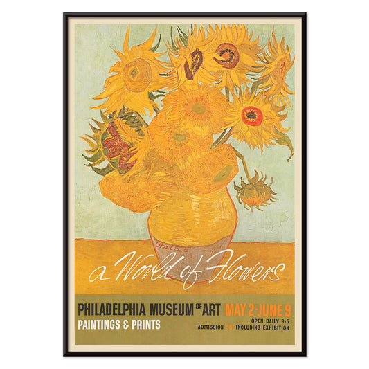
A world of flowers Poster
Unknown artist · 1964 · Cheerful floral poster combining bold petals and leafy shapes in sunny mid-century style
Poster from €9 · Framed from €16
Regular price From €6,00Regular price -
Clear Plate Poster
James Fitton · 1950 · Mid-century food poster with bold plate design and a message about avoiding waste
Poster from €9 · Framed from €16
Regular price From €6,00Regular price -
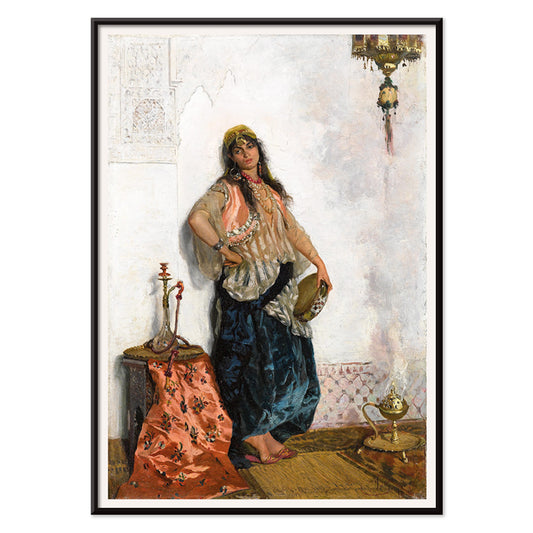
Oriental dancer Poster
Cesare Biseo · 1876 · Lyrical Oriental dancer poster with intricate textiles and a quiet hookah-side pause
Poster from €9 · Framed from €16
Regular price From €6,00Regular price -
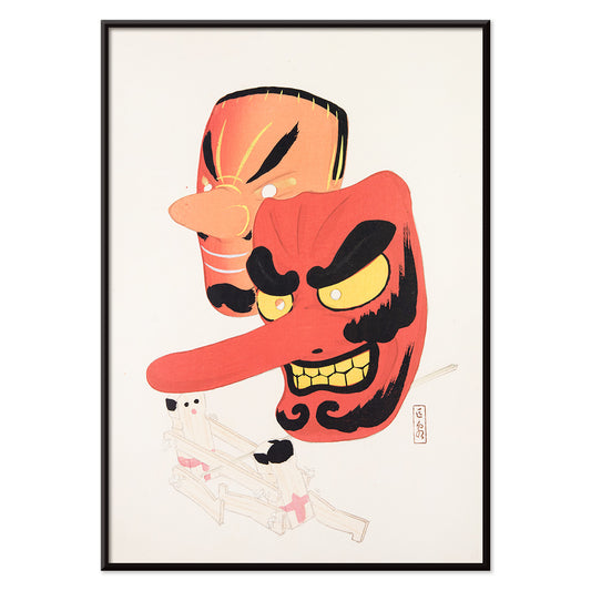
Japanese Toys 1 Poster
Kawasaki Kyosen · 1919 · Playful festival mask vintage print with bold lines and cheerful folk character
Poster from €9 · Framed from €16
Regular price From €6,00Regular price -
After visiting the bathhouse Poster
Kotondo Torii · 1933 · Refined shin hanga poster of a kimonoed woman holding an umbrella in gentle rain
Poster from €9 · Framed from €16
Regular price From €6,00Regular price -
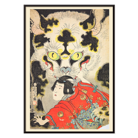
Azuma nishikie Poster
Unknown artist · 1860 · Striking ukiyo-e print of a kimono-clad figure confronting a dramatic tiger head
Poster from €9 · Framed from €16
Regular price From €6,00Regular price -
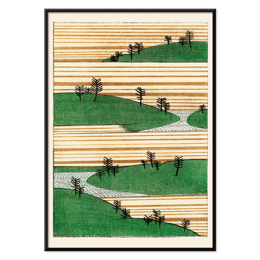
Green Landscape Poster
Watanabe Seitei · 1900 · Tranquil Japanese landscape art print with layered green hills and spacious, calming atmosphere
Poster from €9 · Framed from €16
Regular price From €6,00Regular price -
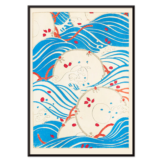
Bijutsukai 175 Poster
Korin Furuya · 1901 · Japanese wave poster featuring bold blue curves and delicate red accents
Poster from €9 · Framed from €16
Regular price From €6,00Regular price


36/1512 items
- Papiers découpés 4 Poster
- Papiers découpés 3 Poster
- Papiers découpés 2 Poster
- Papiers découpés 1 Poster
- Eat Greens for Health Poster
- Noah’s Ark Poster
- Flower Market - Mumbai Poster
- Flower Market - Kyoto Poster
- Flower Market - Dehli Poster
- Flower Market - Cape Town Poster
- Flower Market - Cardiff Poster
- Flower Market - Amsterdam 2 Poster
- Flower Market - Seoul 2 Poster
- Flower Market - Sao Paulo Poster
- Flower Market - Rome Poster
- Flower Market - Milano Poster
- First international tournée of animation Poster
- Flower Market - Nairobi Poster
- Flower Market - Berlin Poster
- Flower Market - Chelsea Poster
- Flower Market - Jamaica Poster
- Flower Market - Seoul Poster
- Flower Market - Tokyo Poster
- Flower Market - Amsterdam Poster
- Flower Market Columbia Road Poster
- Flower Market New York Poster
- Japanese Toys 1 Poster
- After visiting the bathhouse Poster
- Green Landscape Poster
- Bijutsukai 175 Poster
Why vertical posters change a room
A vertical poster behaves like an architectural element: it draws the eye upward, narrows visual noise, and gives small rooms a clearer sense of proportion. Portrait-oriented formats have long been used for theatre bills, book covers, and street notices, where the tall rectangle supports a paced, top-to-bottom read. As wall art, that same structure can steady busy interiors and make circulation spaces feel composed. It is a useful format for entryways, corridors, and the slim wall between window and shelving, where a horizontal print would feel interrupted.
Graphic heritage and what it teaches the eye
The vertical format grew up in public view. Travel announcements, cinema programs, and commercial lithography trained designers to manage hierarchy with precision: headline, image, fine print, all balanced by margins. The best vintage posters carry this discipline into today, whether they are typographic or purely pictorial. Flat colour fields and crisp outlines help a composition read from a distance, while paper texture and ink density reward a closer look. The same logic links naturally to Bauhaus clarity, to the reduced forms of Minimalist design, and to the strong tonal scaffolding found in Black & White imagery.
Placing portrait wall art room by room
In living rooms, a tall print works well beside a bookcase, cabinet, or floor lamp, where it echoes the verticals already present in furniture. In bedrooms, portrait posters settle comfortably on the narrow strip between wardrobe and door, or as a single accent offset from the bed rather than centered over it. Kitchens and dining nooks often suit graphic vintage pieces, especially label-inspired layouts from Advertising, while quieter botanical studies from Botanical can soften hard surfaces like tile and steel. For colour, treat the poster as your accent note: pull one ink colour into linens or ceramics, then keep the surrounding wall and frame finishes restrained so the rectangle reads cleanly.
Curating pairs, framing, and gallery wall rhythm
Vertical prints are easiest to live with when curated in pairs: one image-dense sheet beside a calmer field so the wall alternates between detail and pause. A third element can widen the composition, such as a horizontal counterpoint from Landscape, but keep the spacing consistent so the arrangement feels deliberate. Thin black frames sharpen graphic designs; oak or walnut adds warmth to archival imagery, and coordinated options sit in Frames. Use a narrow mat to give darker prints breathing room, especially in smaller formats, and hang by a shared centerline at eye level while letting top edges step subtly to preserve the vertical rhythm.
The calm logic of a tall rectangle
Format-led collections stay flexible: portrait orientation can hold architectural photos, symbolic studies, abstraction, or vintage typography without forcing a single mood. What unites these posters is the way the tall crop edits a scene, keeping gesture and negative space in balance. When home decor starts to feel crowded, one considered vertical art print can restore order more effectively than a cluster. Treated as a single, quiet opening on the wall, it lets the room breathe while still offering a clear focal point.