


- Destroy this mad brute Poster
- Shaw oder Ironie Poster
- Les Lalanne Poster
- Punch Boutique Poster
- Standpunkt Judentum und Heidentum Poster
- Jet Clipper nach Hawaii Poster
- Campari Soda Poster
- Bec-Kina Poster
- Berliner Straßenszene Poster
- Ernst Kirchner Ausstellung Poster
- Eiffelturm Poster
- Sitzende Frau von hinten Poster
- Park Near Lu Poster
- El Comienzo Poster
- Parler Seul 2 Poster
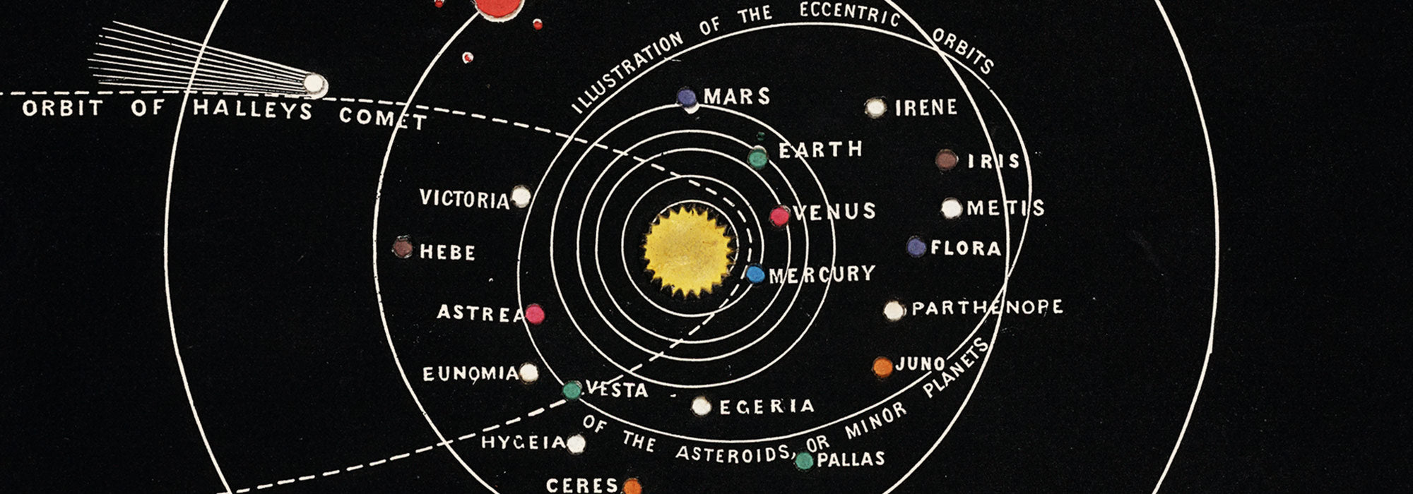
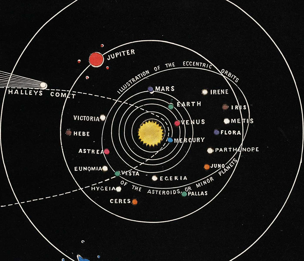
- The Current Standpoint of the Mahatmas Poster
- Ring der Dämmerung Poster
- Parler Seul Poster
- The Dream Poster
- Le Concert Poster
- Vogel, der eine Wolke durchquert Poster
- Weibliche Künstlerin Poster
- Revenge of the Pink Panther Poster
- Frau und Vogel in der Nacht Poster
- Riley Blaze Poster
- Almanaque Poster
- Bauhaus 20 Poster
- Bauhaus 21 Poster
- Mehr Obst essen Poster
- Blauer japanischer Kranich Poster
- Snoopy Come Home Poster
- Nach London mit Jet Clipper Poster
- La Paresse Poster
- Xerez Pedro Domecq Poster
- Balsam Aperitif Poster
- Crans Poster
-
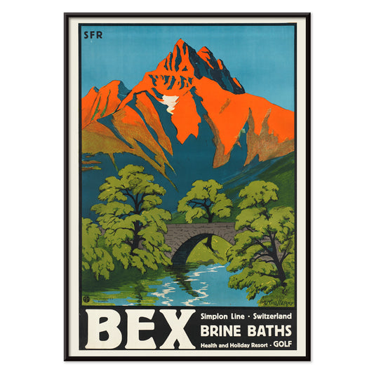
Bex Brine Baths Poster
Aime-Felix Nicollerat · 1896 · Alpenkurort-Poster mit steinerner Brücke, reißendem Fluss und alpinen Gipfeln
Poster ab €9 · Gerahmt ab €16
Normaler Preis Von €6,00Normaler Preis -
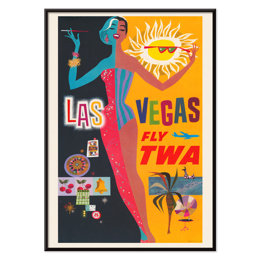
Las Vegas – Fly TWA Poster
David Klein · 1962 · Lebendiges Las Vegas Poster mit Showgirl, Neonreklame und TWA‑Flair
Poster ab €9 · Gerahmt ab €16
Normaler Preis Von €6,00Normaler Preis -
Osen Poster
Komura Settai · 1934 · Ruhige Regenszene als Poster mit Figuren unter Wagasa-Schirmen in sparsamen Tuschetönen
Poster ab €9 · Gerahmt ab €16
Normaler Preis Von €6,00Normaler Preis -
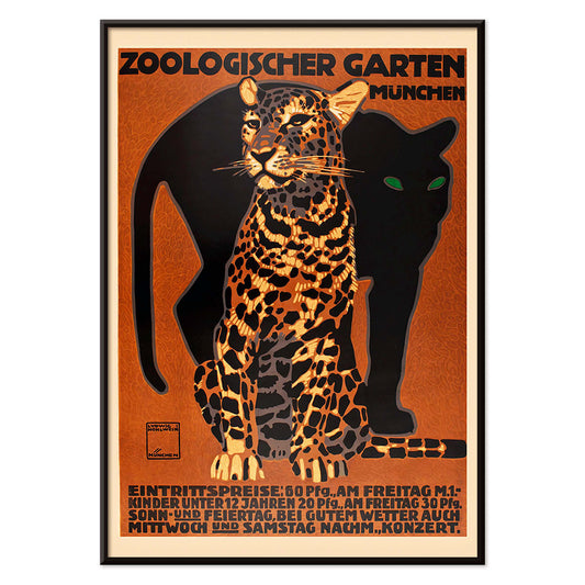
Zoologischer Garten Poster
Ludwig Hohlwein · 1912 · Markantes Münchner Zoo-Poster mit kraftvollem gestreiften Großkatzenmotiv und klarer Typografie
Poster ab €9 · Gerahmt ab €16
Normaler Preis Von €6,00Normaler Preis -
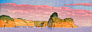
Souvenirs meiner Reisen Poster
Kawase Hasui · 1940 · Ruhiges Küstenposter mit einer Höhle in dunklen Klippen über heller Brandung
Poster ab €9 · Gerahmt ab €16
Normaler Preis Von €6,00Normaler Preis -
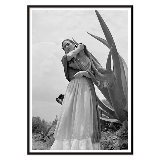
Frida Kahlo neben einer Agave Poster
Toni Frissell · 1937 · Ikonisches Schwarzweiß-Poster von Frida Kahlo neben einer markanten Agavenpflanze Fotografie
Poster ab €9 · Gerahmt ab €16
Normaler Preis Von €6,00Normaler Preis -
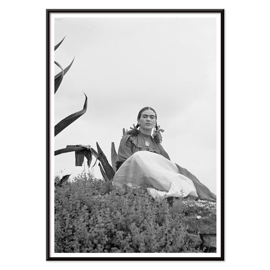
Frida Kahlo sitzend neben einer Agave Poster
Toni Frissell · 1937 · Auffälliges schwarz-weiß Poster, fotografisches Porträt von Frida Kahlo neben einer Agave
Poster ab €9 · Gerahmt ab €16
Normaler Preis Von €6,00Normaler Preis -
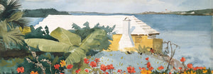
Marquess of Tavistock Poster
Toni Frissell · 1955 · Elegantes Schwarzweiß-Poster mit einem Paar, das den Resort-Glamour von Bermuda der 1950er Jahre beschwört
Poster ab €9 · Gerahmt ab €16
Normaler Preis Von €6,00Normaler Preis -
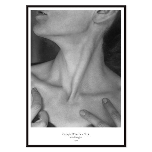
Georgia O'Keeffe Hals Poster
Alfred Stieglitz · 1921 · Intimer Schwarz-Weiß-Kunstdruck, der Hals und Kiefer zur skulpturalen Abstraktion zuschneidet
Poster ab €9 · Gerahmt ab €16
Normaler Preis Von €6,00Normaler Preis -
Frida Kahlo neben Agave Poster
Toni Frissell · 1937 · Ikonisches schwarz-weiß Poster von Frida Kahlo neben markanter Agave-Silhouette
Poster ab €9 · Gerahmt ab €16
Normaler Preis Von €6,00Normaler Preis -
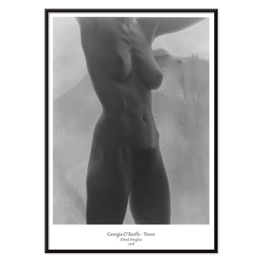
Georgia O'Keeffe Torso Poster
Alfred Stieglitz · 1918 · Beschnittener schwarz-weißer Torso-Kunstdruck im sanften Licht mit feiner modernistischer Intimität
Poster ab €9 · Gerahmt ab €16
Normaler Preis Von €6,00Normaler Preis -
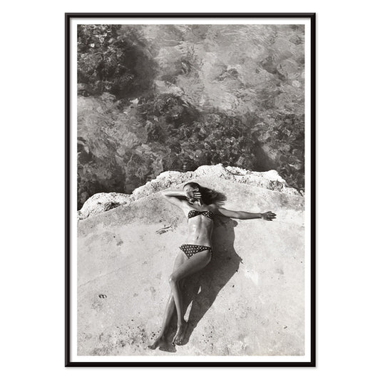
Nickerson Paine im Bikini Poster
Toni Frissell · 1971 · Schwarzweißes Bikini-Poster mit sonnendurchfluteter Küstenkomposition, klarem Kontrast und eleganter editorialer Ästhetik
Poster ab €9 · Gerahmt ab €16
Normaler Preis Von €6,00Normaler Preis -
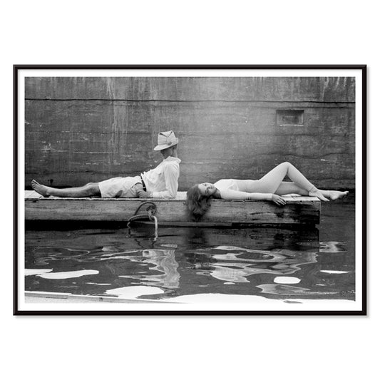
Modefotomodell am Bootsrand Poster
Toni Frissell · 1946 · Elegantes Schwarz-Weiß-Poster mit Model auf dem schmalen Bootsrand an der Küste
Poster ab €9 · Gerahmt ab €16
Normaler Preis Von €6,00Normaler Preis -
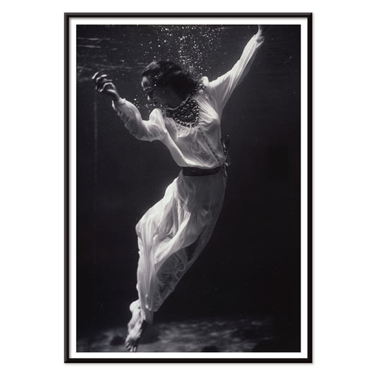
Modell unter Wasser Poster
Toni Frissell · 1939 · Surrealer Unterwasser-Kunstdruck mit schwebendem Modell und leuchtender Ästhetik
Poster ab €9 · Gerahmt ab €16
Normaler Preis Von €6,00Normaler Preis -
Weeki Wachee Quelle Poster
Toni Frissell · 1947 · Traumhafter Unterwasserposter mit schwebender Figur in leuchtendem Schwarz-Weiss und zeitloser Eleganz
Poster ab €9 · Gerahmt ab €16
Normaler Preis Von €6,00Normaler Preis -
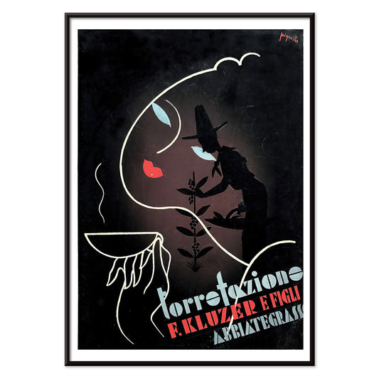
Torrefazione F.Kluzer Poster
Carlo Piquillo Pandolfi · 1930 · Italienisches Art-déco-Poster mit prägnanter Tassen-Silhouette und geometrischen Farbflächen
Poster ab €9 · Gerahmt ab €16
Normaler Preis Von €6,00Normaler Preis -
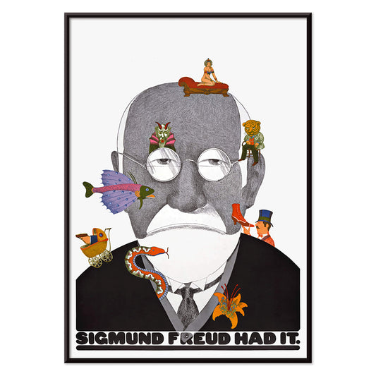
Sigmund Freud hat's Poster
Seymour Chwast · 1970 · witziges Freud-Poster mit Pop-Typografie und surrealen Symbolen in Grün und Orange
Poster ab €9 · Gerahmt ab €16
Normaler Preis Von €6,00Normaler Preis -
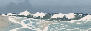
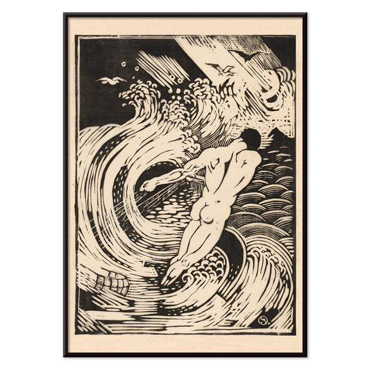
Fischer Poster
Henri van der Stok · 1900 · Dramatisches schwarz-weiß Poster eines nackten Tauchers, der durch stürmische Wellen schneidet
Poster ab €9 · Gerahmt ab €16
Normaler Preis Von €6,00Normaler Preis -
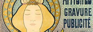
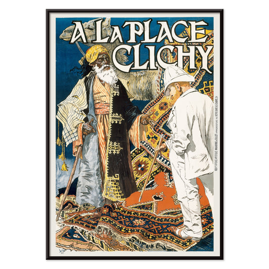
Place Clichy Poster
Eugène Grasset · 1891 · Jugendstil-Poster aus Paris mit eleganter Frau und kräftiger Blau-Orange-Palette
Poster ab €9 · Gerahmt ab €16
Normaler Preis Von €6,00Normaler Preis -
Jäger Poster
Henri van der Stok · 1880 · Ausdrucksstarkes Schwarzweiß-Poster mit dynamischer Jägerfigur zwischen dichtem Laub
Poster ab €9 · Gerahmt ab €16
Normaler Preis Von €6,00Normaler Preis -
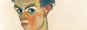
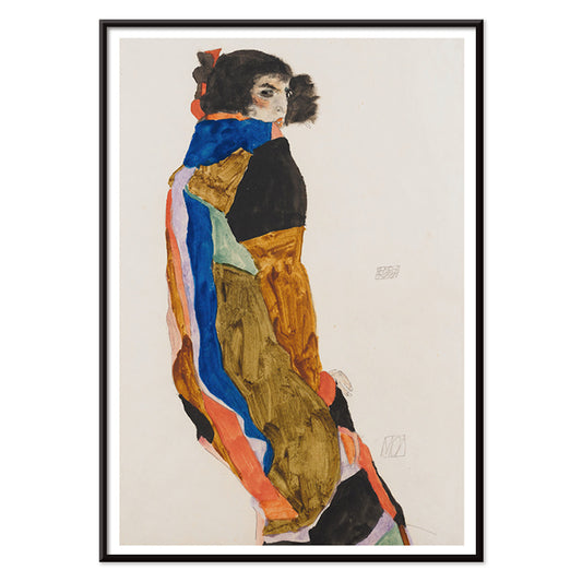
Schiele-Ausstellung in der Galerie Arnot Poster
Egon Schiele · 1915 · Expressionistisches Ausstellungs-Poster mit kantiger Figur und kräftigem Orange
Poster ab €9 · Gerahmt ab €16
Normaler Preis Von €6,00Normaler Preis -
Bootszug Poster
Charles W. Holmes · 1925 · Dynamisches Art-déco-Poster mit Zug und Ozeandampfer in kräftigen Blau- und Gelbtönen
Poster ab €9 · Gerahmt ab €16
Normaler Preis Von €6,00Normaler Preis -
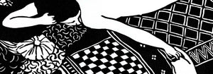
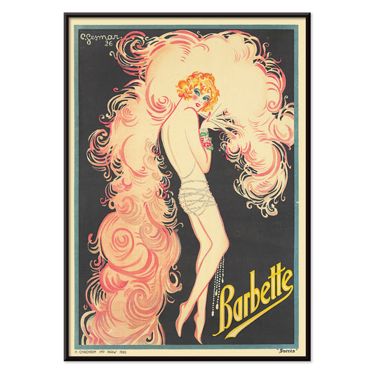
Barbette Poster
Charles Gesmar · 1926 · Glamouröses Cabaret-Poster mit Barbette in wirbelnden pinken Federn und gelben Akzenten
Poster ab €9 · Gerahmt ab €16
Normaler Preis Von €6,00Normaler Preis -
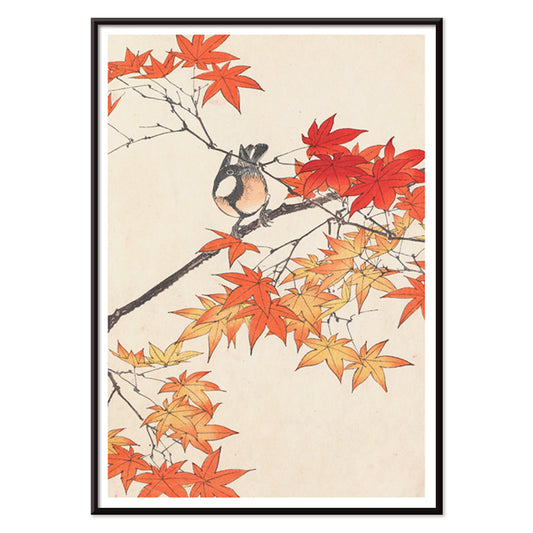
Keinen Kachō Gafu Poster
Imao Keinen · 1892 · Zarter Kunstdruck mit Vogel und herbstlichen Blättern in warmen Rot- und Beigetönen
Poster ab €9 · Gerahmt ab €16
Normaler Preis Von €6,00Normaler Preis -
Moa Poster
Egon Schiele · 1911 · Intimer Kunstdruck einer Frau in gemusterter Robe, ruhig und in sich gekehrt
Poster ab €9 · Gerahmt ab €16
Normaler Preis Von €6,00Normaler Preis -
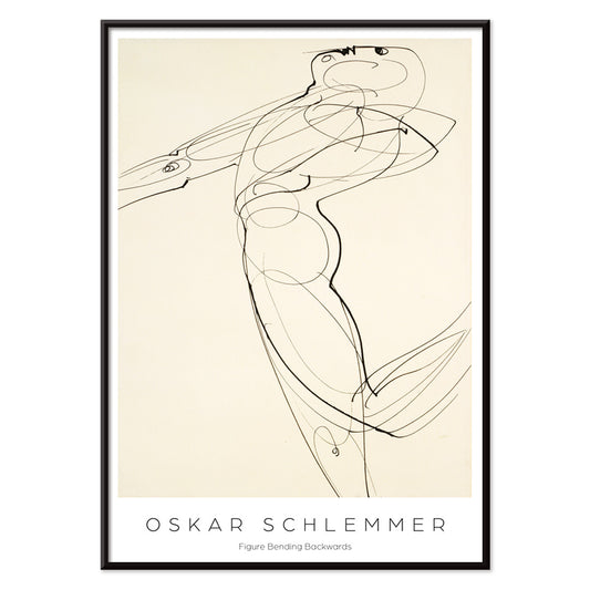
Rückwärtsgebeugte Figur Poster
Oskar Schlemmer · 1931 · Bauhaus-Kunstdruck einer stilisierten Figur mit klarer schwarzer Linienführung und reduzierter Geometrie
Poster ab €9 · Gerahmt ab €16
Normaler Preis Von €6,00Normaler Preis -
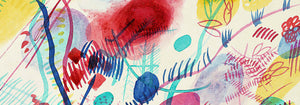
Geometrische und wellenförmige Linien Poster
Myriam Thyes · 2014 · Dynamisches geometrisches Poster mit Wellenlinien und markanter schwarzer Struktur auf warmem Beige
Poster ab €9 · Gerahmt ab €16
Normaler Preis Von €6,00Normaler Preis -
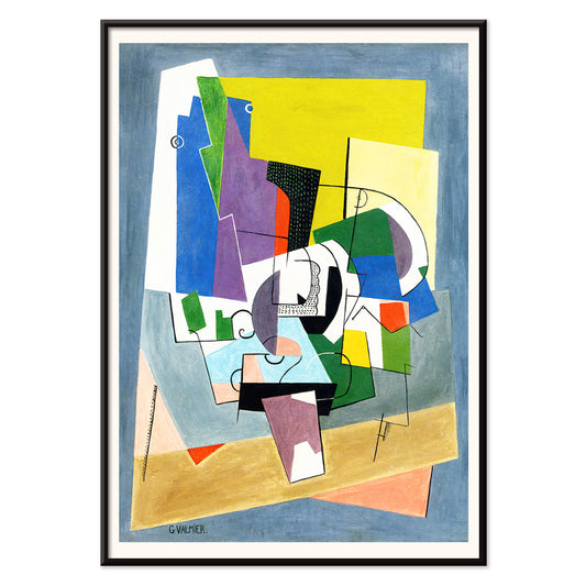
Komposition Poster
Georges Valmier · 1921 · Lebhafter geometrischer Kunstdruck mit ausgewogenem Spiel aus gebogenen und eckigen Formen in Blau, Gelb und Grün
Poster ab €9 · Gerahmt ab €16
Normaler Preis Von €6,00Normaler Preis -
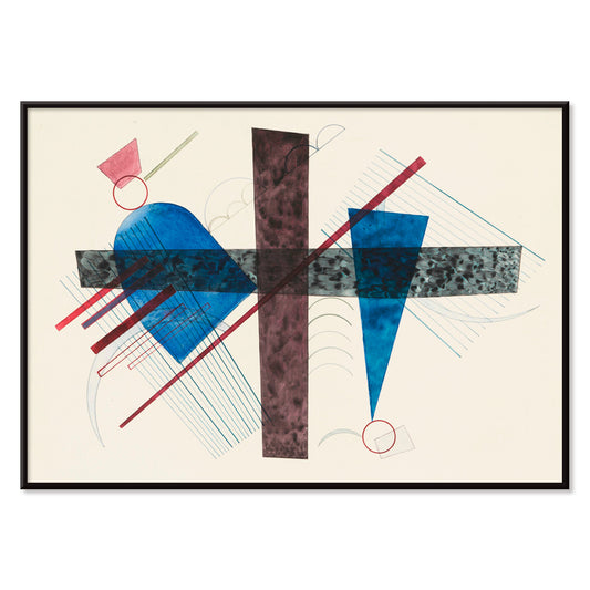
Berührung Poster
Wassily Kandinsky · 1924 · Dynamisches abstraktes Poster mit überlappenden Kreisen, markanten Linien und kräftigen Rot- und Orange-Akzenten
Poster ab €9 · Gerahmt ab €16
Normaler Preis Von €6,00Normaler Preis -
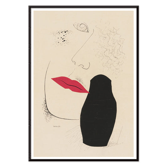
Desire Poster
Mikuláš Galanda · 1927 · Modernistisches Poster mit schattiertem Profil und leuchtend roten Lippen auf Beige
Poster ab €9 · Gerahmt ab €16
Normaler Preis Von €6,00Normaler Preis -
Blau in Rund und Spitz Poster
Wassily Kandinsky · 1933 · Abstrakter geometrischer Kunstdruck mit blauen Kreisen, scharfen Winkeln und roten Akzenten
Poster ab €9 · Gerahmt ab €16
Normaler Preis Von €6,00Normaler Preis -
Zartes Gemüt Poster
Wassily Kandinsky · 1925 · Geometrischer Kunstdruck mit klaren schwarzen Linien, gelben Akzenten und zarten lila Formen
Poster ab €9 · Gerahmt ab €16
Normaler Preis Von €6,00Normaler Preis -
Kleine Wärme Poster
Wassily Kandinsky · 1928 · Warmes abstraktes Poster mit schwebenden Kreisen und scharfen schwarzen Linien in Rot und Gelb
Poster ab €9 · Gerahmt ab €16
Normaler Preis Von €6,00Normaler Preis -
Deutliche Verbindung Poster
Wassily Kandinsky · 1925 · Geometrischer Kunstdruck mit Kreisen und Winkeln, lebendige Primär- und Violettakzente
Poster ab €9 · Gerahmt ab €16
Normaler Preis Von €6,00Normaler Preis -
Ohne Titel Poster
Wassily Kandinsky · 1930 · Abstrakter geometrischer Kunstdruck mit schwebenden Linien und Kreisen auf warmem Beige
Poster ab €9 · Gerahmt ab €16
Normaler Preis Von €6,00Normaler Preis -
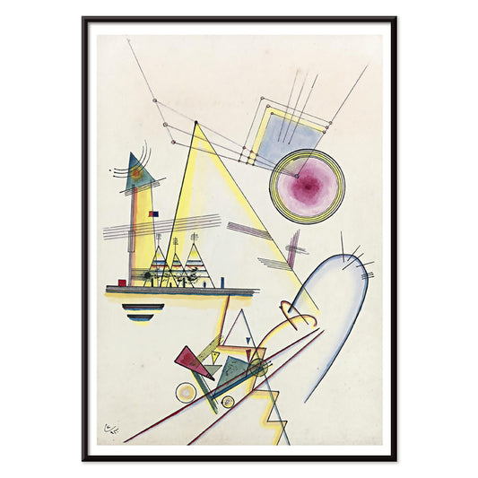
Lyrisches Poster
Wassily Kandinsky · 1911 · Lyrischer abstrakter Kunstdruck mit energetischen schwarzen Linien und kräftigen rot blau gelb Akzenten
Poster ab €9 · Gerahmt ab €16
Normaler Preis Von €6,00Normaler Preis


36/819 items
- Bex Brine Baths Poster
- Las Vegas – Fly TWA Poster
- Osen Poster
- Zoologischer Garten Poster
- Souvenirs meiner Reisen Poster
- Frida Kahlo neben einer Agave Poster
- Frida Kahlo sitzend neben einer Agave Poster
- Marquess of Tavistock Poster
- Frida Kahlo neben Agave Poster
- Nickerson Paine im Bikini Poster
- Modefotomodell am Bootsrand Poster
- Modell unter Wasser Poster
- Weeki Wachee Quelle Poster
- Sigmund Freud hat's Poster
- Schiele-Ausstellung in der Galerie Arnot Poster
- Bootszug Poster
- Barbette Poster
- Moa Poster
- Geometrische und wellenförmige Linien Poster
- Komposition Poster
- Kleine Wärme Poster
- Lyrisches Poster
Schwarz als Struktur im Vintage-Poster-Design
Schwarz wirkt oft weniger wie eine Farbe und mehr wie ein Gerüst. Im Vintage-Poster-Design schärft es Kanten, beruhigt Ornamentik und schafft Atemraum für Farbfelder. Diese Schwarz-Sammlung versammelt Poster, in denen Dunkelheit als Tinte, Silhouette, Nachthimmel oder typografische Rückgratlinie erscheint, ein redaktioneller Filter statt einer monochromen Regel. Es ist ein nützlicher Faden für Wandkunst und Wanddekoration, besonders wenn Sie wollen, dass ein Raum komponiert wirkt, ohne streng zu sein. Kombinieren Sie diese Drucke mit Materialien, die bereits dunkle Noten tragen, etwa Eisenbeschlägen, einer matten Lampenbasis oder einem kohlegrauen Textil, und die übrige Farbpalette wirkt bewusst gesetzt.
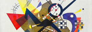
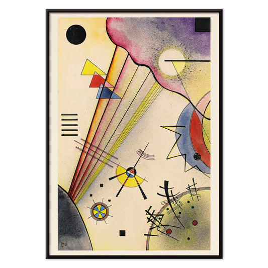
Wie Künstler Schwarz nutzten, um das Bild zusammenzuhalten
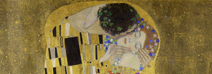
Im The Kiss (1907–1908) von Gustav Klimt wirkt Schwarz wie Samt hinter dem Gold, lässt die Oberfläche von innen leuchten und erhält die Lesbarkeit des Ornaments. Tournée du Chat Noir (1896) von Théophile Alexandre Steinlen verwandelt ein flaches Mitternachtsfeld in Theater und zeigt, wie Silhouette Charakter und Humor mit nahezu keiner Modellierung transportieren kann. Modernistische Balance zeigt sich in Circles in a Circle (1923) von Wassily Kandinsky, wo schwarze Linien als Gerüst für Farbe und Bewegung dienen. Selbst werbliche Bravour profitiert von Dunkelheit: Vermouth Martini (1920) von Leonetto Cappiello nutzt tiefen Schatten, damit Zitrusgelb und Hauttöne plastisch hervortreten, ein klassischer Postertrick für sofortige Lesbarkeit.
Platzieren von schwarz-akzentuierter Wandkunst in der Raumgestaltung
Weil Schwarz als Struktur gelesen wird, eignen sich diese Poster für Räume, die von visueller Ordnung profitieren: Eingangsbereiche, Küchen und Arbeitsecken. Vor hellen Wänden wirken schwarz-akzentuierte Drucke präzise und architektonisch; vor gesättigten Farbanstrichen erzeugen sie Spannung und Tiefe. Im Schlafzimmer dämpft eine dunkle Kontur ein unruhiges Farbschema, im Esszimmer fungiert sie wie eine maßgeschneiderte Jacke und gibt Kerzenlicht und Keramik klare Bühne. Für starke Kontraste siehe Schwarz-Weiß; für zurückgenommene Kompositionen Minimalistisch. Wer historische Grafik und Beschilderungsenergie bevorzugt, findet in Werbung kräftige Typen und dramatisches Figuren-Grund-Spiel.
Kuratorische Kombinationen, Motive und Rahmen
An einer gemischten Galeriewand lassen Sie Schwarz zur wiederkehrenden Note werden: ein grafisches Poster, eine figurative Platte, ein abstrakter Druck. Ein Tierblatt wie Tiger’s Head (1911) von Abbott Handerson Thayer bringt dichte Pinselarbeit und schattiertes Fell, das sich natürlich zu Messing, Leder und dunklem Holz fügt. Für typografische Disziplin und Maß halten Sie Geometrie aus Bauhaus dazu; für natürliche Motive ergänzt Tiere die Bildsprache und lässt schwarze Linien wiederkehren. Wünschen Sie ein symbolischeres Register, führt Esoterisch tarotähnliche Ränder, Sterne und Diagramme ein, die wissenschaftliche Linienkultur spiegeln. Beim Rahmen kommt es auf Leichtigkeit an: schwarzer Eschenholzrahmen oder dünnes Walnussfurnier spiegeln die Tinte, ohne den Raum zu beschweren, während eine großzügige weiße Passepartout Luft um filigrane Konturen und kleine Schriftzüge schafft.
Ein flexibler dunkler Akzent
Schwarze Details bleiben oft in Erinnerung: die Kontur einer Katze, ein modernistisches Gitter, der dünne Rand um ein Etikett. Behandeln Sie diese Kollektion als Werkzeug der Wanddekoration, wählen Sie einen Vintage-Druck, der einen Raum verankert, und lassen Sie Farbe, Textur und Licht mit der Zeit darum kreisen. Wenn Schwarz als Schlussnote statt als plakative Aussage verwendet wird, wirken Poster weniger nostalgisch und mehr wie klarsichtige Gestaltung.