


- Shaw or Irony Poster
- Carrots Poster
- Les Lalanne Poster
- Jet Clipper to Hawaii Poster
- Kohler Chocolat Poster
- Tom Krojer Exhibition Poster Poster
- Berlin Street Scene Poster
- Park Near Lu Poster
- Parler Seul 2 Poster
- Faun and Nymphe Poster
- The Dream Poster
- Le Concert Poster
- Female Artist Poster
- Revenge of the Pink Panther Poster
- Almanaque Poster
- Bauhaus 21 Poster
- The Jefferson Airplane Poster
- Butter Poster
- Pacific Vibrations Poster
- Continental Hawaii Airline Poster
- Sherlock Holmes Poster
- Beer and Cigarette Poster
- Mexican Art & Life 4 Poster
- Mexican Art & Life 3 Poster
- Zug Schleife Poster
- 25th of April Bridge Poster
- Joyful Mountain Poster
- Colorations variées de la Lune Poster
- Le Floral Poster
- Tropical Flowers II Poster
- Flower Market Valencia Poster
- Morning at Dotonbori Poster
- Flower Market Lisbon Poster
- Flower Market Barcelona Poster
- British Overseas Airways Poster
- Orange cut outs Poster
-
The Roasted Planet Poster
NASA · 2021 · Dramatic exoplanet poster showing a scorched world glowing beside a distant star
Poster from €9 · Framed from €16
Regular price From €6,00Regular price -
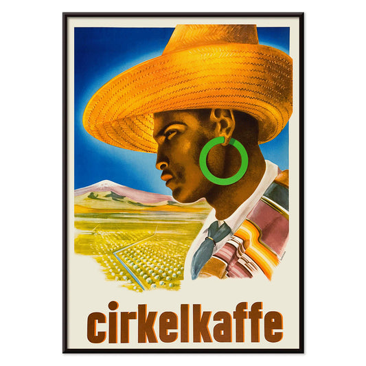
Cirkelkaffe Poster
J.Olséns · 1945 · Graphic coffee poster featuring a wide-brimmed hat figure before green countryside
Poster from €9 · Framed from €16
Regular price From €6,00Regular price -
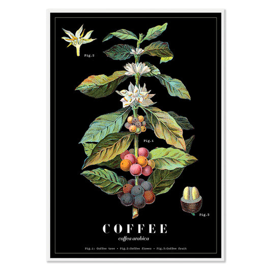
Coffea Arabica 2 Poster
Davis, Sacker & Perkins · 1885 · Lush coffee plant botanical print with white blossoms and ripening red berries
Poster from €9 · Framed from €16
Regular price From €6,00Regular price -
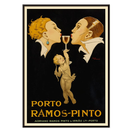
Porto Ramos-Pinto Poster
René Vincent · 1925 · Art Deco poster of a couple about to kiss as a cherub offers port wine
Poster from €9 · Framed from €16
Regular price From €6,00Regular price -
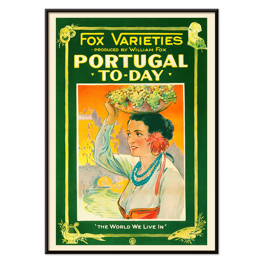
Portugal Today Poster
Unknown artist · 1927 · Colorful Portugal travel poster featuring a traditional woman bearing a brimming fruit basket
Poster from €9 · Framed from €16
Regular price From €6,00Regular price -
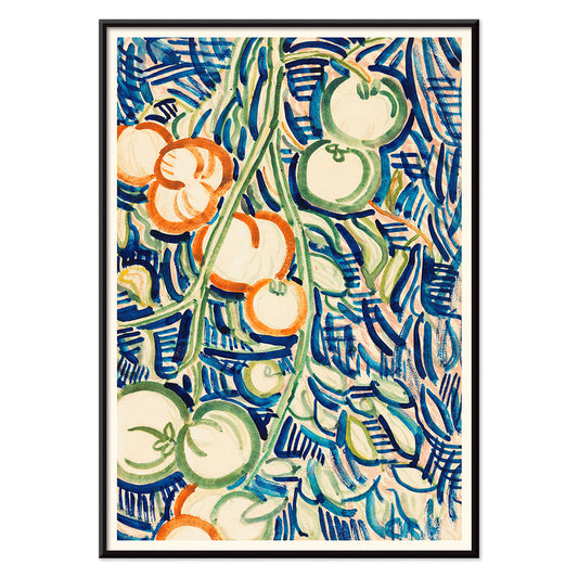
Red and green tomatoes Poster
Christian Rohlfs · 1906 · Expressive still life art print of red and green tomatoes with modern color tension
Poster from €9 · Framed from €16
Regular price From €6,00Regular price -
Yachigusa Pl.06 Poster
Seikō Ueno · 1902 · Swirling orange kimono pattern vintage print with rhythmic curves and crisp negative space
Poster from €9 · Framed from €16
Regular price From €6,00Regular price -
Exotic butterflies Pl.093 Poster
Otto Staudinger · 1888 · Detailed butterfly print featuring jewel toned wings arranged like a collectors plate
Poster from €9 · Framed from €16
Regular price From €6,00Regular price -
Exotic butterflies Pl.097 Poster
Otto Staudinger · 1888 · Detailed butterfly scientific print arranged as a specimen plate on warm beige
Poster from €9 · Framed from €16
Regular price From €6,00Regular price -
Exotic butterflies Pl.021 Poster
Otto Staudinger · 1888 · Detailed butterfly print arranged as a specimen plate with delicate naturalist coloring
Poster from €9 · Framed from €16
Regular price From €6,00Regular price -
Flares of Fury Poster
NASA · 2012 · Explosive solar-flare poster with fiery arcs around a glowing star in deep space
Poster from €9 · Framed from €16
Regular price From €6,00Regular price -
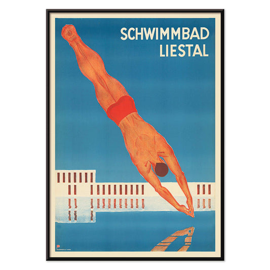
Schwimmbad Liestal Poster
Unknown artist · 1934 · Modernist swimming pool poster with bold red diver above deep blue water
Poster from €9 · Framed from €16
Regular price From €6,00Regular price -
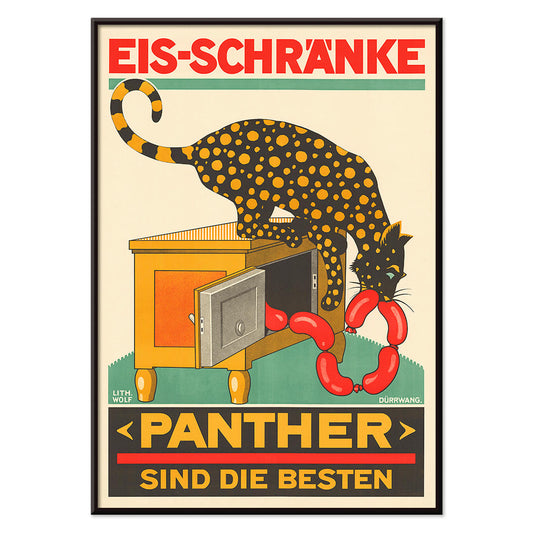
Panther Poster
Unknown artist · 1900 · Whimsical panther poster raiding an icebox with sausages in classic Swiss advertising style
Poster from €9 · Framed from €16
Regular price From €6,00Regular price -
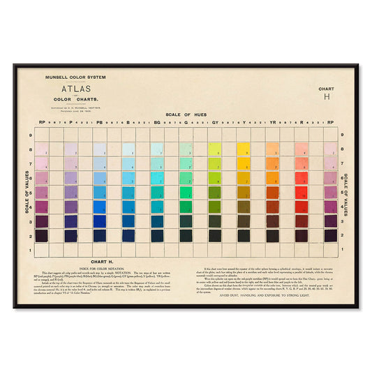
Atlas of the Munsell color system Poster
Albert Henry Munsell · 1915 · Iconic color system poster mapping hues, value, and chroma in a tidy chart
Poster from €9 · Framed from €16
Regular price From €6,00Regular price -
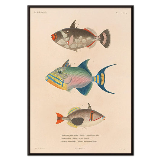
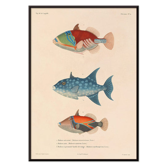
Voyage autour du monde 16 Poster
Louis-Isidore Duperrey · 1825 · Hand-colored fish scientific print with crisp linework and lively aquatic tones
Poster from €9 · Framed from €16
Regular price From €6,00Regular price -
Voyage autour du monde 17 Poster
Louis-Isidore Duperrey · 1825 · Detailed scientific print of Pacific fish studies with crisp linework and soft hand-coloring
Poster from €9 · Framed from €16
Regular price From €6,00Regular price -
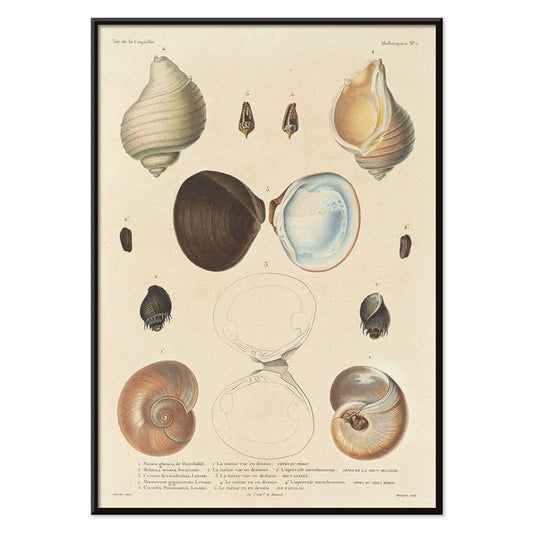
Voyage autour du monde 56 Poster
Louis-Isidore Duperrey · 1825 · Delicate seashell print arranged as a scientific plate with warm coastal tones
Poster from €9 · Framed from €16
Regular price From €6,00Regular price -
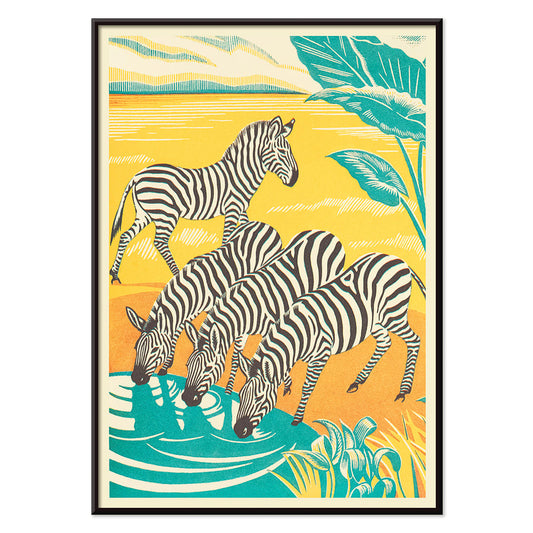
A Jungle Picnic 25 Poster
Clifford Webb · 1934 · Storybook zebra poster set in a tranquil jungle clearing with lush greenery
Poster from €9 · Framed from €16
Regular price From €6,00Regular price -
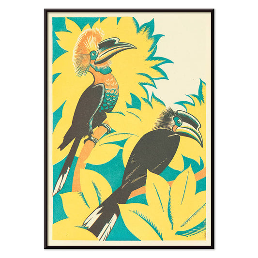
A Jungle Picnic 7 Poster
Clifford Webb · 1934 · Playful tropical bird poster with stylized foliage and an upbeat jungle picnic scene
Poster from €9 · Framed from €16
Regular price From €6,00Regular price -
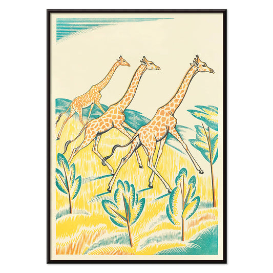
A Jungle Picnic 4 Poster
Clifford Webb · 1934 · Whimsical giraffe art print with three runners weaving through a bright jungle
Poster from €9 · Framed from €16
Regular price From €6,00Regular price -
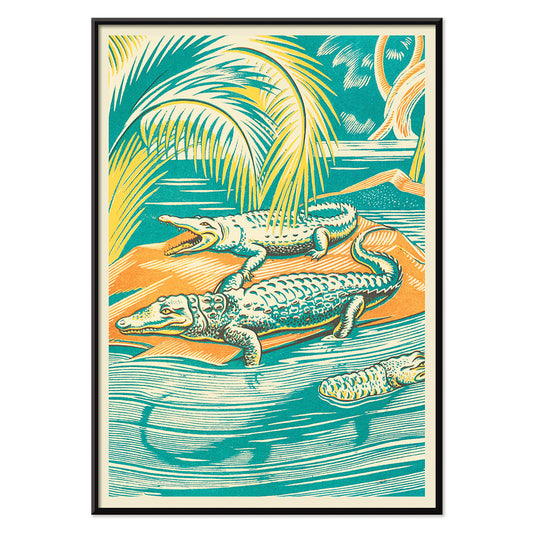
A Jungle Picnic 3 Poster
Clifford Webb · 1934 · Whimsical crocodile picnic poster with lush jungle foliage and storybook charm
Poster from €9 · Framed from €16
Regular price From €6,00Regular price -
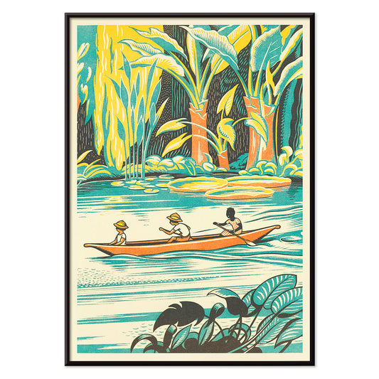
A Jungle Picnic 8 Poster
Clifford Webb · 1934 · Adventurous jungle canoe vintage print with three travelers moving through calm water
Poster from €9 · Framed from €16
Regular price From €6,00Regular price -
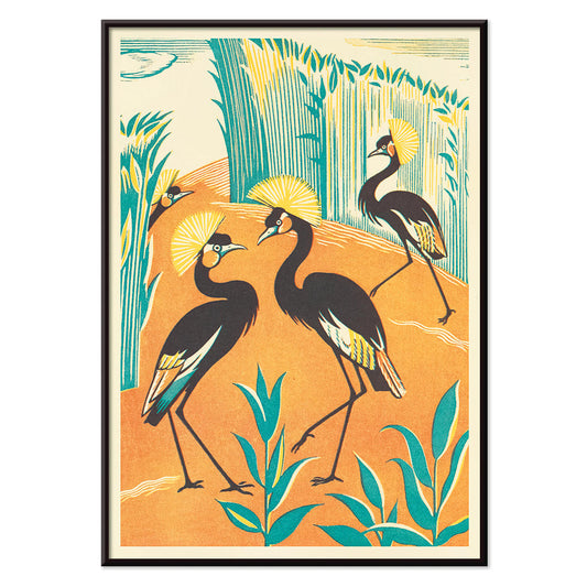
A Jungle Picnic 15 Poster
Clifford Webb · 1934 · Stylized jungle birds poster featuring elegant cranes amid lush green foliage
Poster from €9 · Framed from €16
Regular price From €6,00Regular price -
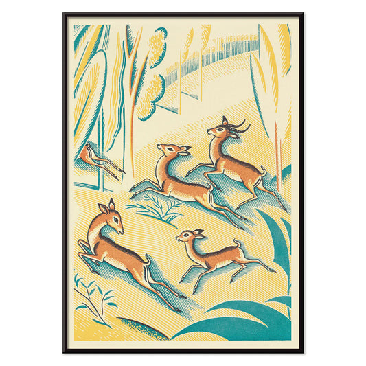
A Jungle Picnic 1 Poster
Clifford Webb · 1934 · Whimsical gazelle poster set in a patterned jungle picnic scene
Poster from €9 · Framed from €16
Regular price From €6,00Regular price -
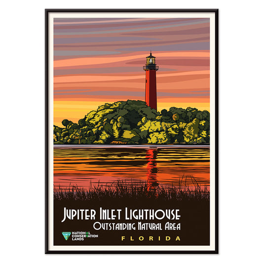
Jupiter Inlet Lighthouse Poster
Unknown artist · 2012 · Vintage-style lighthouse poster with glowing sunset sky and calm inlet reflections
Poster from €9 · Framed from €16
Regular price From €6,00Regular price -
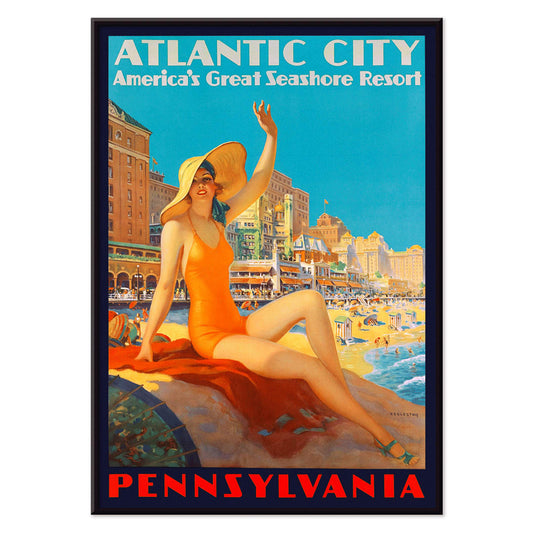
Atlantic City Poster
Edward M. Eggleston · 1935 · Sunlit Atlantic City beach poster with bold lettering and breezy seaside energy
Poster from €9 · Framed from €16
Regular price From €6,00Regular price -
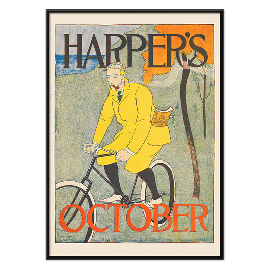
Harper for October Poster
Edward Penfield · 1894 · Autumn cyclist poster featuring bold flat colors and hand-lettered Harper's Magazine text
Poster from €9 · Framed from €16
Regular price From €6,00Regular price -
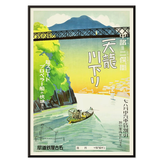
Tenryu River Poster
Nagoya Rail Agency · 1930 · Serene riverboat travel poster with green banks and layered blue mountain silhouettes
Poster from €9 · Framed from €16
Regular price From €6,00Regular price -
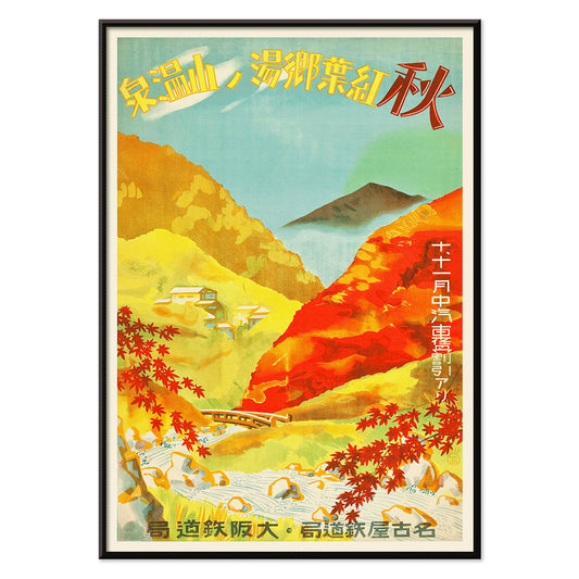
Red Leaves at Yunoyama Onsen Poster
Osaka and Nagoya Rail Agency · 1930 · Stylized autumn travel poster with scarlet maple leaves over a tranquil onsen valley
Poster from €9 · Framed from €16
Regular price From €6,00Regular price -
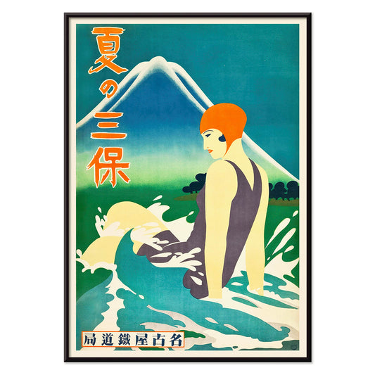
Summer at Miho Peninsula Poster
Nagoya Rail Agency · 1930 · Art Deco travel poster with swimmer, curling blue waves, and Mount Fuji in the distance
Poster from €9 · Framed from €16
Regular price From €6,00Regular price -
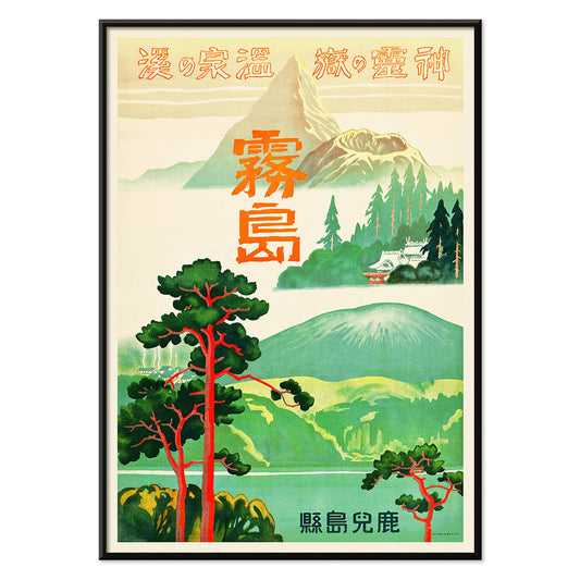
Retreat of Spirits Poster
Japanese Railways · 1930 · Atmospheric Kirishima travel poster with lush greens and warm volcanic accents
Poster from €9 · Framed from €16
Regular price From €6,00Regular price -
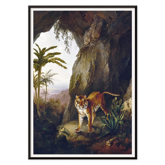
Tiger in a Cave Poster
Jacques–Laurent Agasse · 1814 · Majestic tiger art print resting in shadowed cave with sunlit foliage
Poster from €9 · Framed from €16
Regular price From €6,00Regular price -
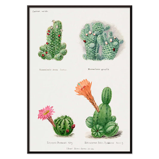
Assorted cacti Poster
Unknown artist · 1899 · Lively cactus botanical print with multiple forms and bright blossoms on clean paper
Poster from €9 · Framed from €16
Regular price From €6,00Regular price -
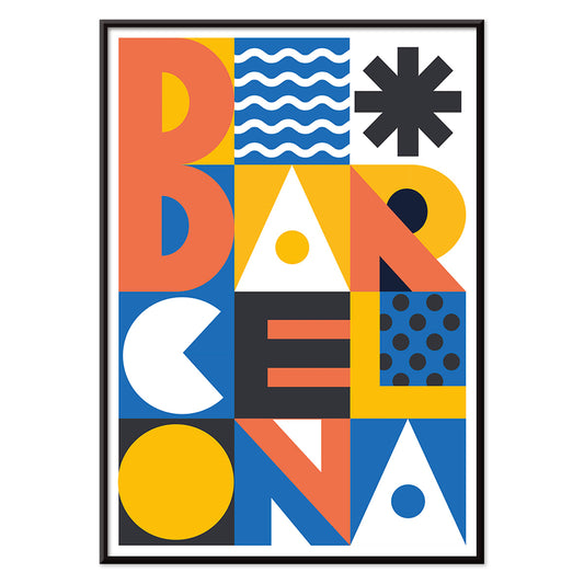
Barcelona Text poster Poster
MORYARTY · 2021 · Modern Barcelona poster with bold stacked typography and bright geometric color blocks
Poster from €9 · Framed from €16
Regular price From €6,00Regular price -
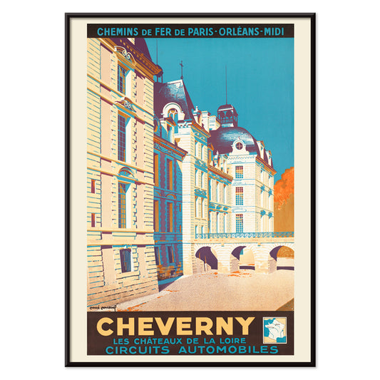
Cheverny Poster
René Roussel · 1952 · Elegant château travel poster balancing beige architecture with bold blue sky and warm highlights
Poster from €9 · Framed from €16
Regular price From €6,00Regular price -
Minimalist Map of Barcelona Poster
MORYARTY · 2018 · Minimalist Barcelona map poster with bold red street lines on warm beige
Poster from €9 · Framed from €16
Regular price From €6,00Regular price


36/332 items
- Cirkelkaffe Poster
- Coffea Arabica 2 Poster
- Porto Ramos-Pinto Poster
- Portugal Today Poster
- Red and green tomatoes Poster
- Exotic butterflies Pl.097 Poster
- Schwimmbad Liestal Poster
- Panther Poster
- Atlas of the Munsell color system Poster
- A Jungle Picnic 25 Poster
- A Jungle Picnic 7 Poster
- A Jungle Picnic 4 Poster
- A Jungle Picnic 3 Poster
- A Jungle Picnic 15 Poster
- A Jungle Picnic 1 Poster
- Jupiter Inlet Lighthouse Poster
- Atlantic City Poster
- Summer at Miho Peninsula Poster
- Retreat of Spirits Poster
- Tiger in a Cave Poster
- Barcelona Text poster Poster
- Minimalist Map of Barcelona Poster
Orange as a Temperature
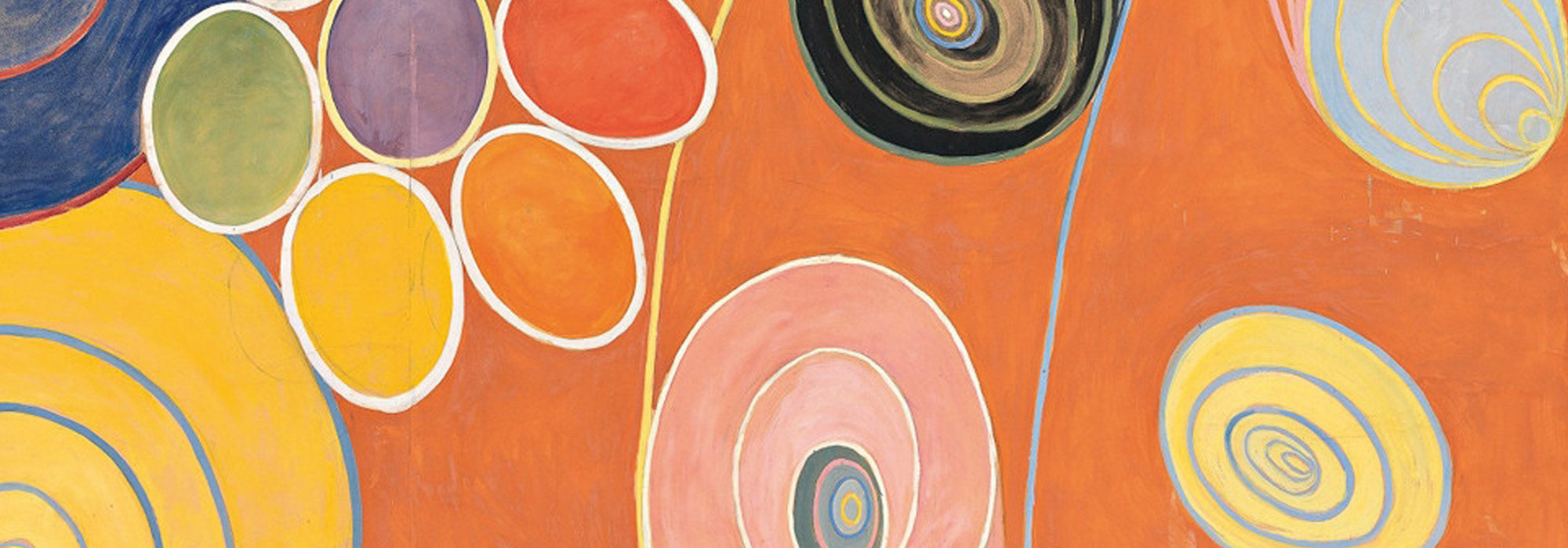
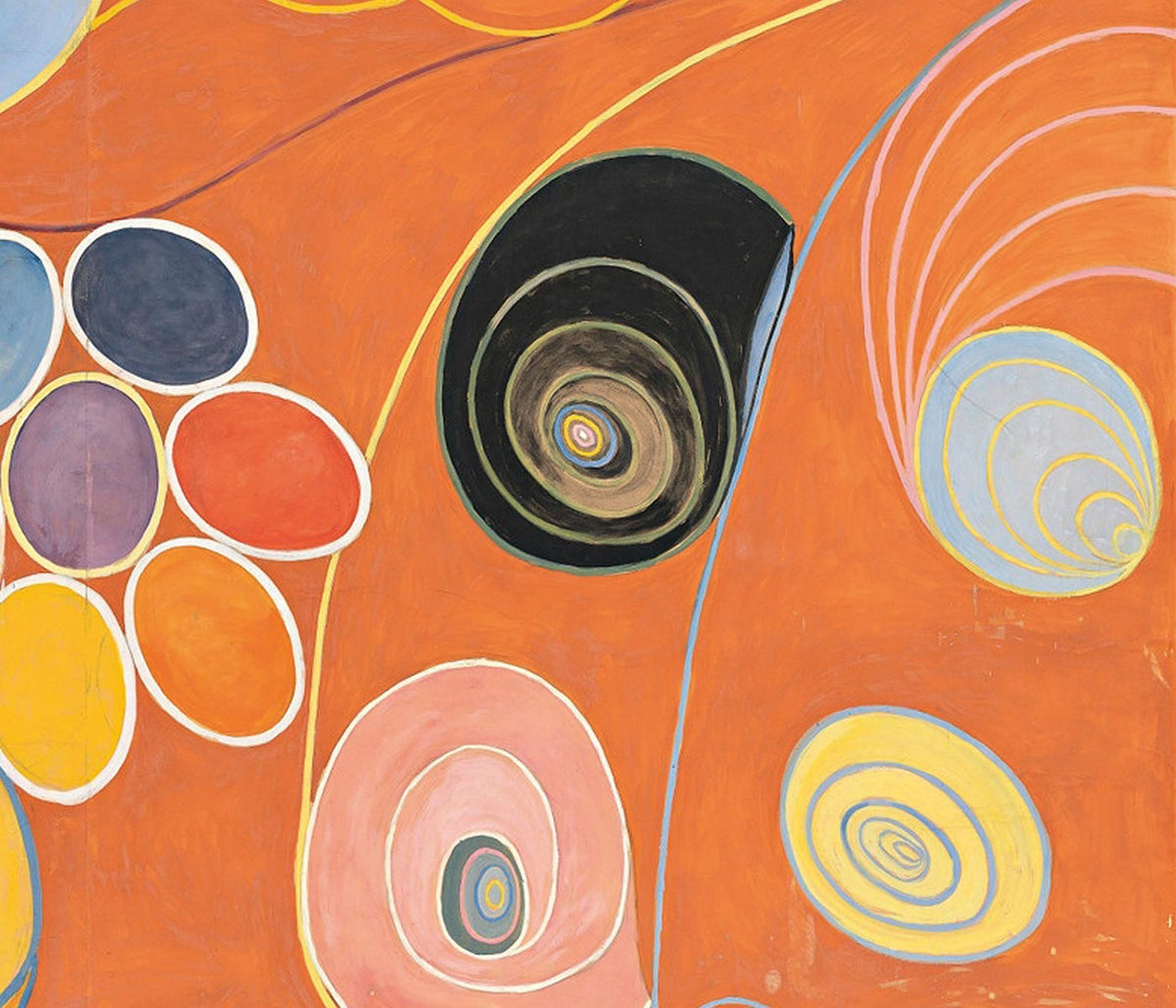
Orange is less a subject than a sensation: late-afternoon light on paper, oxidised inks, the glow of citrus peel. In this collection, colour becomes a guide through poster history, from modernist studies to travel graphics and vintage illustration, chosen for orange notes that warm decoration without taking over. It is a practical palette tool for home decor, echoing terracotta tiles, leather, brass, or a single linen cushion, while the compositions stay varied and surprising. Oranges run from burnt sienna to soft tangerine, often set against cream stock or deep ink, giving each print a depth that reads well across different rooms.
From Colour Theory to Modernist Graphics
Some of the most persuasive oranges arrive through theory rather than motif. Chevreul’s Cercle chromatique turns pigment into geometry, a nineteenth-century diagram that still feels contemporary in its clarity. That analytical spirit links naturally to abstract work and the sharp pedagogy of bauhaus, where colour and form were treated as a language. In Kandinsky’s 1923 Bauhaus exhibition poster, orange blocks and angled lines act like structure you can hear, with warmth held in disciplined balance. Paul Klee takes the opposite route: The Harbinger of Autumn (1922) lets orange seep through watery forms, closer to weather than signage.
Interior Guidance for Orange Wall Art
In interiors, orange works best when it has a counterweight. In kitchens or dining corners, pair citrus tones with chalky whites and matte black hardware; if you like a more engineered note, a scientific art print aligned with space such as NASA’s Deep Space Atomic Clock brings crisp lines that keep warmth from feeling sugary. In bedrooms, choose softer apricot and rust notes and let materials do the heavy lifting: oatmeal textiles, walnut, and amber glass. If your walls already carry strong colour, introduce orange through line and negative space, or soften it by mixing with botanical prints where paper tone and fine drawing create breathing room.
Curating Pairings, Frames, and Gallery Walls
When building a gallery wall, treat orange as rhythm rather than a single statement. Alternate a warm print with something cooler so the eye keeps moving: green plants, indigo textiles, or blue ceramics work as natural foils. Lithographic posters from advertising often carry the richest oranges, because the process favoured saturated inks and clear silhouettes; they tend to sit well in slim oak or dark-stained frames, depending on whether you want the hue to glow or to anchor. For an intimate counterpoint, bring in figure drawing: Schiele’s Kneeling Female in Orange-Red Dress (1910) is all tense contour and exposed paper, with the fabric acting like a flare against restraint, especially effective near bookshelves or a writing desk.
Why Orange Keeps Returning
Across the twentieth century, orange served both persuasion and possibility: a café sign, a railway sunset, a modernist diagram promising order. As wall art, it behaves like a controlled source of heat, useful when rooms lean grey, beige, or concrete. These vintage prints let you borrow that warmth in measured doses, from calibrated circles to loose watercolour stains, without forcing a full colour scheme.