


You may also like
-
The Little Street Poster
Johannes Vermeer · 1658 · Quiet Delft street art print with brick facades, doorway shadows, and daily life
Poster from €9 · Framed from €16
Regular price From €6,00Regular price -
St Denis Church Poster
Jan Weissenbruch · 1846 · Sunlit city-square art print centered on St Denis Church with blue sky and warm stone
Poster from €9 · Framed from €16
Regular price From €6,00Regular price -
Mosque The Mooristan Poster
David Roberts · 1842 · Atmospheric Cairo art print featuring monumental mosque architecture with small figures for scale
Poster from €9 · Framed from €16
Regular price From €6,00Regular price -
Grand entrance to the Mosque of the Sultan Hassan Poster
David Roberts · 1842 · Monumental Cairo mosque entrance poster with bustling figures rendered in warm stone tones
Poster from €9 · Framed from €16
Regular price From €6,00Regular price


-

"Very nice Posters. The quality is amazing and we received it very quickly !"
-

"A shop to visit absolutely. Huge selection of posters. We spent more than an hour there !"
-

"Perfect to find gift. Price are very good. An they can frame and pack it on site"


About the Artist
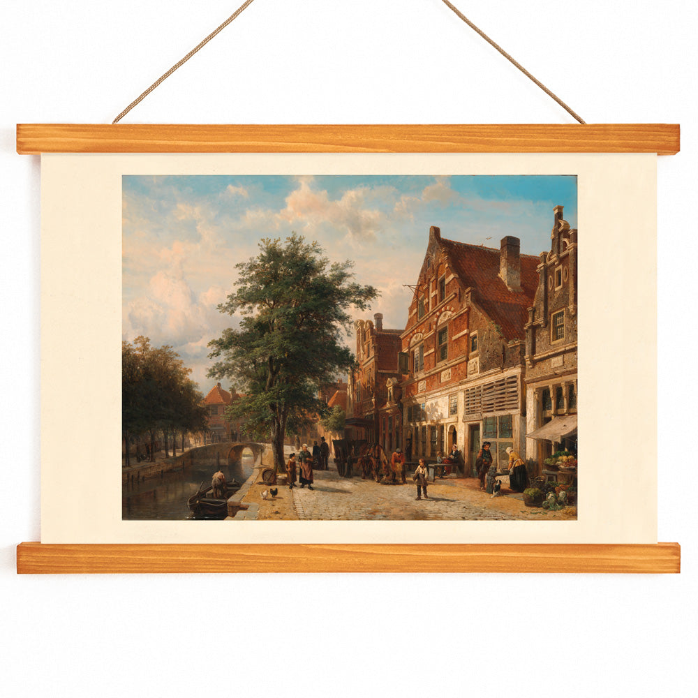
Cornelis Springer was a Dutch painter renowned for his evocative city views that blend architectural precision with scenes of daily life. Active during the mid-19th century, Springer played a significant role in rekindling appreciation for historic urban environments at a time when Dutch cities were undergoing rapid transformation. His works appealed to collectors interested in both the recognizable charm of familiar streets and the subtle narratives unfolding within them.
Springer’s paintings are firmly rooted in the tradition of Dutch architectural art, offering a sense of nostalgia and civic pride. This 1850 cityscape reflects his commitment to capturing the enduring spirit of place, making it a lasting example of 19th-century Dutch urban art. For those who appreciate classic European scenes, it connects beautifully with the classic art and landscape traditions.
The Artwork
This artwork presents a tranquil moment in a Dutch town, inviting viewers to observe the gentle flow of everyday life along its streets and canal. Rather than focusing on a dramatic event, the scene highlights the harmony between architecture and community, where townspeople go about their routines against a backdrop of historic buildings and waterways.
Created during a period of growing interest in local heritage, such cityscapes served as visual souvenirs and expressions of urban identity. The composition celebrates the continuity of civic life, with the town’s architecture acting as a silent witness to generations of inhabitants.
Style & Characteristics
The image is defined by meticulous architectural lines and a strong sense of perspective, drawing the eye along the canal and through the orderly façades. Figures are thoughtfully placed, animating the scene and providing a sense of scale. The water’s surface reflects the buildings, adding depth and a touch of luminosity.
The palette features soft blues in the sky and water, muted greens in the foliage, and warm browns and beiges in the masonry and streets. This restrained color scheme creates a peaceful, inviting atmosphere, making the print well-suited to interiors seeking refined detail and understated elegance.
In Interior Design
This cityscape art print brings a sense of quiet sophistication to living rooms, studies, or hallways. Its harmonious tones pair well with natural wood, linen, and brass, fitting seamlessly into classic, transitional, or Scandinavian-inspired spaces.
To enhance its effect, coordinate with blue or beige accents in textiles or ceramics, and consider displaying it alongside other pieces from the landscape or frames collections for a cohesive gallery wall.